The Instagram Modern Country Farmhouse Experiment
June 26, 2019Social Media
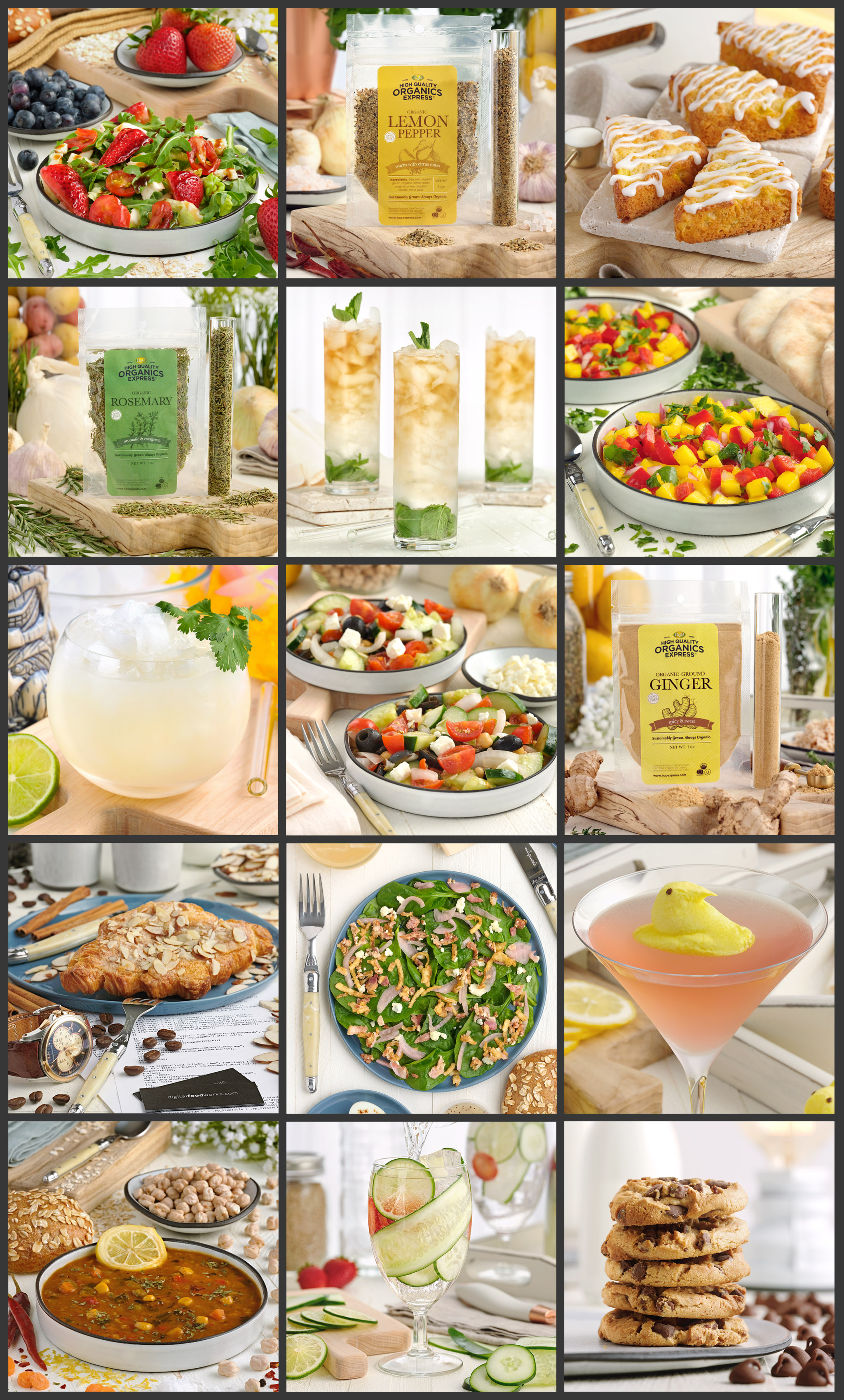
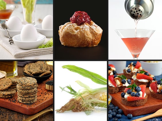
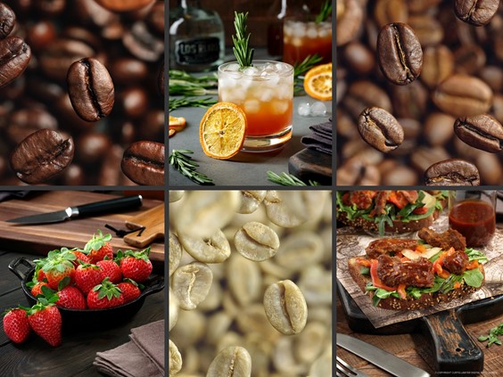
Here's a small grid of all 15 photos in the order they appear on Instagram.
While Content Guides and Style Guides are really important for working on projects (to help remind everyone involved about the look and feel of the campaign)… I ended up feeling like they were a bit limiting for this site, (which is basically a B2B site), and it wasn't really drawing attention to anything specific.
Photography-wise — light setups are created to make each specific thing you're shooting look great. What I attempted to do for this series of 15 photos (which were mostly just for our social channels), was to use the same light setup and style guide for everything — all 15 photos.
The light and staging setup had originally been created to feature a product series, the High Quality Organics Express spice packet photos. It's what I call our "hero" angle, and I think the "Clean Modern Farmhouse" look worked quite well for those.
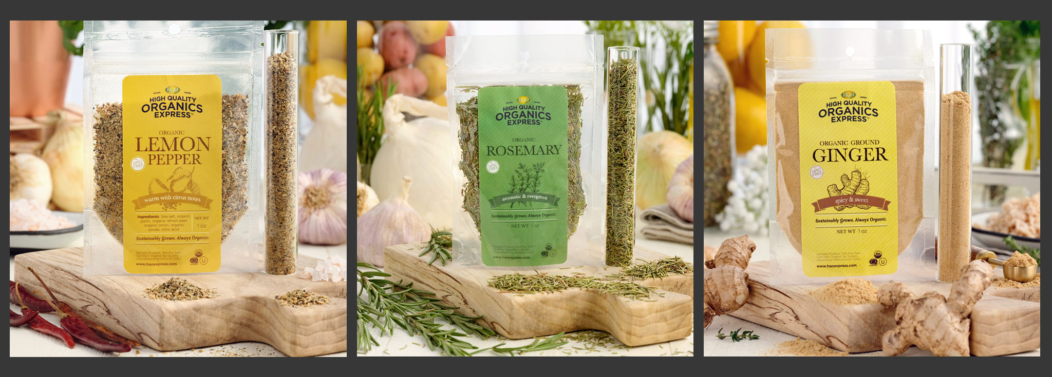
The sample spice packet photos from High Quality Organics Express.
Engagement wasn't unusually high, but product photos can be tricky and tend to work better on the actual company's channels as opposed to on a channel where it "could" look like an endorsement. I think the Instagram platform, specifically, is getting a little suspect of "influencer" type of photos, where the product or service is too obviously out in font in the photo. A little clever and indirect "hook" or angle seems to work better for promoted products when it's an "influencer" type of post.
I attempted doing an overhead shot with the same setup… but pulled the plug on doing more. The lighting for overhead photos (aka a "flatlay") is very different. It's something how big of an impact rotating the camera 90° can have on a photo.
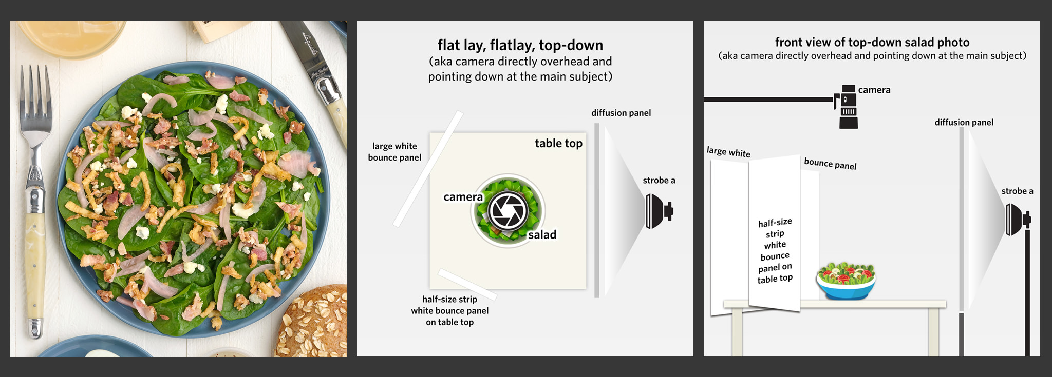
The "hero" style lighting setup for the spice packet photos, didn't lend itself extremely well to a "flatlay" photo of this salad. It turned out okay, but there really wasn't enough depth being generated by the shadows to make the elements stand out.
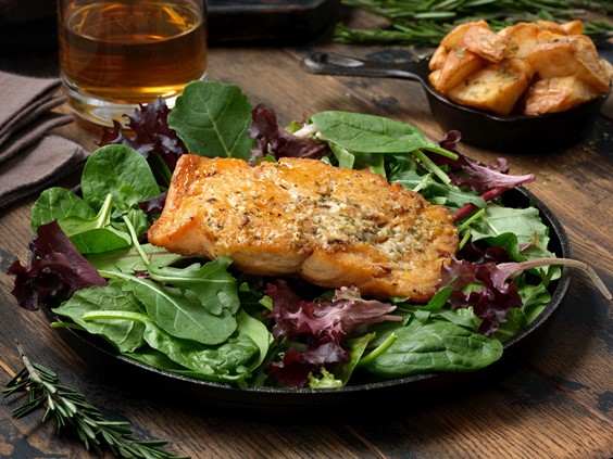
I got to use these really cool, shallow plate/bowls four different times. They're great for salads and soups (desserts too I suspect)… I really like them because they're a bit smaller than you might expect (making the food look a little bigger) and that thin black line around the edge really gives them a contemporary look — while still being artisanal stoneware.
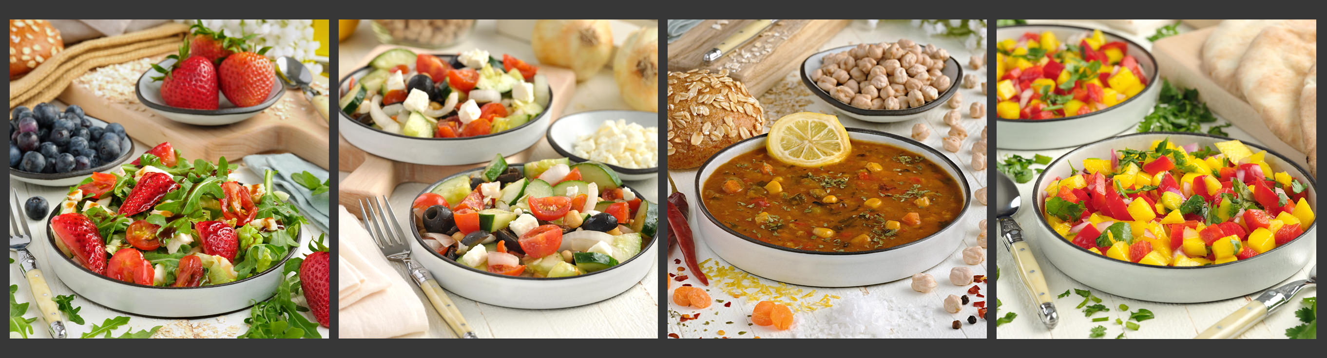
These plate/bowls are really cool because they're not that deep. When staging something like soup, sometimes the things you want to feature, sink below the broth. With these bowls, it's much easier to keep featured elements on the top.
The bowls were all shot at a 30-45° angle and more or less in the same "main bowl / back bowl" format. The light setup seemed to work well on this type of shot — it's pretty close to the spice packet photos, but the camera is higher and angled down more than with the spice packets.
I am noticing now — that because the main light was on the right side of the subject, it looks like I set these up so the eye would spiral in counter-clockwise… which is interesting. Normally on a "full bright" shot like this, I would have a tendency to put the main light on the left and behind the main subject — then attempt to lead the eye in clockwise. So these are "mirrored" or flipped over from my normal pattern.
The next three don't really fit into a single category. In this group, my favorite is either the Chocolate Chip Cookie Stack or the Mango Scones. It's probably because of the color palette in those two. I really, really wanted to like the denim blue plate (under the Almond Croissant)... but I don't feel like I've found it's best use or setting yet.
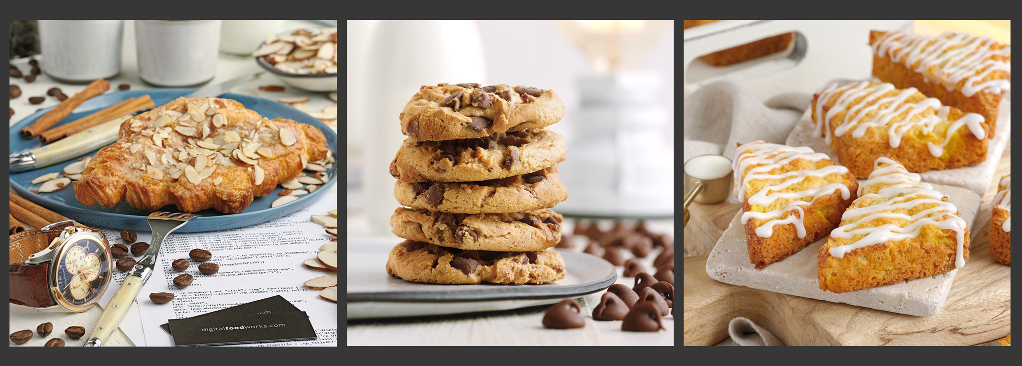
These three don't fit into any single category. From left to right, an Almond Croissant, Chocolate Chip Cookies, and Mango Scones.
Last, but certainly not least, the beverage shots. Beverage photos are still performing well — and it doesn't even have to be an "adult" beverage. One of the best performing images of the 15 is the Cucumber Strawberry Detox Water. If the photo has a cleaver hook, theme, or is just a really great shot for one reason or another — it can do really, really well.
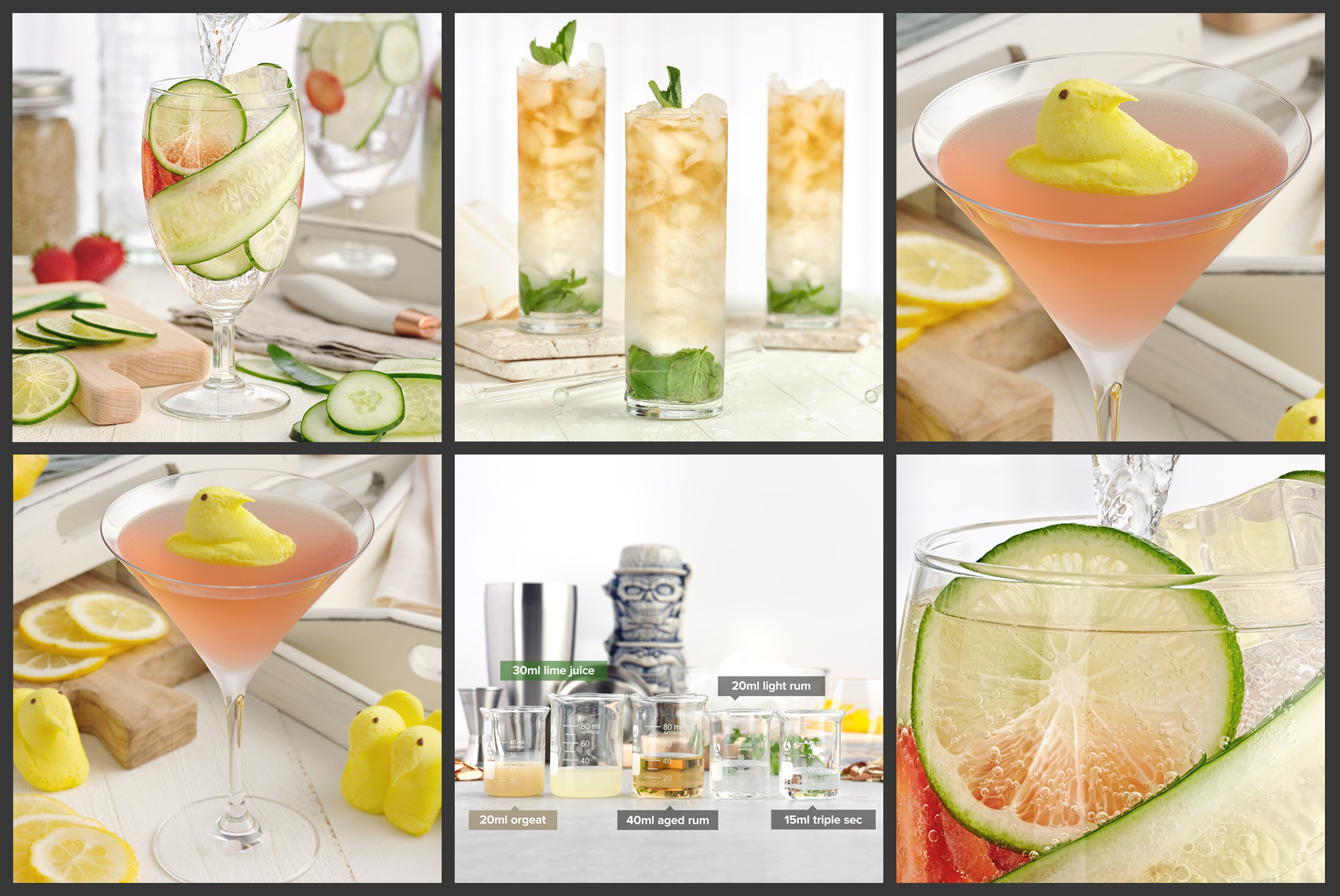
Even though there were only four beverage photos, I shot multiple angles and crops for a couple of them. Some additional images were taken for the recipe application's step-by-step feature. Both the Jeepers Peepers and Mai Tai from the 40's Cocktails are in the DFW recipe application.
Interestingly, I think this "modern farmhouse" light setup was the hardest on the beverage photos. The cucumber strawberry detox water photo really worked well because it used the same "hero" angle that the spice packet photos did… so the light and scene were really crafted specifically for that angle and look. I would have used a totally different setup for all the other beverage photos in the series… if they weren't in this experiment group.
For a little while, I'm going to revert back to a simple "three across" group format for Instagram — if there's a topic group that gets an article, those three images would be used for the article and a Facebook posting as well.
One of the ideas that I wanted to test with this Modern Country Farmhouse experiment, was basically just to see what the result of adhering to a style guide and content guide for the DFW would look like. While it is totally something I would recommend to a specific product and/or campaign… I'm not 100% sure it works for a B2B portfolio type of site.
The primary goal should be to show whatever topic I'm photographing, (whether it's for a client or an internal article), in the best light possible (photography pun). That's a hard thing to keep relevant for even just 15 photos. For example, what if it's National Bourbon Day and I'd like to share a recipe for an amazing Bourbon Pecan Galette… but I just know that it would look awesome on a dark background with a high contrast ratio… and I'm sort of… "stuck" in Modern Country Farmhouse mode? I might be inclined to not even pursue the Bourbon Pecan Galette idea until I'm shooting dark high contrast things… and it's not good to limit creativity like that.
I have also noticed (after further inspection)… that some of the accounts that I admired so much for sticking with a style guide, across many, many images… actually use the exact same subject — over and over and over, quite a bit. I'm not sure how I feel about that… or if it's good for creating an engaging conversation or interaction with your audience.
The reason — is because organic reach on all platforms, keeps shrinking. If you want your whole audience to see a post, you almost have to show your new brownie recipe from the left on week one, from overhead on week two, from the right on week three, with a bite out of one piece on week four, on a plate with you in the picture on week five, etc., etc., etc. That's why the account looks so uniform.
It's what the computer wants you to do… and I'm sure there are "how to" books out there that tell you that's what you should be doing to get followers.
I "get it"… and adopting a plan like that does make it easier to post multiple times per day because you end up with a wealth of material to use.
While it may not end up be the fastest way for me to get followers, my gut feeling (for the nature of the DFW site), is to show the best couple of images… and then move on to the next project. Rows and groups of three photos might support that idea better. We'll see how it goes.
In keeping with how I closed the last article regarding these Instagram experiments — this group of 15 "Modern Country Farmhouse" images (using the same light and style set up) resulted in a 20-25% increase in followers over the course of about 10 weeks. The average photo "like to follower ratio" averaged 15% (meaning — for every 100 followers, 15 of them "liked" or interacted with the image).