Previously On Instagram and Our Style Guide for Spring 2019
March 28, 2019Social Media
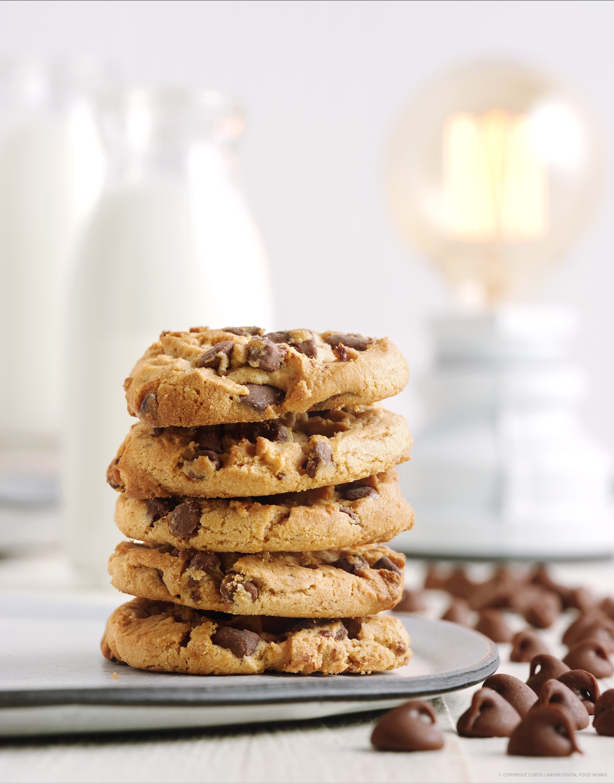
It wasn't easy catching the glow of that Edison era light bulb in the
photo. In order to balance it with the strobes, I had to reduce shutter
speed down to 1/30 of a second (i.e. the light bulb is considered
continuous or "natural" light, it doesn't discharge a high power "pop"
like a flash does).
It sort of worked out, but it also felt a little random to me. It was hard to tell that there were in fact — five different categories looping around — unless you really read the posts that went with each image.
For my next observational excursion, (both of those words get 18 base points each in Scrabble... if you were wondering), I'm going to try 15 images that adhere to the same style guide. Maybe 18 images, or possibly 21, but probably 15. I'm not sure yet. 15 felt a little short when looking at them all as a group. Two more rows of three images would bring it to 21 images — that seems to look a little more like a "campaign" or an intentional style decision. We'll see how it pans out.
Style Guides
There really isn't a specific format or an "official" kind of document that can be used as a style guide… they can be very different based on who they're for. A style guide for a designer can be a large, multi-page document that outlines things like fonts, colors, spacing, and even how and when to use a certain logo format. It's usually drafted when multiple designers, art directors, and creative directors are working on the same campaign or for a single brand… in an attempt to keep a uniform look to all of the material that is being created.For a photographer, style guides generally aren't quite as long (but they can be). A photography style guide usually just outlines colors, materials, and textures, that should be featured (or avoided)… and if you're lucky, tells a little bit about the backstory of the people that you are taking the photos "for".
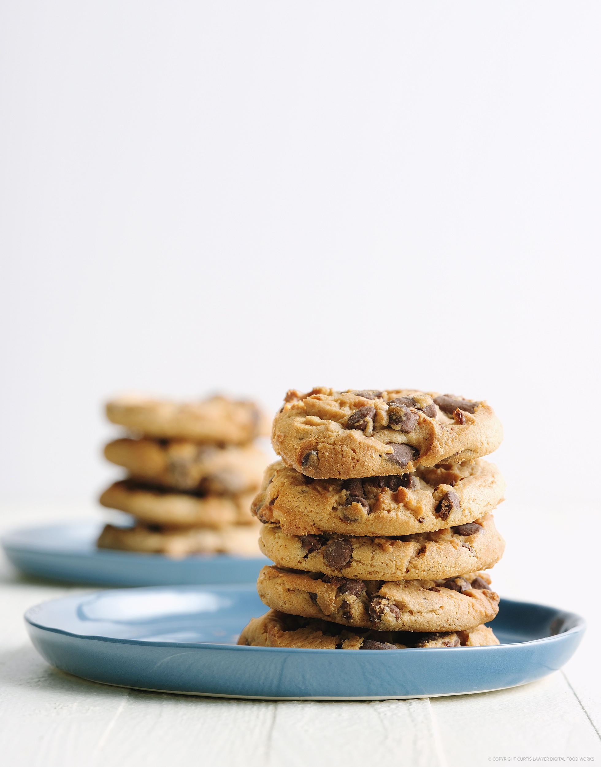
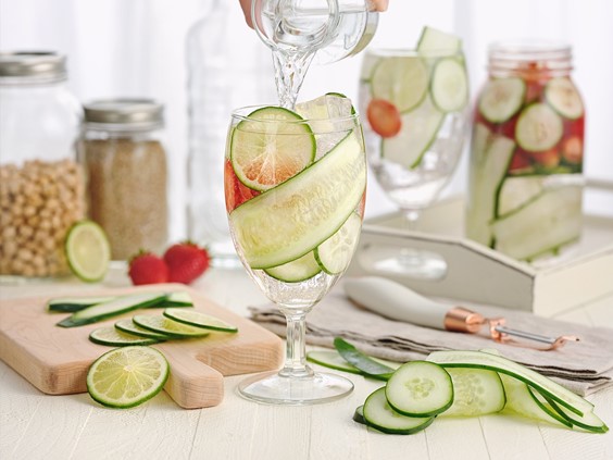
Rather than working with the more traditional yellow and green accents for spring, I thought I would try out a dusty, almost denim gray-blue. It definitely fits in with the "modern farmhouse" aesthetic... we'll just have to see how it pairs with food!
Creating a style guide to use for a business-to-business photography and design website (this site, to be exact), is kind of a tricky proposition though. On one hand, you could say "This one style is what I do and it's what you're going to get when you hire me." — I know that's what everyone tells you to do in those "Self Help Business Articles" — but… it really limits the kind of work you might be considered for.
Being both a designer and a photographer — I really like the idea of working with different looks and crafting different stories. I think being able to adapt to different creative ideas while looking at the big marketing picture... and not being tied down to a single style or method is what gives everything at Digital Food Works a little "plus" — it's that little extra something that makes DFW special.
Presenting many different styles quickly on a website though… brings us back to the "it all looks very random" problem. And so — Instagram to the rescue! (Cue that little "good idea" light bulb photo.)
It occurred to me that I might be able to run a styled campaign on Instagram, without it necessarily taking over the look and feel of the DFW site. As long as there was a link to this article from our /Fresh/ topic page — that would at least lead to a plausible explanation of what was going on… it might… maybe… make sense. Additionally, it could also end up being an interesting way to organize some of the photos on my photography portfolio pages… i.e. by "styled looks and feels" and not just a typical breakdown to categories like food, beverage, and dessert. As I alluded to earlier, we'll see how it goes.
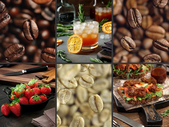
Spring 2019 : The Modern Country Farmhouse
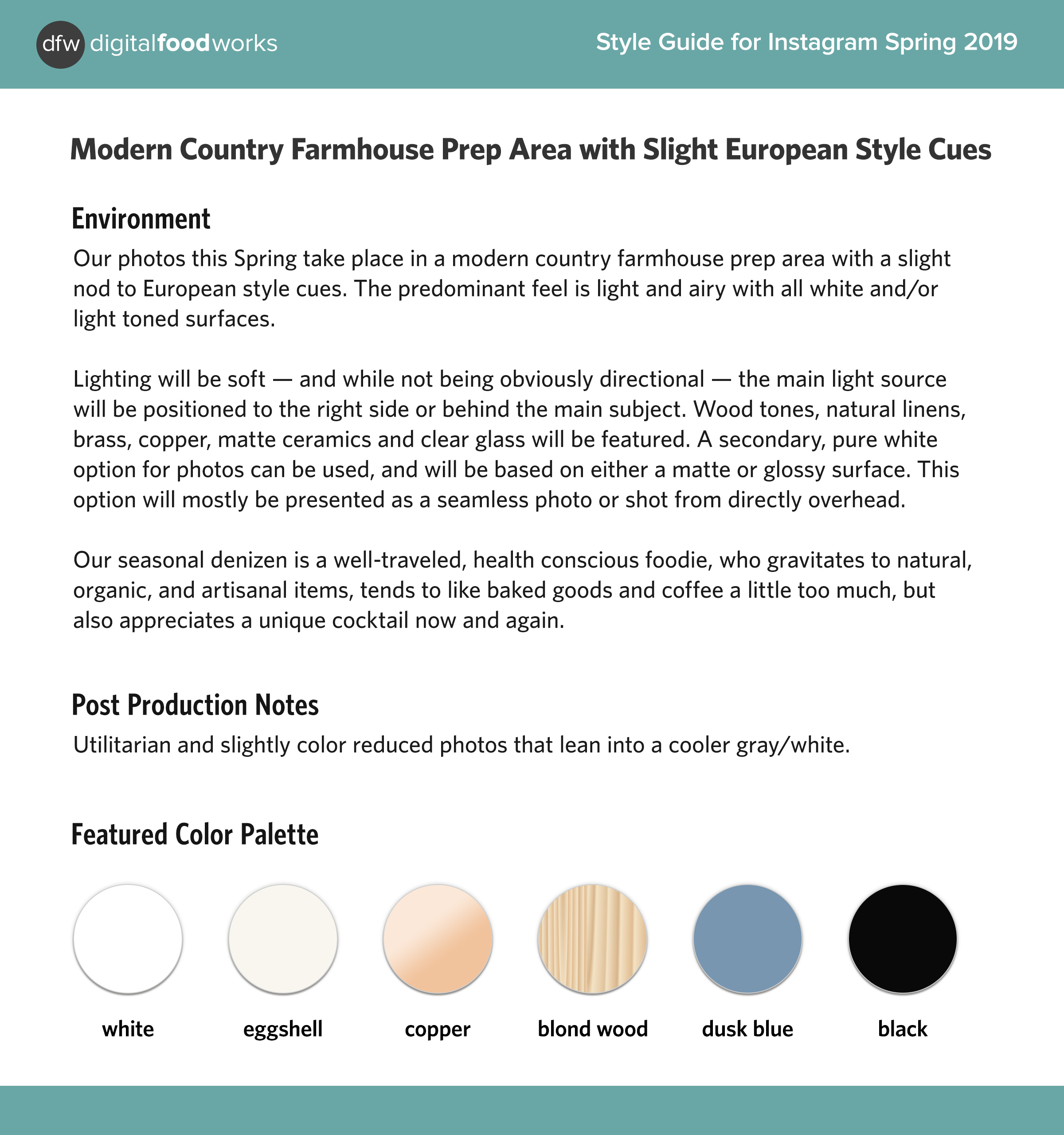
The style guide I'm using for the DFW Instagram feed for Spring 2019.
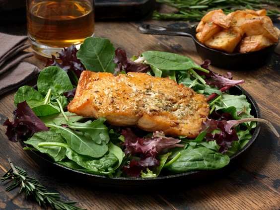
Well... a lot actually. While I really enjoy shooting products on seamless white, I've found photographing food and beverages using that familiar minimalist white, industrial farmhouse type of setup... to be a little more difficult. It's probably just me.
I think when the subject is a product, and there's nothing else around... it's clear where the focus is — but when there's a plate and a fork and some linens or a cutting board and some food items — all of those things stand out equally. You really have to find some way to get the food to pop away from any staging — which is already popping off the white. I love the look... so this will be a great personal exercise as well as an Instagram experiment.
Hopefully (and this is a little off topic)… I'll also have time to turn on the DFW Recipe Application during this particular style guide period. I don't currently have much in the way of photographs for that application right now, but I'm hoping this style guide will actually help to keep that separate from this Instagram experiment.
I have taken the time to program a "step-by-step" function into the application and any images photographed for that function, will have their own (more utilitarian) style guide — while the main "hero" shot of the thing we're making, will most probably be styled unto itself. The DFW Recipe Application is being set up as a testing ground of sorts, and so by nature — many different ideas, recipes, and media types will be in the database. I want to see in a "live" environment and on different platforms — what works best.
I think in a "real" site (where I'm not demoing different applications) the style guide for the site should stay consistent for any and all photos on that site.
Should You Have Your Own Style Guide?
I would say yes… to just about anyone really. If you are a competitive cook, media personality, health and fitness expert, and especially if you are a small brand with something like baked goods or catering services to market — writing down even just a few words about your style will help keep all the images you create, uniform. That in-turn establishes familiarity with potential new customers or followers — and that familiarity turns into a "connection by sight". In a world where so much is decided on seeing an image for a half-second — adhering to a color and texture system could be the difference between someone recognizing you, without even looking at the account name, and then following that content back to your site, and in-turn taking whatever action the photo leads to.Even just writing something down like "I take my photos on a dark wood cutting board with natural color linen napkins, use mostly antique flatware and pink depression-era glass plates" will go a long way in helping to keep the look and feel of your content consistent.
There probably needs to be a side article here at some point for competitive cooks, recipe developers and social media stars (as opposed to a brand with a product or service) — with regard to "sponsor product style guides" — and how to include the sponsor product's look and feel into your own style. As I'm quickly discovering, sponsored products play a big part in the economics of this particular group.
A big question when creating sponsored content images for your own site and social media channels is — should you continue to follow your own style, or adapt to the sponsor's style? Probably... a little of both. I'm hoping we'll get to examine a scenario like that, as these 15-21 images are being photographed, and cover the topic with a small article.
Too Many Words
At this point, I would usually write something about the next article not being as long as this one is — but I think I have one more slightly long article to go before getting back to posting some photos. I want to write a little bit about the DFW "Content Guide" for our new experiment.In previous ramblings, I wrote about feeling like the "why" behind the photos in our last experiment was a little lacking — so I wanted to come up with an Instagram Content Guide. A brief outline that would help with making sure what I was posting to Instagram fell into a predetermined "value category" for the audience.
I didn't really want to get into the content guide here, because it is a separate thing from the style guide. If successful, the content guide will be used over and over, through many different styles. But that… is for the next article. :)