The Instagram Light, Dark, Light, Dark Experiment
January 10, 2020Social Media
Way back on August 20th, 2019 — I started posting a series of images on Instagram that followed a "light tone then dark tone" alternating pattern. This little checkerboard test ran from that date, up until October 28th, 2019 — so basically 60 days and encompassed 18 images, give or take.In previous tests, I've tried staggering content types (The Instagram Five by Three Experiment) and using style guides (The Instagram Modern Country Farmhouse Experiment), etc. This time, I didn't spend too much time thinking about content "types" for the various posts, and only concentrated on the light/dark alternating pattern for the main "cover" image.
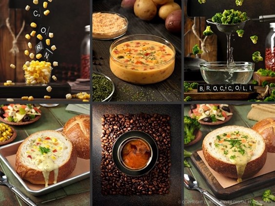
The most liked image from this period was the tassel end of a corn cob (one of the light toned images), with 88 likes and 19 comments. Who would have ever guessed? That image was nested though, with a couple of "setup" images and a movie clip, that panned from left to right and then back on the corn.
The image that collected the smallest number of likes from the period was a single zucchini, isolated on white, packshot style, with the word "zucchini" in the frame. It received 55 likes and 10 comments. Poor little zucchini.
I can't really draw any conclusions from any of this, other than to say, I've had a hunch that things that "look" like ads (i.e. with printed words in them), don't do as well as straight up images. Many social platforms use an image inspecting and visual recognition algorithm that is capable of determining what an image is, and how much of an "image", is text.
If you say an image is a #Zucchini and it's #RawFood or #HealthyFood (for example) and the system looks at the photo and comes up with "image may contain: words" — then the number of people it shows the image to, may be reduced. No hard proof of that, I'm just putting that out there.
Recapping some of what was in the series of 18 images, I started working on floating veggies, just to have some photos to look at, reflect on, and plan some slightly more involved "floating things" images in the future.
The first in the series, a floating Cubanelle Pepper received 74 likes, a floating Zucchini 64 likes, and finally a floating stalk of Celery with 84 likes. It's starting to feel like Zucchinis aren't as well liked as other veggies!
I think my main takeaway from that series was… don't work with potting soil again. Oh… it seems like a great idea on paper, but that stuff is dirty.
I guess the only other photos that might fall into a "content group" would be the "veggies on white" photos.

The "Veggies on White" series contains an image with the highest number of likes (the corn) and the smallest number of likes (the zucchini).
This group contains photos with the highest and lowest number of likes… the Zucchini received 55 likes, a Lemon with 61 likes, and the Corn with 88 likes.
There really aren't any other "content groups" in those 18 photos… they just followed the light, dark, light, dark design pattern. Looking back at them as a whole, I don't think I like the design pattern as much as when I've tried to stay in a single "look" for the series.
Just prior to this group, I tried some "three across" images… I'll talk more about those in a future article, but before that — there was a group of "all white/light background" images. Staying with that one "white/light" design ascetic for a prolonged period of time wasn't the most exciting thing in the world, but it did seem to be effective, and in looking back on it now… it feels more together and focused than what basically amounts to a random checkerboard pattern.
For the "autumn/winter" period that we're in now… I've decided to stick to a darker look for the entire series, and so we'll just have to wait and see how that turns out, this spring!
Closing Stats
I'm going to close this article in the same way I've closed the other "Instagram Recap" articles… with some general stats. But these really aren't scientific or absolute… they're just a reference as to how this one DFW account has been progressing.This group of 18 "Light, Dark, Light, Dark" images resulted in a 13-17% increase in followers over the course of about 60 days. The average number of likes per photo was 75 (total number of likes divided by 18 photos). The average photo "like to follower ratio" was around 12% (i.e. for every 100 followers, 12 of them "liked" or interacted with the image).
Stay tuned though — the next "instagram musings" article should be a little interesting, as I inspect the "three across" idea. Not to give too much away, but there's something interesting about the pattern, as it relates to likes — that may or may not be useful. :)


