P.S. Flavor!™ Spice Jar Product Photos
June 23, 2018Nine Ways to Sunday with PS Flavor
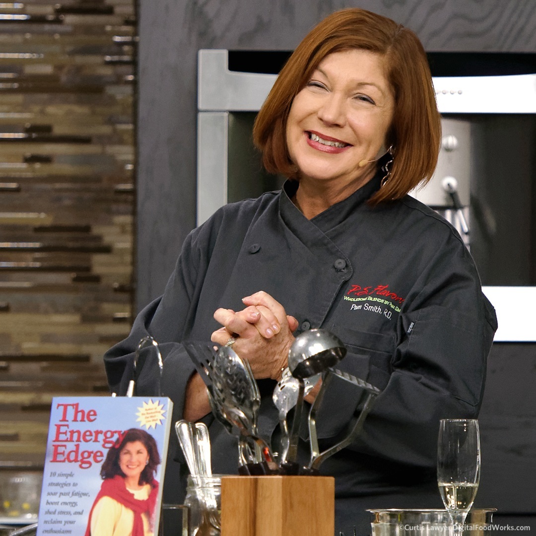
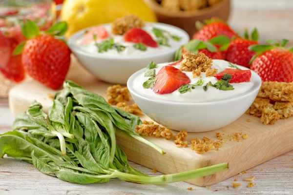
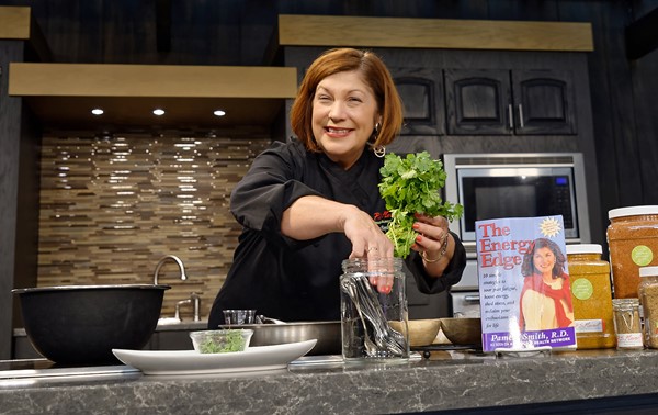
Pamela Smith, RDN, seen here hosting and cooking at Epcot's International Food and Wine Festival - has also created her own spice blend line called the P.S. Flavor!™ Spice Blends.
Shortly after starting the first series of photos, I was invited to work with P.S. Flavor!™ on the design of a brand new product labeling system, boxes, publications and all manner of supporting collateral material — which was a very happy sidetrack, and produced some amazing design work (some of which can be seen under the "Design" main menu link on this site).
Now that the look and feel of the core product has been refreshed, I can't wait to see how the original Nine Ways project idea unfolds. Basically, the goal here is to feature a single product line — using nine different art and photography motifs. Pretty much anything can be used for marketing these days — social media is an especially hungry platform — but with that being said, all "Nine Ways" will lean a little more toward being "marketing practical".
The first "way" in the Nine Ways series is simply called "Individual Product Photos", but there are going to be a couple articles in a row, in just this one category. The "on white" product photo is one of the core things that every product should have, so that's where the Nine Ways project begins. Ok, enough about the concept I want to start looking at some of the photos!
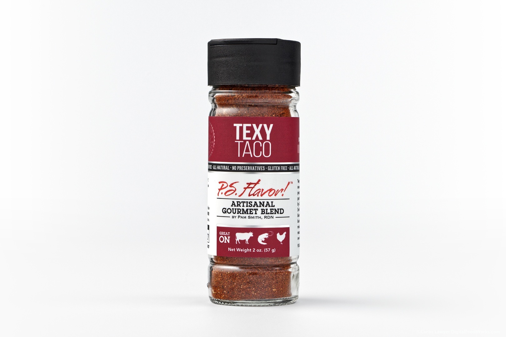
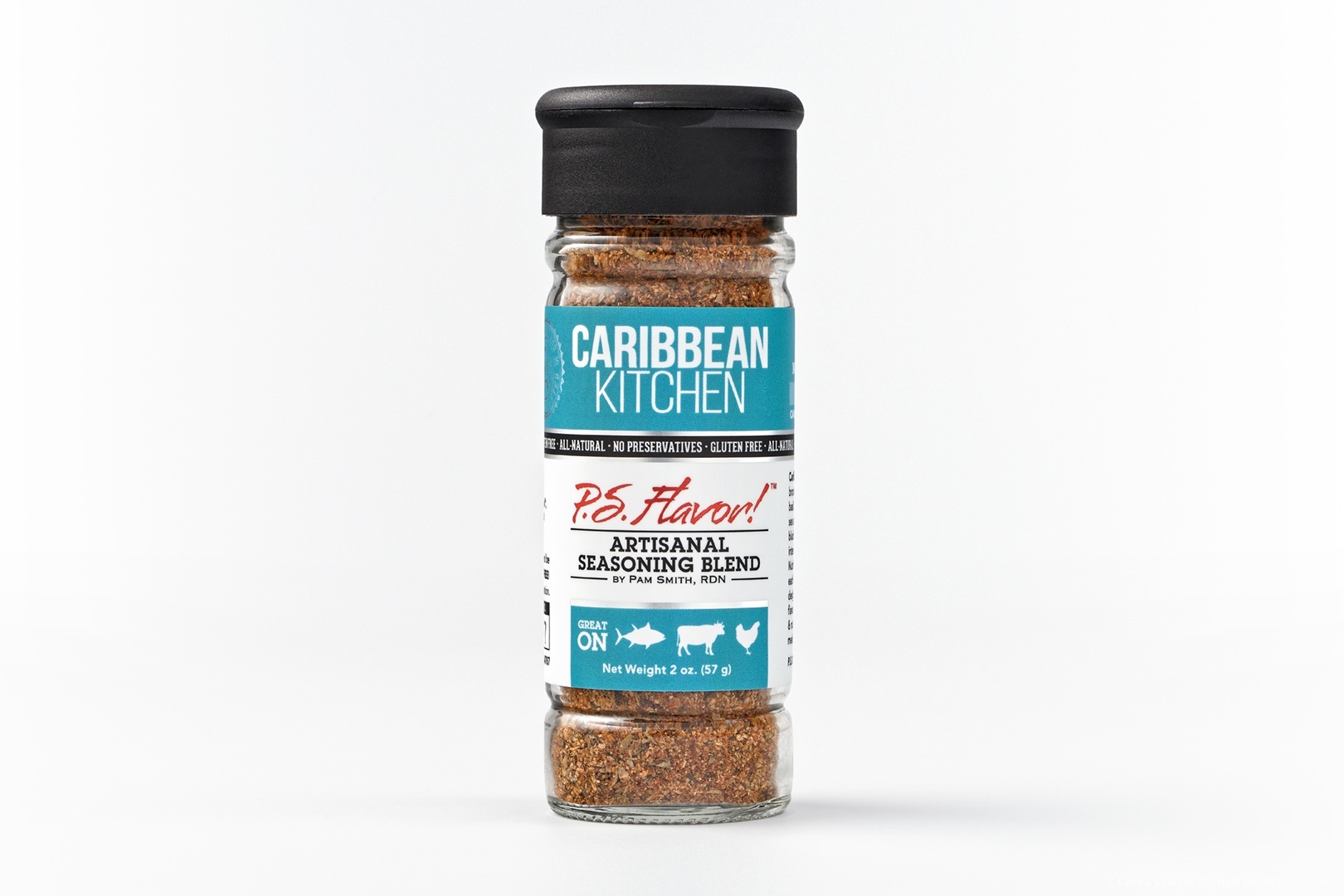
The first "glam" lighting setup that I created for the P.S. Flavor! products is simply stunning and to this day is still one of my favorite looks for the product!
Getting rid of the horizon line and the reflective surface was the first step. The horizon line (where the surface meets the background) had been two different shades of white — with the background being illuminated more than the surface. This allowed the product's reflection to show up more in the surface. It's an amazingly cool look, but it creates a lot of light bounce which adds contrast and highlight issues that have to be mitigated. Even though the bottles all look very similar, they each contain their own very unique imperfections in the glass. Just rotating a single bottle 1mm clockwise would often change the highlights… many of which ended up having to be blown out in post, in order to increase the contrast in the spice product itself, as seen through the refractive nature of the glass. Whew.
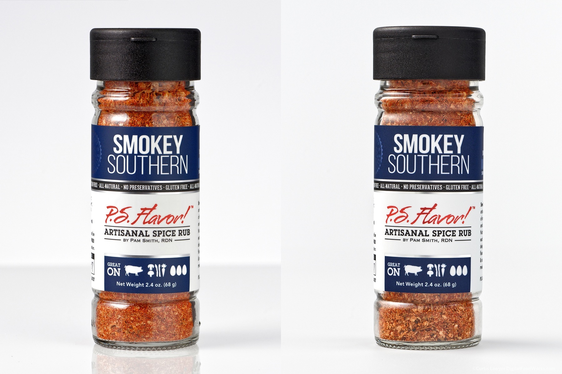
Loosing the horizon line and about half of the light sources and modifiers created a slightly flatter image... which is too bad - but it made for a much more sustainable lighting set up. The perceived loss in "label curve" here is an optical illusion. The bottle on the left was shot with the camera slightly higher and angled down where the photo on the right was shot with a perfectly level camera angle and slightly lower on the bottle.
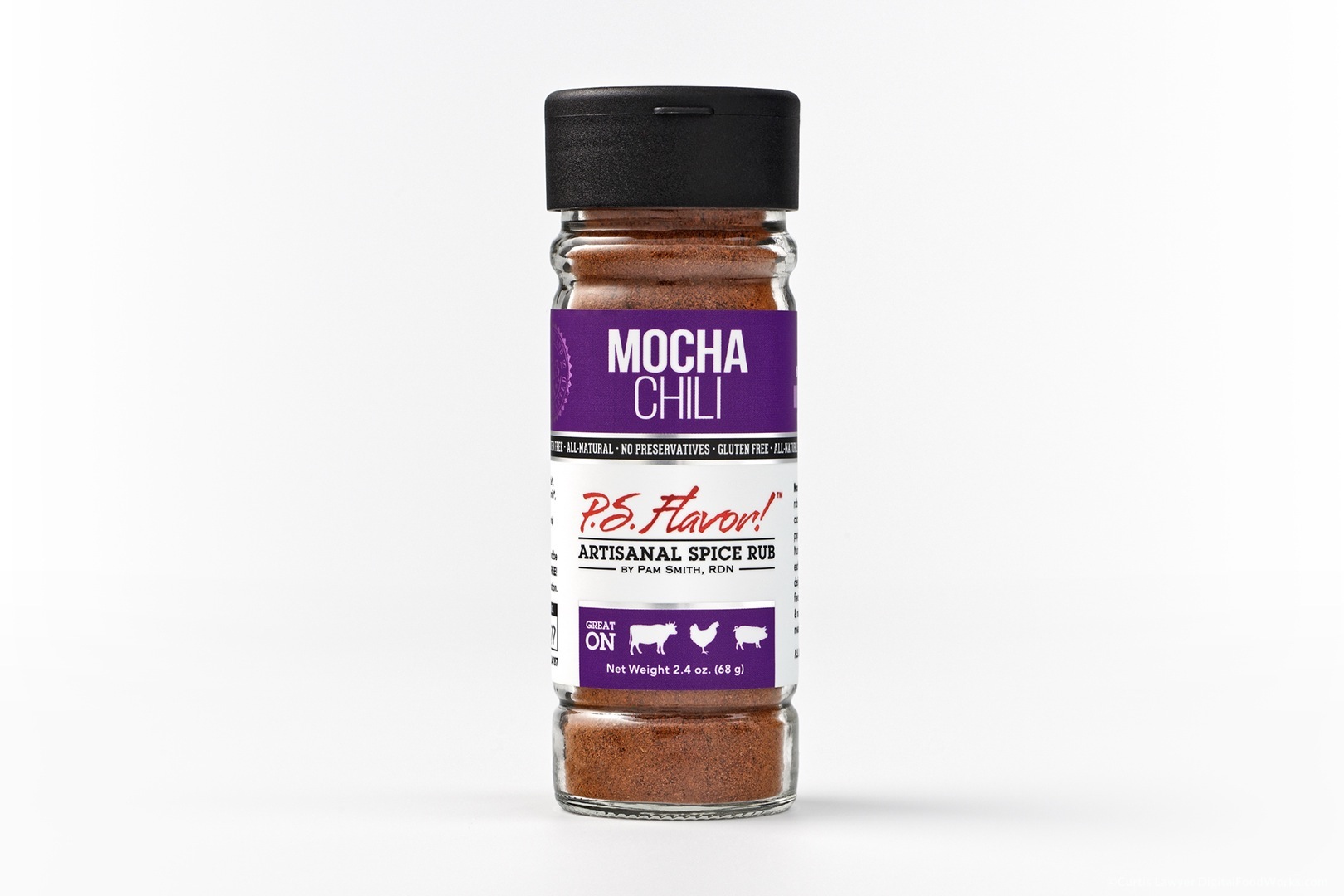
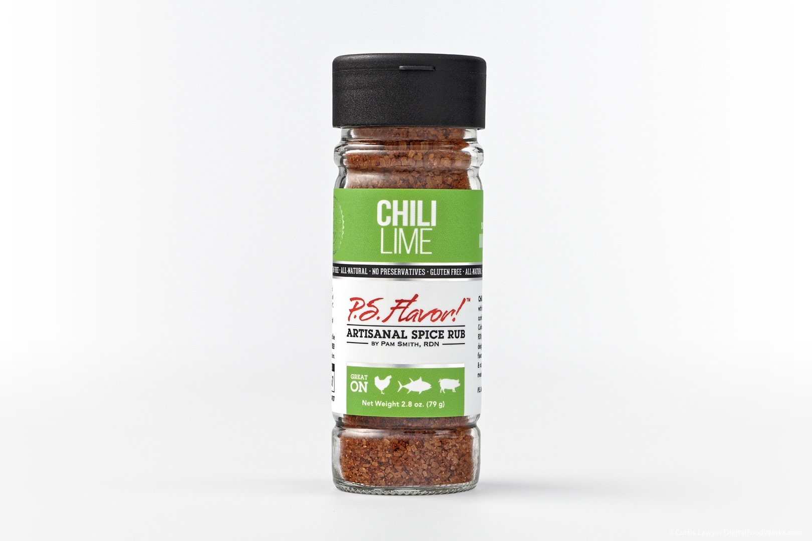
Removing the horizon line and the reflective surface made the lighting set up more repeatable (when setting the whole thing up again, months down the road), and from bottle to bottle. The really challenging element here still remains though… and that's creating a balance between being able to see the product in the glass — while also still being able to see the label, which is a highly reflective silver-backed substrate. Even though a blanket of white ink is printed over the top of the silver metallic foil label, the effect ends up being almost pearlescent.
The labels are printed on a metallic substrate with a white layer of ink over the silver. Even though the white layer is quite thick, it still reflects more light than a solid paper or plastic compound.
The label (reflective) and the glass (transparent) accept and reflect light in almost exactly opposite ways. Adjusting the light to make one look better, usually resulted in making the other surface look a little worse. I really didn't want to start doing composite shots on these, so I ended up with a "best means" lighting set up — which was more like making sure no single element created an unsightly visual issue that would draw your attention away from the label and the bottle as a single cohesive object.
A quick side-note here about those white pop up boxes that magically make all products look amazing — they don't quite work like that. While those boxes are great for some things, they do produce rather flat lighting. Perfectly acceptable for some things — but as is the case with all things photography — getting a little extra quality and character, requires a lot of extra hard work.
I truly believe that each and every product has it's own unique look and character that should be featured in the photograph. In many cases, these basic product-only photos are the first contact that most people will have with your product — and if there are multiple products in a line-up — it speaks directly to perceived brand value as well. Each product should have it's own character but there also needs to be a quality that spans the entire product line. Quick shooting an object in a pop-up light box, will make it look just like every other product that has been shot in a pop-up light box.
The surface that I selected for the spice bottles is a matte acrylic sheet in a basic horizonless sweep or lift format - where the "floor" of the surface also becomes the backing wall.
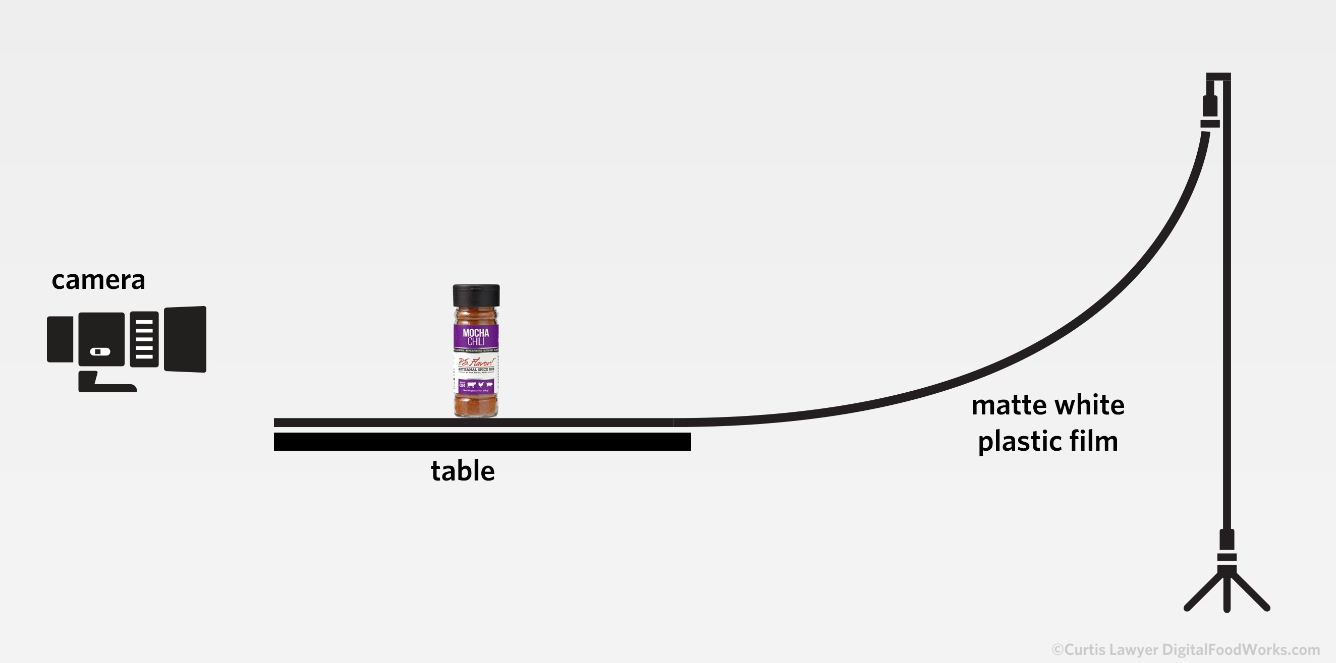
The easiest way to insure there's no hard "horizon" line in the photo is to make the "floor" and the "wall" out of the same material with a very gentle slope. You generally need the same amount of "flat" space before and after the main subject in order for the light gradation to be convincingly non existent.
I kept the lighting down to two strobes and used bounce cards and flags to control the light around the bottle. This was done for readability of the label more than anything. Direct lighting on the front of the bottle really doesn't work here because of the unique reflective surface of the label, so the smaller bounce cards allowed me control the amount and positioning of light that reaches the bottle.
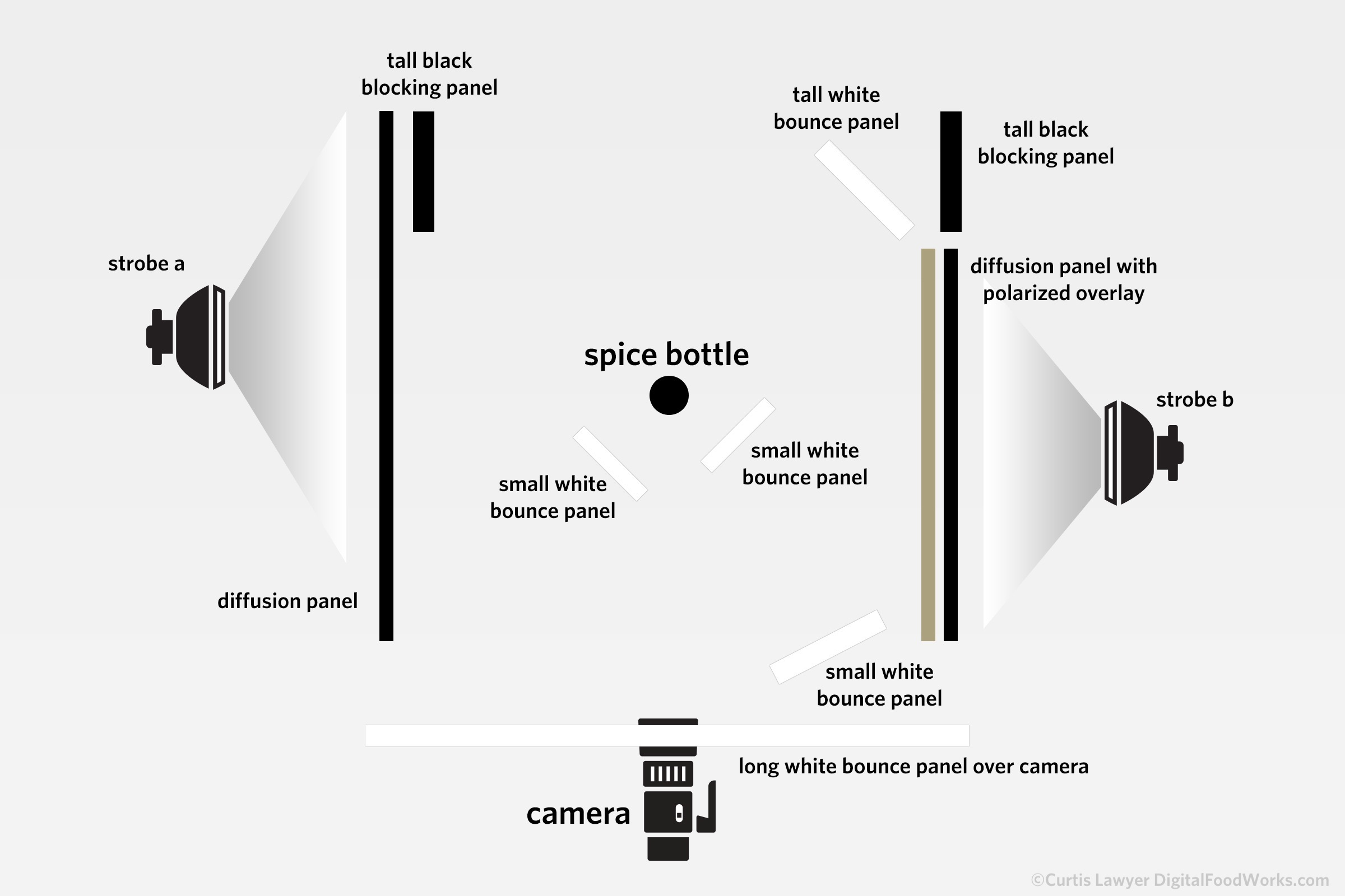
This basic light set up for the P.S. Flavor!™ spice bottles puts just the right amount of indirect lighting on the front of the bottle to let the label and spices inside the bottle be seen with a minimum of contrast and reflection issues.
The light to the right of the bottle was completely polarized (so naturally the lens was polarized as well) and this was done to more easily dial out (or in) highlights in the glass itself — providing illumination with fewer reflections.
This lighting set-up does produce perspective shadowing on the ground surface, which has to be lowered in post production a bit — and the very front of the bottle needs to be layered, exposed up about one full stop, and then gradient masked back into the main photo which balances the light levels out.
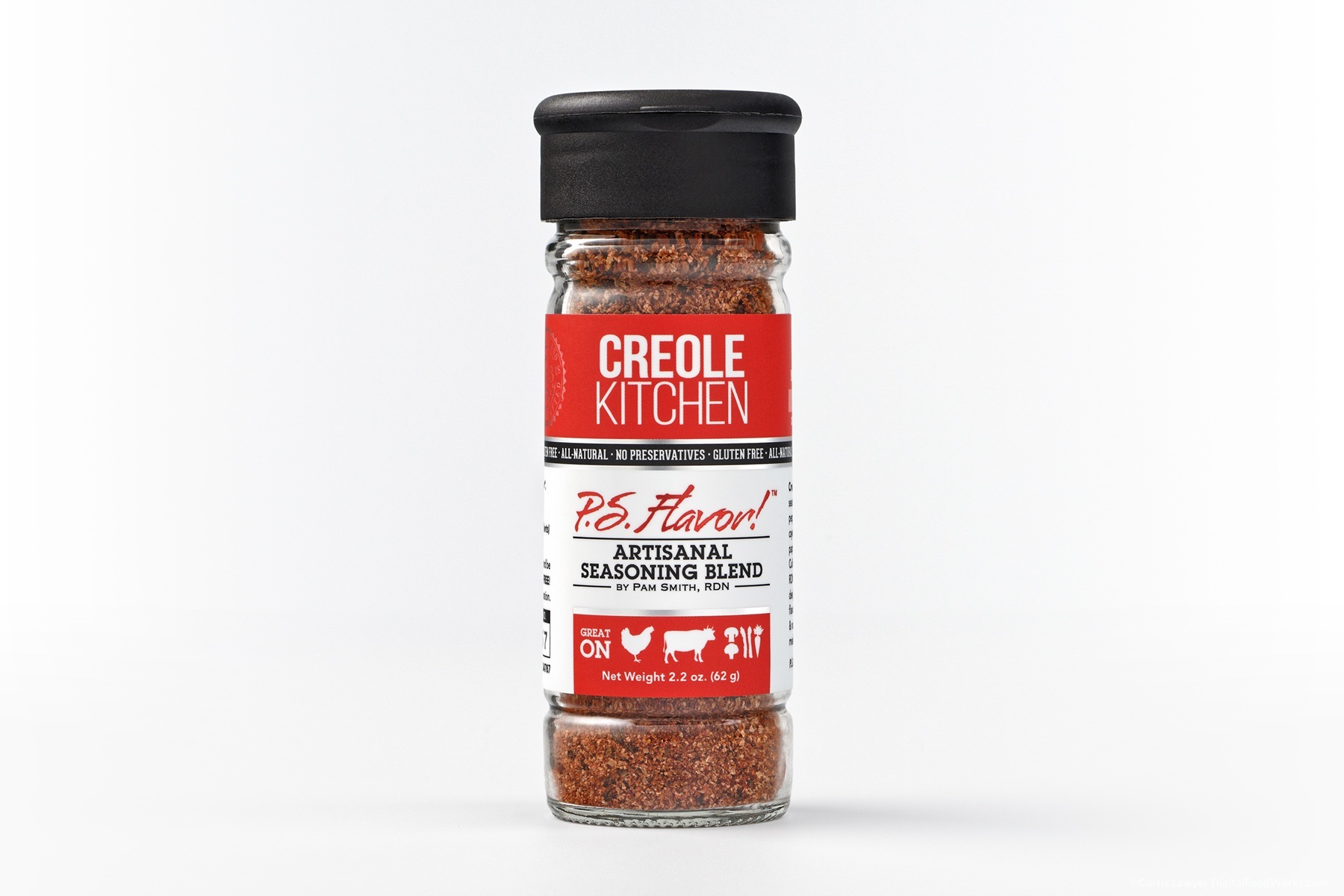
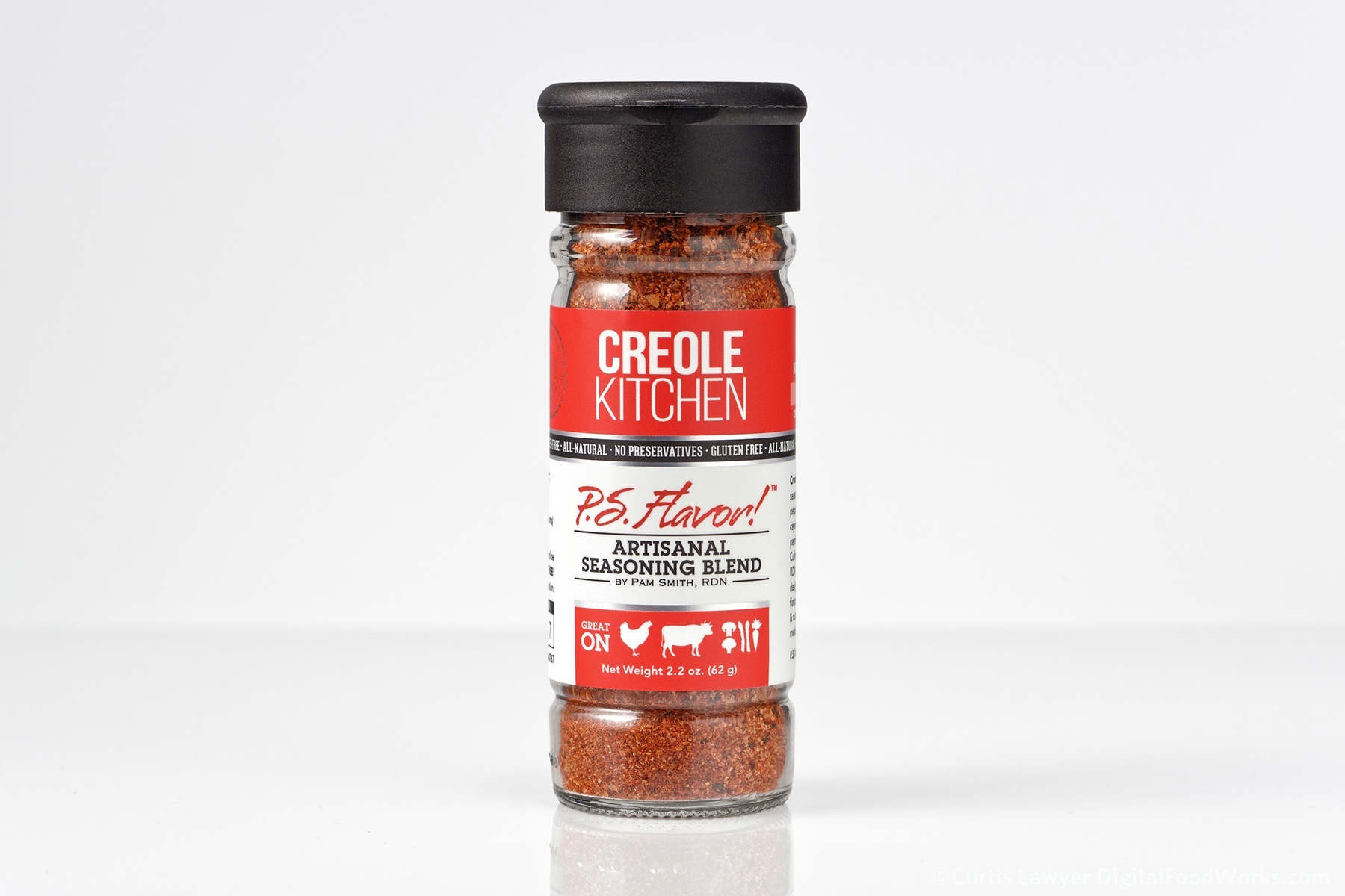
The P.S. Flavor!™ Creole Kitchen Bottle - Label design and product photographed by me (Curtis Lawyer) right here at Digital Food Works! Yay!!! And — just so grateful for the opportunity to wrap everything that I do, around such an amazing product line. Thank you team P.S. Flavor!™
There's no doubt that the original light set up was amazing and produced an image with a ton of character. The almost 2 hour set-up from scratch though - wasn't practical from a production time or budget perspective - considering there were going to be four to six new bottles each year.
The extreme highlights in the bottle are softer, but that comes at the expense of reduced contrast in the blend. That's too bad, but it was a situation where I felt like the overblown highlights in the previous setup were almost pulling your eye away from the label — which is not what we want. So this "middle ground" is a good, happy place, that works on all of the bottles, no matter how dark or light the blend inside the bottle is.
This "hard side" lighting set up created files that were much easier to isolate as well. While that's not really the focus of this article, I am also a graphic designer, and I wanted to show off just a couple of the things we're able to do when there are well photographed product photos to work with!
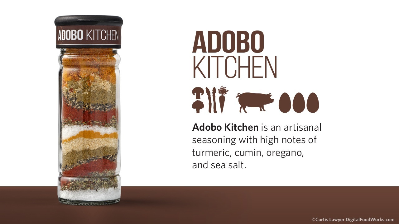
Here's a Powerpoint idea that takes a breakdown look at the spices in the bottle (shot in the same manner as the bottles with labels) along some of the information that was created for marketing purposes.
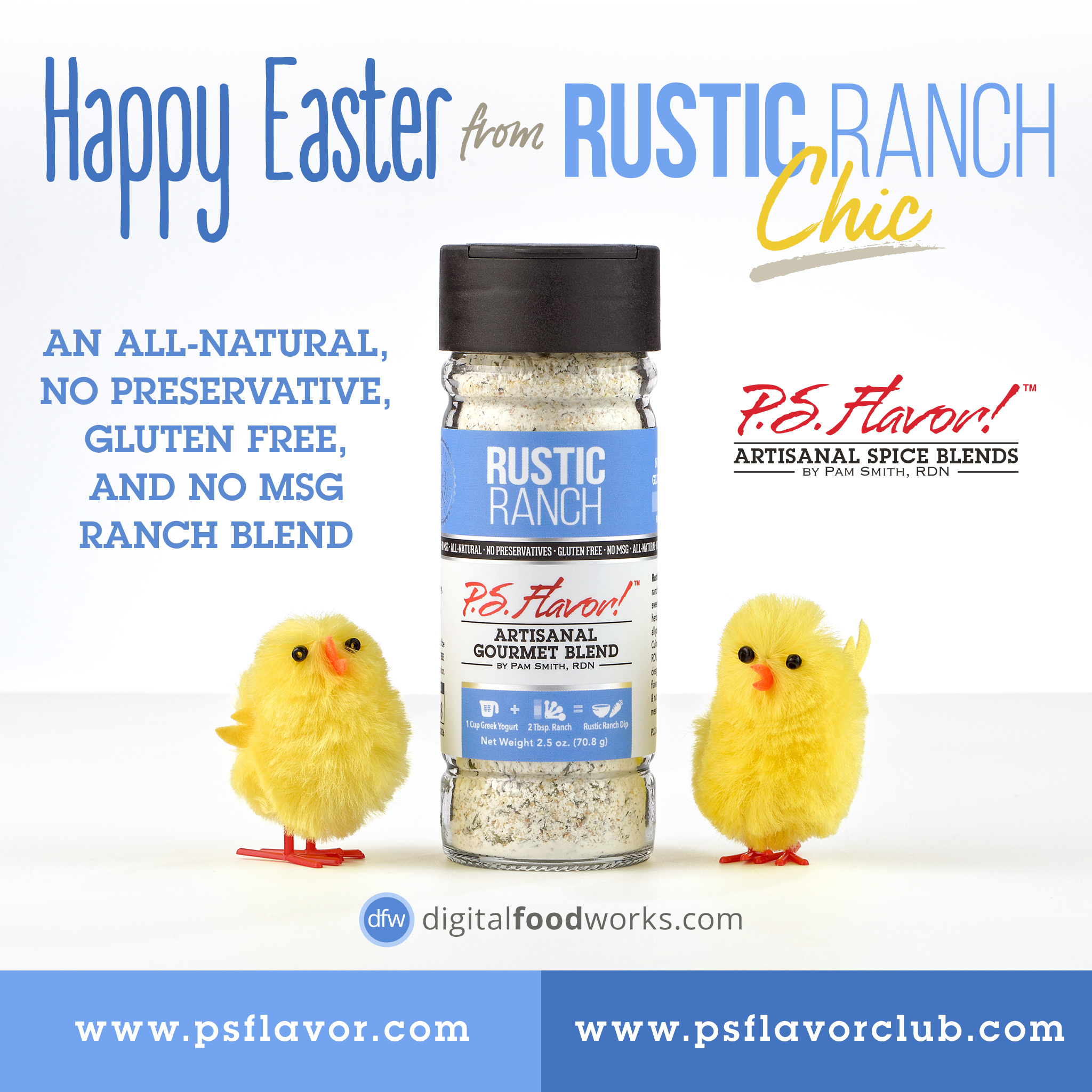
This Easter piece was a quick concept for social media that included the spice bottle image. The fake "horizon" was an easy add in Photoshop. Taking out a horizon that's burned into the image, is a little more difficult.
This first "way" of the Nine Ways project is going to span more posts than some of the others — simply because there are so many variations in the different product packages, requiring different techniques and lighting set ups. In the next article, we'll take a look at shooting the sample and refill packets — which ended up to be the most technical product container of the series.
You can read more about the P.S. Flavor!™ Spice Blends at http://psflavor.tumblr.com
Below are a couple more of the bottle shots from the series. You can see more of these and some of the other P.S. Flavor!™ branding version one and two spice bottles that were photographed as isolated product photos in my isolated product photo gallery page by clicking here.