P.S. Flavor!™ Sample & Refill Packet Product Photos
June 26, 2018Nine Ways to Sunday with PS Flavor
Continuing on with my Nine Ways with P.S. Flavor!™ project – we are still in the "Way One, Individual Product Photos" segment, but this time – we're taking a look at the "spice blend sample and refill packets".I wanted to take just one second and go back in time to take a look at the version 2 branding system on the P.S. Flavor!™ sample packets. We shot a whole series of product photos for these before starting the design process on branding version 3 – which was so much fun, and I think the P.S. Flavor!™ version 3 branding system is just amazing – but it's still fun to go back and look at what came just before these!
These little packets were always really challenging to photograph, and the new version 3 branding label added a new element to the mix – metallic paper! The same metallic backed label material that is used on the bottle labels, is also used on these packets. Just like the bottles, you really can't just light them head on because the more direct light you pour over them – the more contrast they loose because of the reflective nature of the label. It's a little like shooting directly into a mirror with a flash.

Even just a small change in flash direction and placement would cause various metallic backed elements to almost disappear, just like the "2013" stamp the colored part of the label.
It was pretty clear after a few lighting configurations that these were going to have to be composite images. That's where multiple photos are overlaid in post to form a single image. For the P.S. Flavor!™ sample packets, three photos were needed to properly expose and clearly read all the various parts of the packet.
The item and the camera have to stay in the exact same position – what changes is the amount and quality of light reaching the packets. Luckily, three strobes are enough to get the light levels where they need to be – but it's not quite as simple as turning each light source on or off. Doing that would create a new "hard shadow" issue in the pucker parts of the packet (say that three times fast).

The P.S. Flavor!™ sample and refill packet photos are actually a composite of three photos, each with different flash direction and level values.
The speed "trick" here is the use of polarizing film on the left AND right strobes. In tandem, these two lights were set at equal power and they work together as the "main light". Because these are isolated product photos, we're not really looking for dramatic shadows – but instead are trying to get even light across the surface of the packet. With a circular polarizer on the lens as well, two photos could be taken quickly — one with most of the light from the right strobe being blocked out by the polarizer, and a second shot with most of the light from the left strobe being blocked out. All that was needed was a quick turn of the polarizer on the lens.
A third "fill" type shot was taken with the polarizer set to block equal amounts of light from the left and right strobe — but this time an overhead, non-directional light was cranked up a bit more, and provided a large blanket of light pouring straight down over the top of everything.

The P.S. Flavor!™ sample and refill packet lighting setup uses three strobes, and a lot of polarizing film.
None of these photos are really usable on their own – but there are parts on each of the three display good color, contrast, and readability. The only thing left to do, was to bring all three into Photoshop, and mask in and out the good parts of each image (the topic, of a different article I'm sure).

I took the time to create a mask around the see-through plastic pouch and a second mask around the product in the packet so that opacity levels could be adjusted separately if the packet needs to be placed on something other than white or light gray.
For our purposes here (because these would be used at many different sizes), a "faux" drop shadow was needed around the packet edge. I also took some time and ran a second mask around just the product in the packet, and then dropped the opacity of the see-through plastic pouch – so the packet comp could be layered convincingly over surfaces that are not "just" white. If you can't "see through" the plastic – it would look a little "fake".
Each of the blend packets were photographed one at a time and two at a time as well. I'm not sure if the "two packet" format was ever used anywhere, but it would be a difficult effect to achieve in post because of the see-through nature of the packet.

Because the packets pucker and are never really "flat" the two-up layout would be difficult to simulate convincingly in post-production.
I also photographed category groups, the Gourmet Blends, the Kitchen Blends, and the Rubs.

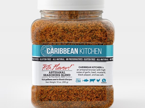
The P.S. Flavor!™ products were categorized in three groups – kitchen blends, gourmet seasonings, and rubs. I photographed the blends in those groups twice, selecting different "top" packets.
Last but not least, I grabbed three shots of the "All Nine" – this kind of layering would be very difficult to "fake" in post production.

I set up the "All Nine" group in three different set ups as well. This "deck of cards" fan is one of my favorites.
The lighting configuration for the packets isn't really difficult to set up and it is really constant from packet to packet – but that's mostly because I'm spending time in Photoshop comping the best parts of three different photos to create the final image.
In my next "way one" article, we'll take a quick look at the final product container in the series!
You can read more about the P.S. Flavor!™ Spice Blends at http://psflavor.tumblr.com
Below are a couple more of the packet shots from the series. You can see more of these and some of the other P.S. Flavor!™ branding version three container types in my isolated product photo gallery page by clicking here.

