Camera Height and Angle Adjustments
October 29, 2018Product Photography
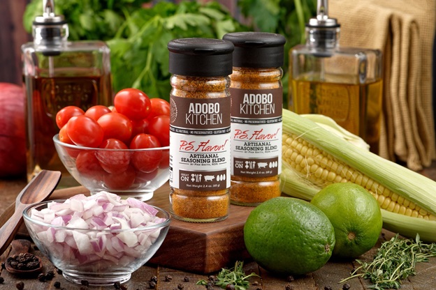 In my most recent set of three Instagram photos I featured the P.S. Flavor!™ spice bottles using one of my favorite formats, the "shoebox diorama" setup.
Because the camera's sensor is only about 4 times as high as the product bottle itself, tiny height and angle adjustments of the camera make a big impact on what might appear to be the same scene.
While most of the photos in the P.S. Flavor!™ series were shot straight on (at the product's solar plexus area), I changed things up a bit with this Adobo Kitchen photo and positioned the camera just above the top of the bottles and angled the camera down slightly.

Reach right in and grab a bottle! Shooting from slightly above the
product and pointing the camera down slightly emulates what a consumer
might see when walking up to the product on a counter.
This angle is a little more natural to what most of us would normally see when walking up to a counter, and helps to make the product more approachable — as if you could just reach out and grab one of those bottles in the photo.
For the bold new Porcini Pepper blend, I positioned the camera slightly below the middle of the product and set the spice bottle itself a little higher in the scene.
Shooting slightly below the product (or food item) really gives it the "hero complex", as if we're all (literally) looking up to it — it's big and bold — front and center — and lends to the perception that the product can be the main attraction of any dish you add it to. (This camera level and angle really works well for burgers and tall sandwiches too!)
The final photo in the series of three is shot straight on and in the middle of the bottle. Most of this collection of photos for the P.S. Flavor!™ bottles have been taken at this angle and camera height, which is kind of an "equalizing" level — it suggests that the spice product is as important to the — recipe as all of the other natural ingredients are.

Unified elements. Setting the camera height right in the middle of the product height blends all of the elements in the photo together. In our case for this photo of the ingredients for a Chili Lime Ketchup... we're saying that the spice blend bottle, is eqully as important to making the ketchup, as all the other ingrediets are.
Like with most things, there's no blueprint or magic bullet to creating the perfect photo for conveying a message — but instead, it's a lot of little decisions about things like light, camera height, depth of field control, and product placement that all add up to suggest a certain feeling when looking at the photo.
If you would like to find out more about the products featured here, please visit the P.S. Flavor!™ Spice Blends site at http://psflavor.tumblr.com

