Pause, Rewind, Remove and Change
August 4, 2017Nine Ways to Sunday with PS Flavor
JUMP TO THE PHOTO GALLERY
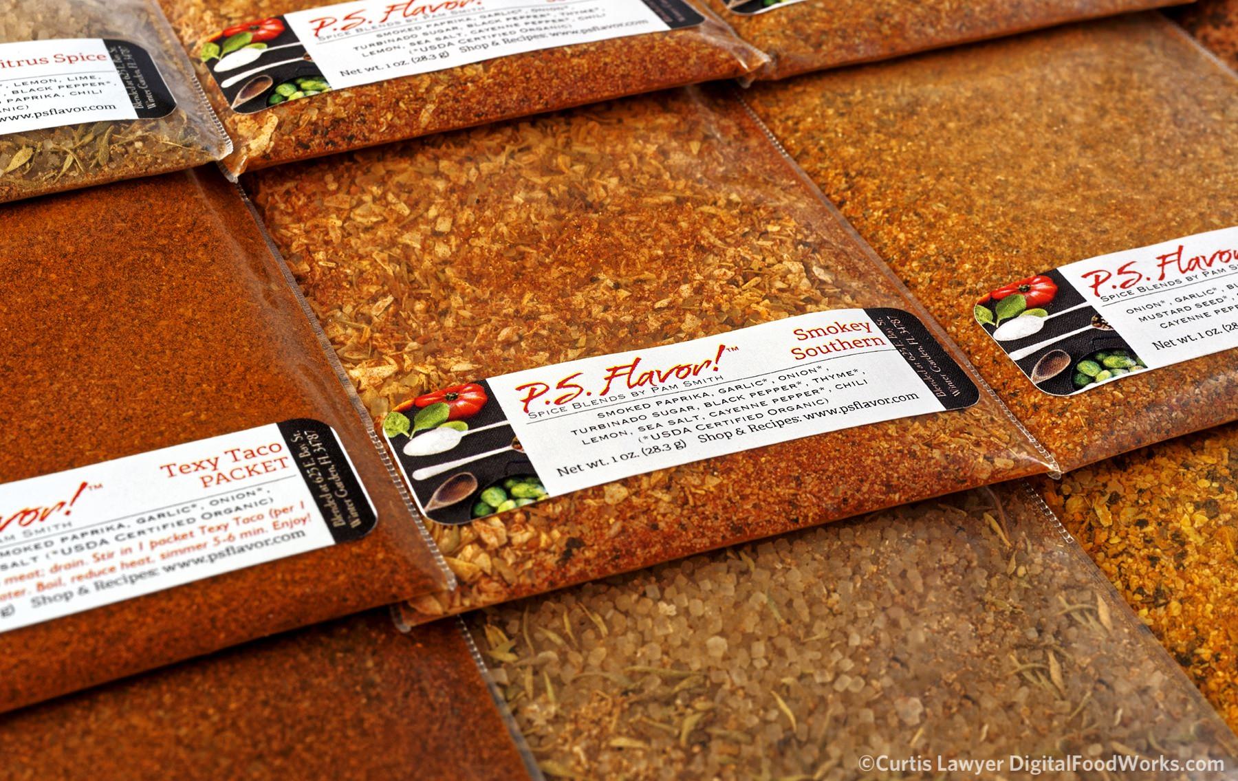
Soooo many packets!
As fate would have it though, team P.S. Flavor was starting to see some of the same consistency issues that I was observing in the bottle quality, along with a new label "bubble, crease and peel" dilemma. This happens sometimes when the quality of OEM products change (like labels and glass jars). All of a sudden, what had been working, doesn't seem to be working quite the same.
Not many people think about this part of manufacturing, but it's a major concern for anyone that makes a consumable product for a living. In P.S. Flavor's case... they make the most amazing spice blends... that are incredibly good for you, with no preservatives, gluten, or fat. What they don't make… is glass bottles and labels.
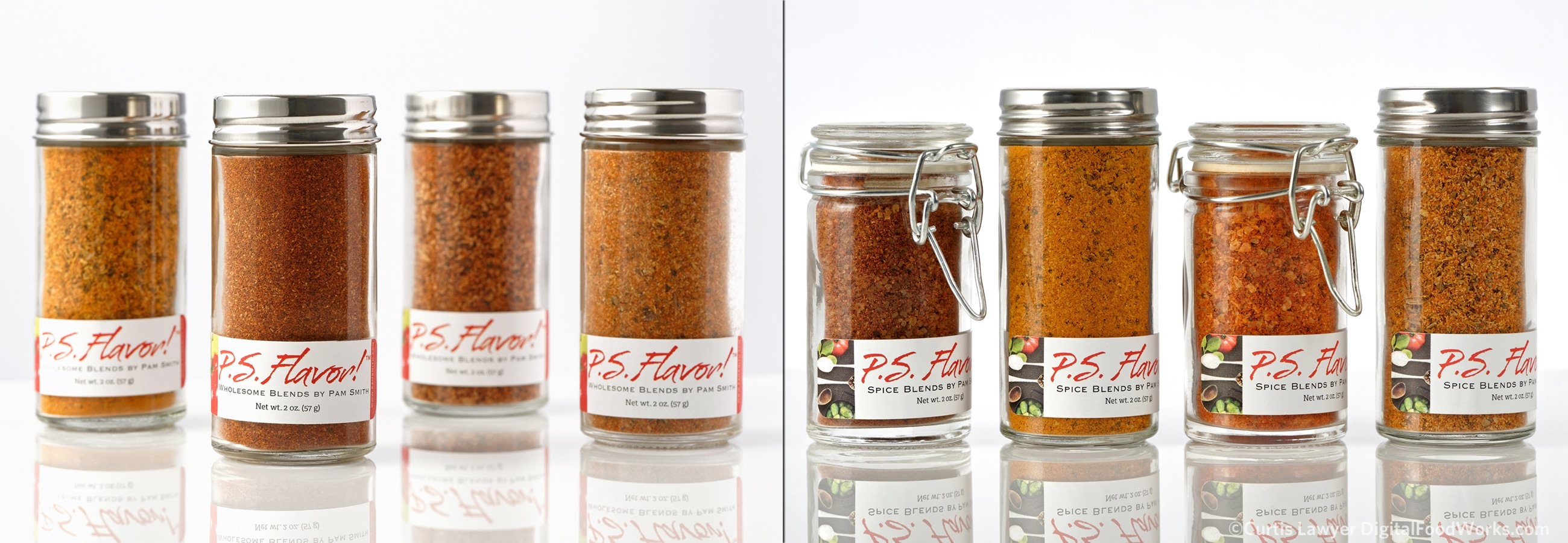
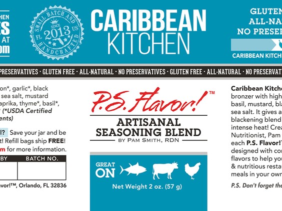
Consumer experience with the packaging is a very important part of marketing a consumable product. What's inside the bottle can be the most amazing thing in the world, but if labels are peeling or the glass itself is noticeably imperfect... consumers might not even pick up the spice bottle. (Pictured here, Branding Version 1 on the left and Branding Version 2 on the right.)
It's totally out of one's control and changing to a new system… a system that makes the product's experience better for the consumer… is a brave (and almost always) expensive undertaking.
P.S. Flavor has decided to do just that though… because they care very much about everyone that uses their products. New, uniform bottles and lids are in the testing phase now. Along with a new bottle shape, comes new label dimensions… (and this is where I come back into the story)… a whole new look for P.S. Flavor!
I could not be happier to report that I've been given the opportunity to redesign the label system for the new jars, and (eventually) packets and pails too! That does mean however, my Nine Ways – with P.S. Flavor! project… will be rolled back… and I'll have to start over from the beginning.
P.S. Flavor!™ is getting a new look! That also means my "Nine Ways with P.S. Flavor" photography series will have to be put on hold. Designing the new branding and labeling system must come first!
The design task at hand it a bit more challenging than it might seem though. The Epcot Food and Wine Festival is a large showcase period for the P.S. Flavor! Spices… and the labels are needed sooner... than right now!
Branding the rest of the P.S. Flavor! look (for collateral and marketing purposes) will be based on what we're doing for the label. It's a little "cart before the horse"… but it's not the first time I've worked this way.
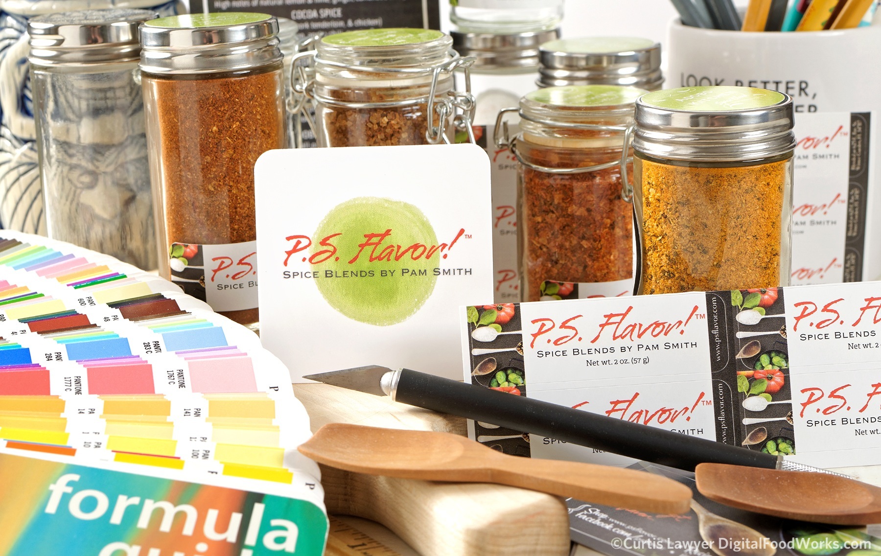
The challenge of course, is that while the label is somewhat small, and has technical requirements and limitations… the important design elements that are used here… must translate well to larger pieces down the road. Core design values and element have to be carefully considered, and a rule-base for things like the font system, colors, tag lines, icons and overall structure, needs to be carefully recorded. This is all to make sure what comes later, matches what's needed now!
Oooooo... the spice bottles on a dark background are so beautiful! But... does that mean the label should be black? It would contrast and be bold... but could something like that be a sustainable element that translates from the bottle label to a rack card and then onto the website and beyond? Those are questions that have to be answered now, all at once... while we're designing the P.S. Flavor Branding Version 3.0 material.
I love working with team P.S. Flavor and could not be more excited about this new opportunity and getting to be a deeper part of the P.S. Flavor story.
P.S. Flavor! is at a point where the future is wide open and everything is possible for this delicious and versatile set of spice blends (and more)… and (even though I realize I'm about to reference myself in the third-person)... I can't wait to see how amazing the new label system and eventual re-branding version 3.0 looks!
Fortunately, I won't have to wait long… the Epcot Food and Wine Festival is less than a month away… and that's our current dateline for debuting the new bottle label system!