Two Tiny Steps Back, One Giant Leap Forward
July 14, 2017Nine Ways to Sunday with PS Flavor
JUMP TO THE PHOTO GALLERY
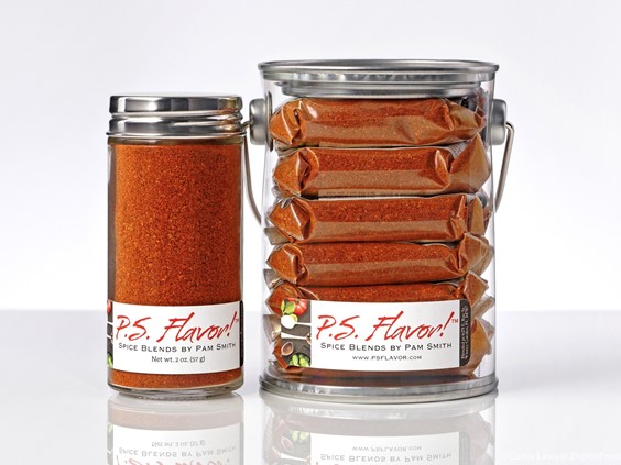
Way One of Nine Ways to Sunday (Part W, Segment One) — Just to recap... my previous start on shooting the P.S. Flavor! Spice Blend product photos had been slightly delayed by a branding change on all of the P.S. Flavor! labels. The "version one" bottles had been photographed and were looking great when word came that some new "v2" bottles, packets and pails were in the works.
That's not an optical illusion, my camera is leveled with the
surface. The new bottles don't exactly stand
up straight! This little guy is impersonating the "Leaning Tower of
Cocoa" with front-facing left lean of around 2 degrees. (Unedited SOOC/crop-only)
The new bottles are going to look great with natural media around them, such as they would on your kitchen counter… but the "white gloss" look that we started with… is going to show every little imperfection in the glass. The new glass was so rustic and charming, a slight change in the way the bottles were being illuminated and positioned was needed.

Naturally, the lean has to be corrected for in editing (as much as possible) which is a bit
trickier than it might seem. The bottle needed to be re-slanted, while
leaving the horizon untouched. Hopefully, this "lean" won't be
noticeable with a little more staging around the bottle.

The "gray cloud" of diffuse reflective light on the top and bottom of the laydown shot is difficult to mitigate with polarization because of the irregularities in the surface of the glass. (Unedited SOOC/crop-only)
So, I decided to go with a two-bottle approach, and show the top of the bottle along with a three-quarters view of the bottle. That way, the spices and the top label are clearly visible, in the same photo.

A new "version two" bottle staging set up was needed so that the top and front of the bottle could be seen at the same time, without showing any of the diffuse reflective light that the old 3/4 laydown shots were now exhibiting.
Another change that was necessary is the addition of a totally new light panel (a 45 degree overhead 4x4) bringing the total amount of power needed for these shots to just over 1,000 watts. This was pretty much for the same reason, we're not just lighting the bottles here… we need to see what's inside the bottles. In order to eliminate the refraction cloud that was showing up in the glass, I basically had to split "key" light duties between two sources.
A final change was more for marketing purposes than anything. Where I had been doing "bottles of the same shape" type of shots (for editorial support), I'm now focusing more on the "Perfect for…" groups.
The P.S. Flavor! Spice Blends are not just sold individually, but in "Perfect for…" groups as well (i.e. Perfect for Grilling, Perfect on Veggies, etc.). So rather than shooting art-based editorial photos, the groupings now follow the "Perfect for…" product categories.
The group that I love the most is the "All Eight P.S. Flavor! Spice Blends" group. I mean just look at all of those gorgeous spices…
… how can you not want a collection of these beauties in your very own kitchen? The good news is… you totally can have them in your own kitchen! This isn't just an art project… the amazing P.S. Flavor! Spice Blends are available for purchase in the P.S. Flavor! Spice Blend store! Click Here to visit their site!
I had a great time re-shooting the product and problem solving some minor issues with the bottles. That begin said… I'm even more excited to get going on the pails and packets that are now also part of the project. Even though we're still on white, there are sure to be new challenges and triumphs in store, and it's always more fun when the end-result is a brand new photo of that product that has never been seen before!
Stay tuned for Packets and Pails!!!
Even though it was not longer required... I still shot the same bottle types as a group... because... I think they look cool. This is the shaker group.
Each of the version two bottles was photographed in four different positions, this is the "head on" front shot. (Chili Lime Rub)
The "top and quarter turn" photo replaces the old "laydown" shot. The rustic nature of the glass is now kicking up too many reflections when you view it from any angle other than straight-on.
The "top" bottle (which is actually laying down) fit tight and close to the bottle standing up... but because of the clasp, the bottle top had to be about 3/4 of an inch in front of the other bottle. That caused the front label and spices to be a bit blurry. The solution was moving the bottle top further away and back to the "top" was the same distance to the camera as the front label.
Here's the Perfect for Grilling group. "Grilling" is a focus theme for the P.S. Flavor Spice Blends during 2017.


