Light Position and Caprese Toast
March 10, 2020Food Photography
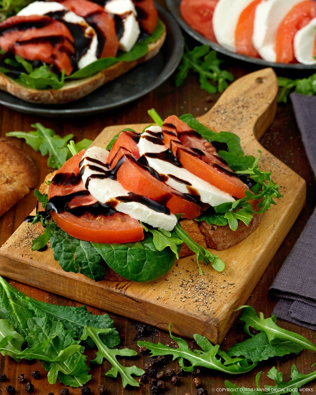
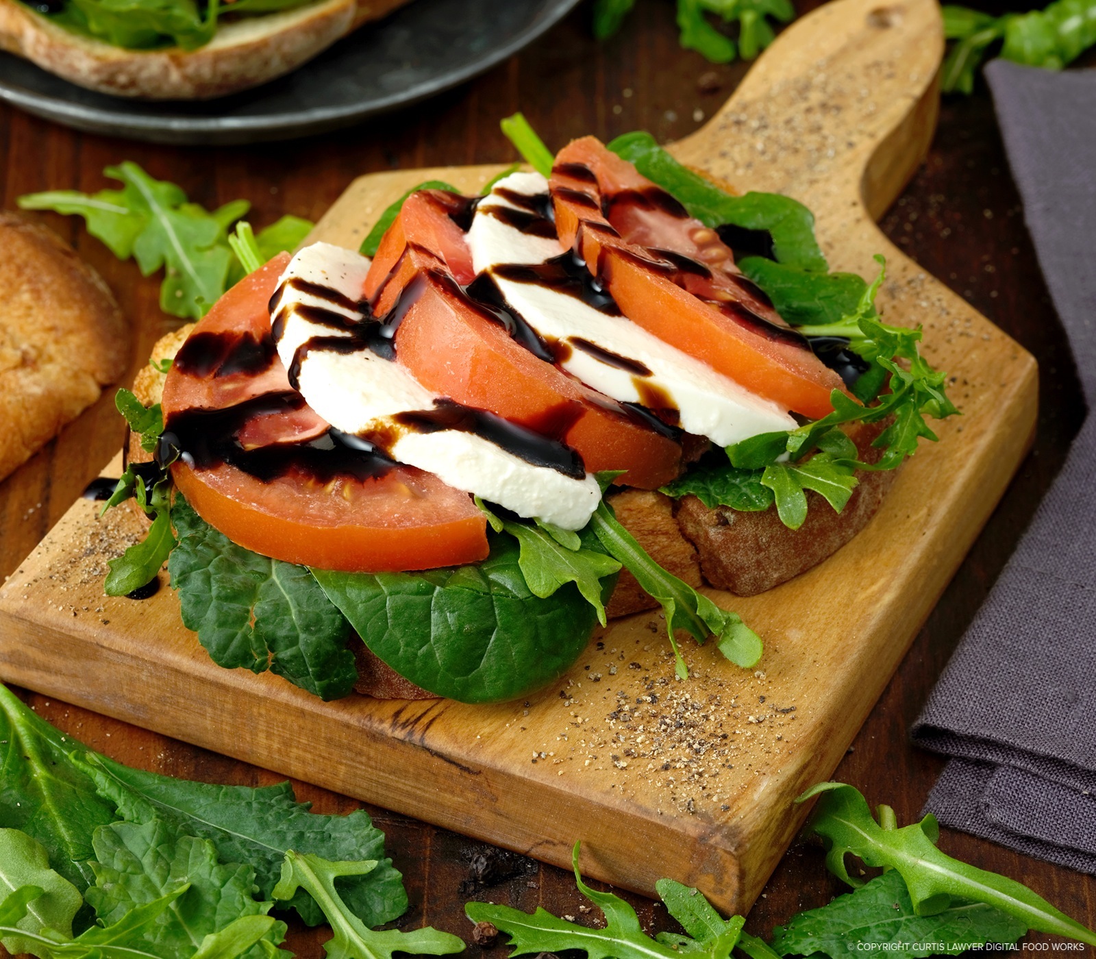
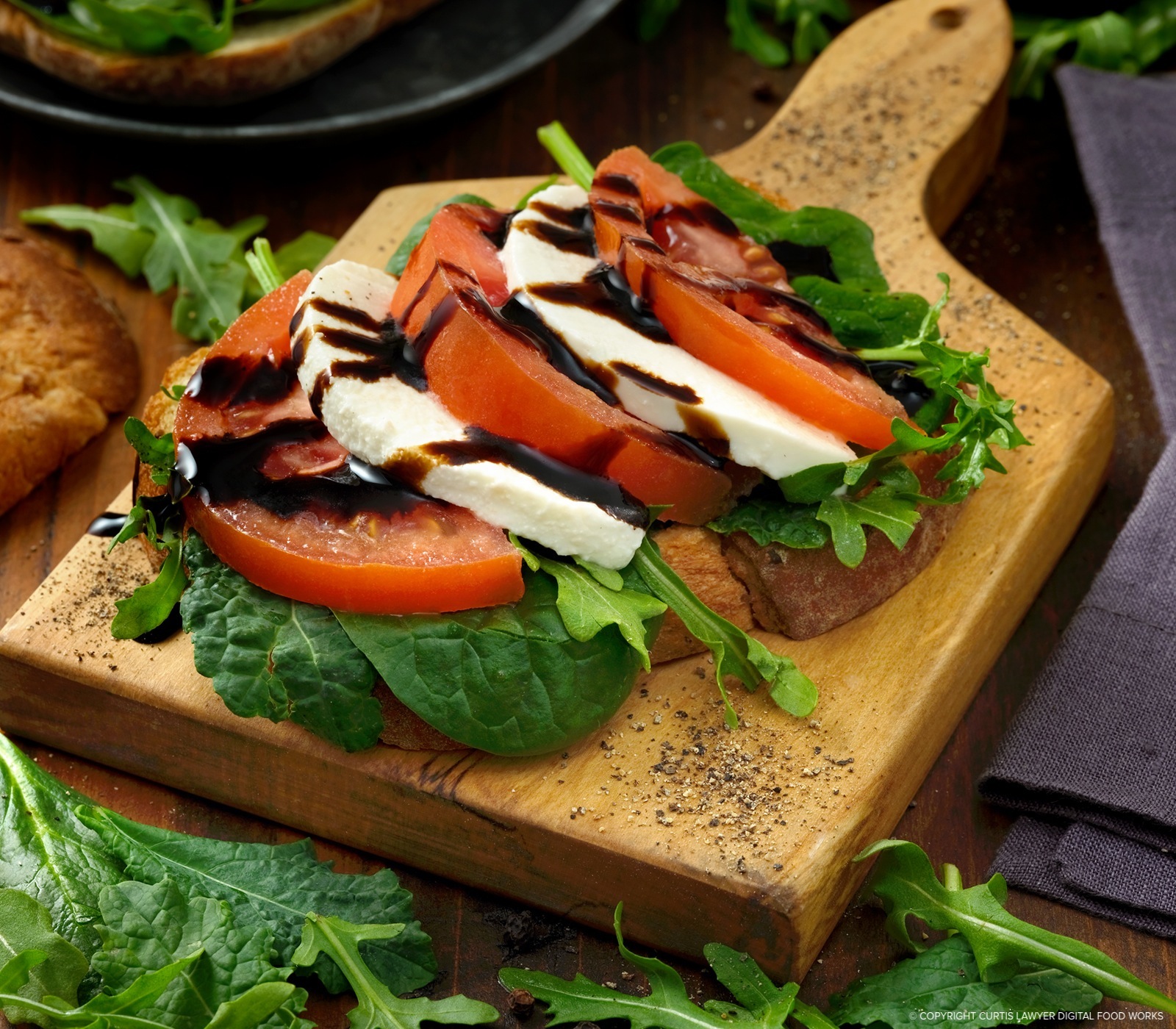
The Main Light for the selected "hero" photo is positioned directly to the side of the caprese toast.
If I'm not trying to specifically shoot in one style or another, my photos tend to fall into the "Chamber of Commerce" category… sharp, clear, well balanced, nice color, etc. — maybe not so much on the "artsy" side.
It's interesting to note — that I think any of these four light placement samples could work. I sometimes have to edit photos where I don't have the luxury of getting to change any of the lighting — and strictly as a photo editor, I'd be happy starting off with any of these.
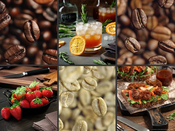
So the subject is pretty straight forward… the subject is a Caprese Toast… with mozzarella, tomatoes, baby spinach, arugula, and some aged balsamic. The whole scene is pictured above, it's a 4:5 which fits Instagram's tall photo profile.
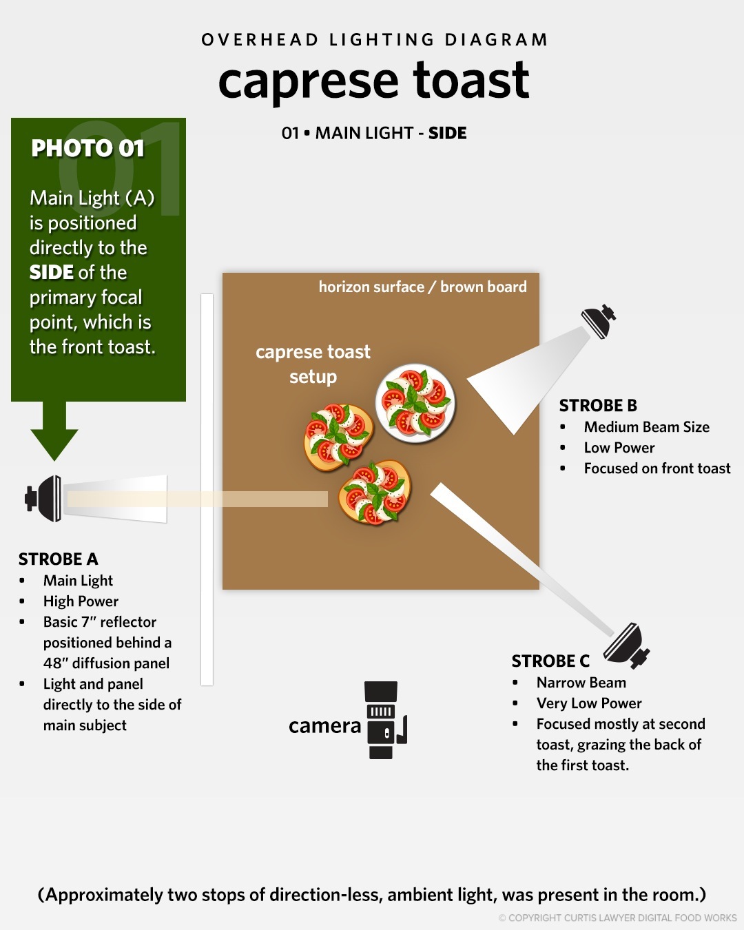
The Main Light is positioned directly to the left hand side of the main subject (caprese toast) and has a 48" square diffusion panel in front of it. In all cases, the light is always pointing at a 90° angle to the camera.
Most of the light however, was coming from a flash on the left side of the food… because it was the brightest source of light, I'm calling it the Main Light, or Strobe A. This is the light I'll move around to see how it effects the photo. Two additional flashes were set up on the right side of the food, both at very low power compared to the main flash. These were set up for the purpose of adding some accent, edge, and fill lighting to various parts of the photo.
The camera, the subject, and those accent lights were not moved between the photos — only the Main Flash was moved. The aged balsamic — has a mind of it's own, and it did ooze and move a little bit between shots. The four positions were… (1) directly beside the Caprese Toast, (2) two feet in front of the toast, (3) two feet behind the toast, and (4) four feet behind the toast.
Since I selected Photo 01 as the "hero" shot, I'll compare the other light positions to Photo 01. Here's a look at a diagram that show the difference between Photo 01 and Photo 02.
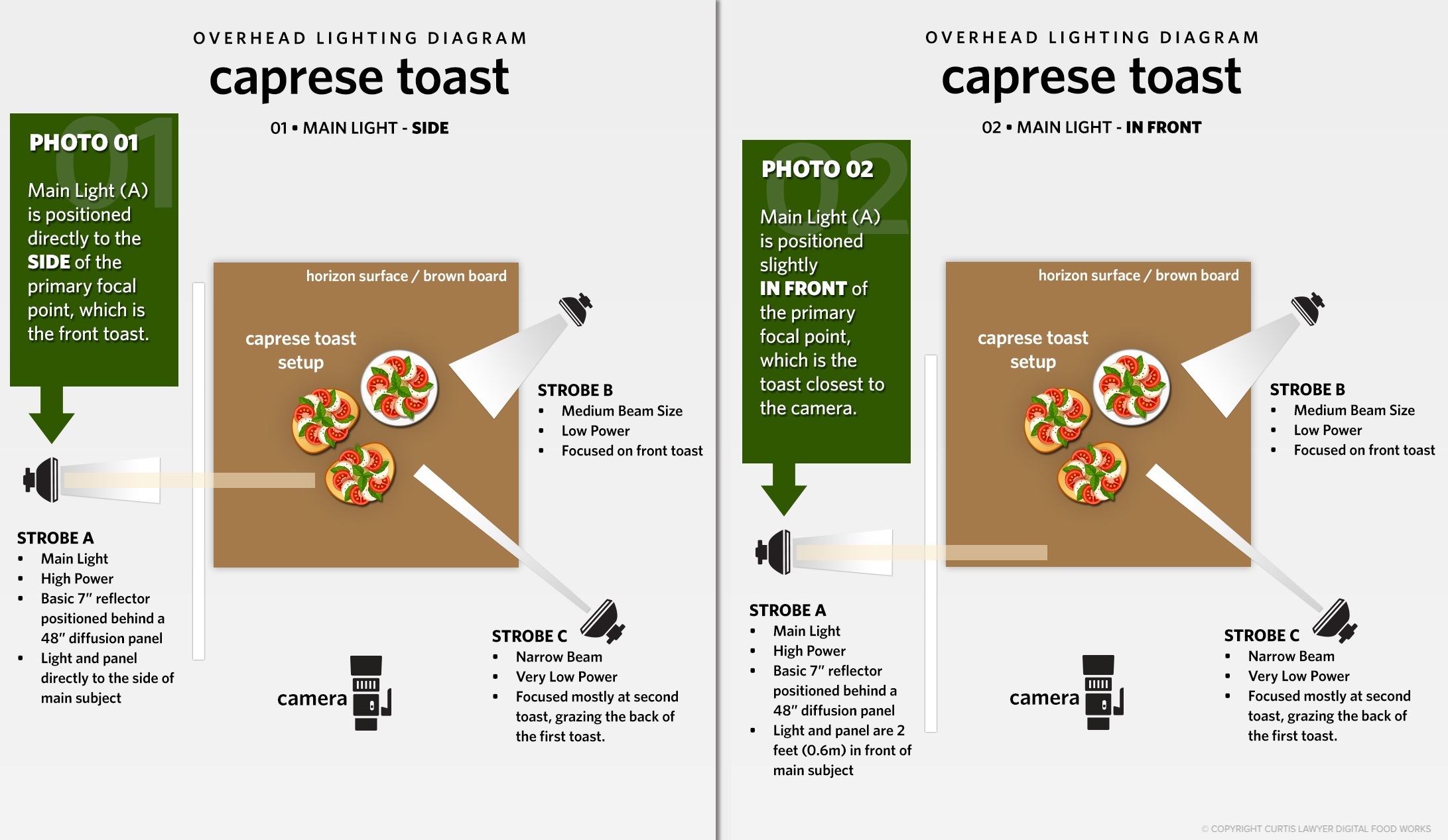
In Photo 01 (the selected hero photo), the main light is directly to the
side of the toast. In Photo 02, the main light is pulled forward about 2
feet (0.6m) in front of the toast.
In my "hero" shot, the Main Light was directly to the side of the toast, but in Photo 02 the light was moved 2 feet in front of the toast — but still pointing at a 90° angle (or straight across the scene). Because most of the interesting stuff happens around the main focus point, I'll just show the bottom half of the photo for comparison.
 01 HERO - LIGHT TO THE SIDE
 02 - LIGHT 2 FEET IN FRONT OF TOAST
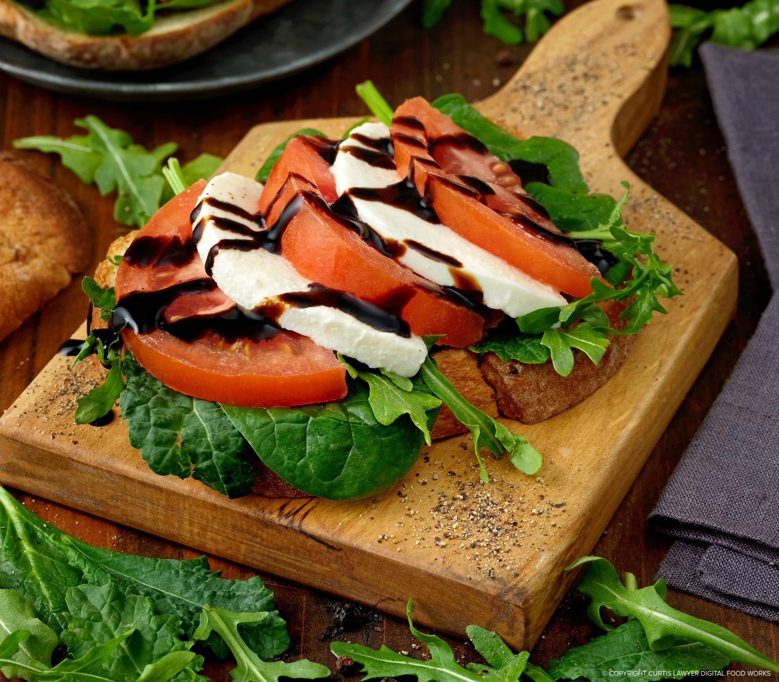
At first glance, the photos are about the same. The real difference though can be seen in the leading edge of the mozzarella and in the baby spinach and arugula leaves toward the bottom of the photo. Because the light was moved two feet in front of the subject, (and in order to keep the general levels the same), the leading edge of the mozzarella has been overexposed in Photo 02, where in Photo 01, there's still a little texture visible. The reflection of the main light is also brighter in the balsamic, for this same reason. The biggest difference though can be seen in the spinach and arugula. When the light is directly on the side, the shadows and highlights of the veins in the leaves make the texture appear to stand out more. In Photo 02, because the light is very nearly reaching the food at the same angle as the camera's lens… the leaves look flatter, and not as textured.
Let's take a look at what happens when the light is moved 2 feet behind the subject. Here's the difference between Photos 01 and 03.
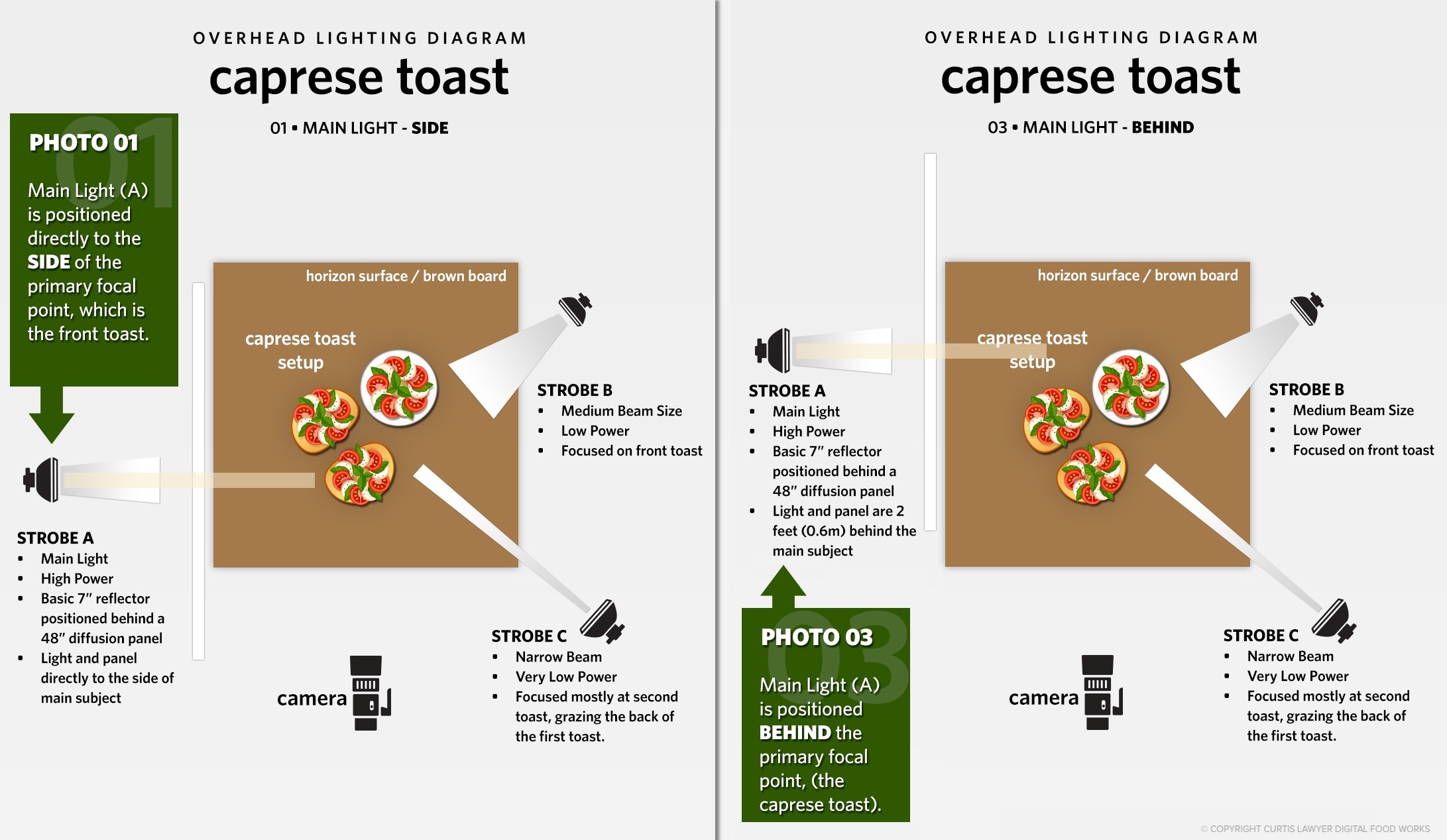
In Photo 03 (setup seen above right), the main light is pulled backwards about 2
feet (0.6m) BEHIND the toast.
Even though the light is now 2 feet behind the main subject, it's still pointing at a 90° angle (or straight across the scene) — and there's enough spill over and general bounce around the room to illuminate the toast.
01 HERO - LIGHT TO THE SIDE
 03 - LIGHT 2 FEET BEHIND TOAST
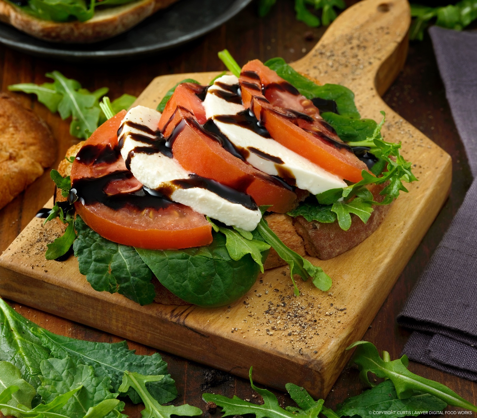
In Photo 03, we're starting to bring back some of the texture in the leading edge of the mozzarella, but the toast is starting to cast a shadow on itself — leaving the front of the toast a little darker than with Photo 01 (check out that baby spinach leaf under the first tomato, it gets really dark in Photo 03). There's also a slightly brighter spot near the serving board handle (compared to the front of the board), because it's not being shaded by anything. This is a lighting position I have used many times before though. If I would have kept developing Photo 03, I would have added a little more light to the front of the toast, because you want the main subject to stand out, and not be in it's own shadow (especially if there's a product label involved, and not just food). But that would have meant setting up another light… and that's not what this little experiment is about.
Finally, in Photo 04, I moved the light another 2 feet behind the subject (but still at a 90° angle). This would put the main light 4 feet behind where the main light is in Photo 01.
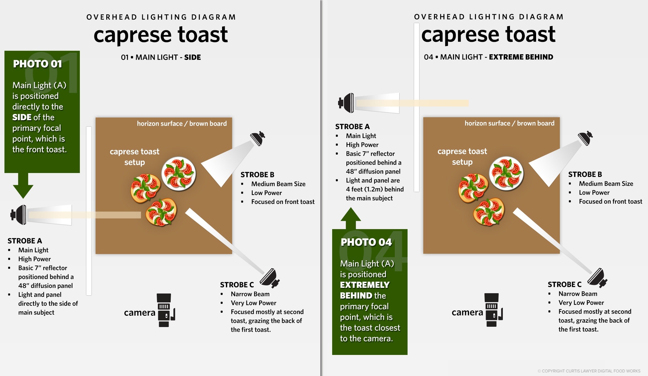
In Photo 04 (setup seen above right), the main light is pulled backwards about 4
feet (1.2m) BEHIND the toast.
This is also a main light position that I have used in the past, because it creates some great long shadows. While bright and dull spots seem to even out… it's clear that when looking at the very front of the serving board — there's not really a whole lot of light reaching the front-side of the toast. The board is darker in that area, because it's completely in it's own shadow, with the main light being so far behind it. We're also starting to get some different looking reflections in the balsamic — and that's simply because the light is 4 feet away. Finally, in looking at the area just under the back plate (the second toast in the photo), the long shadows are making the surface and part of the first toast and serving board darker, because they are casting shadows forward, onto the main subject.
01 HERO - LIGHT TO THE SIDE
 04 - LIGHT 4 FEET BEHIND TOAST
As I mentioned at the top of the article, there really isn't a wrong or right here, it just depends on the overall mood and what you're trying to convey in a photo. Usually, there is no "best" option either. As you can see with these photos, adjusting something as simple as a light, a few feet in one direction or another — can make one part of the photo look great, and then another area less great — and then visa versa.
I usually try and find the best balance between everything — don't over or under expose anything too much, make sure there's contrast and some depth and texture — so that you feel like you can reach right in and grab the food. I think all four of these could fit that description — but Photo 01 (with the main light directly to the side of the toast) just seemed to have the best balance, tonality, and texture, between the four different lighting positions.