The Instagram Five by Three Experiment
February 11, 2019Social Media
Today... I posted the final photo in my 5x3 experiment on Instagram. It's an overhead shot of the Chocolate Brownie Bites that were used in the previous Chocolate Martini photo.I wanted to take a quick look back at the group as a whole, and maybe see how they would have looked if I had followed a more common 1x3 pattern.
Up to this point, I had been posting in groups of three, where each photo in a series of three images were in the same category or theme style. I basically wanted to discover what switching that up would look like... and so I started posting 5 different theme styles in sequential order... times 3 photos in each theme — bringing everything to an even 15 photos (so as not to disturb the 3 across pattern that I had been using prior to this experiment).
Evenly spaced through the rest of this article, are the five different image themes, and the three images that belong to each group.
No "absolute positive proof" kind of data can really be collected from this one tiny experiment. I didn't really follow any kind of set schedule for posting, and really, every photo is different — so the number of likes and followers each photo may have earned could be dependent on any number of variables. Only after many more tests, could any real conclusions be made.

Theme 001 — "Things in a Small Black Dish". These are high contrast,
moderately tight macro shots. From left to right; (a) Star Anise, (b) Asian Pigeonwing Tea, (c) Matcha Tea Powder.
I did however, come away with some "gut feeling" thoughts and ideas.
First — I was really hoping to see more of a pattern in the grid. My gut feeling is, I could have posted 15 random photos rather than staying with the five different themes in order (times three) … and I would have ended up with similar results. So the 5x3 doesn't end up being a "style" of it's own — but more of a "cleanse" — a break from what I was doing before — and a transition into what's coming up next.

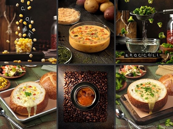
Theme 002 — "Soup". From left to right; (a) Turkey Chili, (b) Corn Chowder (c) Butternut Squash Bisque.
Second — Wide photos (3:2) don't do as well as tall photos (4:5) or traditional square photos (1:1). There's not much to write about with this one, it's just a hunch. I'm guessing that because the photo is less tall, it's easier just to swipe by it in the stream view... to the point where it might not even be seen at all if one gets swiping too fast. :)
Finally — I feel like I started to break one of my own "rules" with regard to what I believe a social media "channel" like this should be — and "channel" is a really good word as it relates to television. Why would someone watch my channel? Where's the content?

Theme
003 — "Small Autumn Gourds". From left to right; (a) Orange Star Gourd,
(b) White Snow Pumpkin, (c) Green Yellow Gourd with Tall Stem.
It was really easy for me to get caught up in the process of sticking to the five themes — so much so, that I thought the 5x3 idea was the "show", but it's not — it's just a schedule.
Prior to this, when I was doing the 1x3 pattern, I would do a little write-up for each photo that would have something to do with photography or lighting — some interesting thing about design... or maybe even a little fact about the herb or whatever the subject of the photo was. I feel like the 5x3 pattern drew me away from that — a little bit — especially when looking at the channel from the "grid" view.
To me, looking at the DFW Instagram "grid" now — I'm not really sure what the "DFW Instagram Channel" is about. It's not a single style or topic or theme, it's just random(ish) photos with a pleasing aesthetic value.

Theme
004 — "Drinks". From left to right; (a) Modern Mulled Mai Chai Wine,
(b) Classic Sidecar Fizz with Egg White Foam, (c) Chocolate Martini.
I didn't really have any "goal" as far as getting more followers goes with this experiment... it really was just to see what it would look like. Instagram can be such a fun platform … and I'm really surprised and just — honored — that people are continuing to "like" and follow my tiny little channel, looking at the photos and reading the captions, and even reaching out to send words of encouragement or to ask a question about something I've written — you all are the best!!!
What's next? Well I have a few "housekeeping" photos I wanted to post… a craft project photo and some product box designs that I want to share — but they don't really fit into any specific theme… and then I think I have three more of those "texture" tiles that I never posted after that. Those texture tiles also provide a nice "divider line" of sorts when looking at the Instagram grid view, because they are very "edge-to-edge" color and texture — which is different than a "normal" photo.

Theme
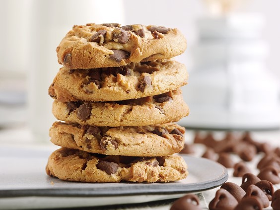
005 — "Desserts". From left to right; (a) Ginger Molasses Cookies on a Milk Bottle,
(b) Chocolate Croissant with Powder Sugar "Snow", (c) Chocolate Brownie Bites.
After that, and going forward — rather than having five different image based themes (or going back to the 1x3 pattern), I want to try and have five different "post types" — but try to get them all to match with the same lighting and design theme.
That however … should be the topic of another post! I just wanted to give everyone that's interacting with my posts on Instagram and Facebook a big "Thank You"!!!! It's just so much fun getting to hear from everyone — and in turn — seeing and interacting with what you all are doing as well. The folks in my followers list are an amazing group of talented people from all over the world that create some pretty amazing food, beverages, products, designs and packaging! You all just amaze me with your projects, and I can't wait to see what everyone is working on each time I turn on Instagram!

