Lighting the HQO Express Sample Packets
June 13, 2019Product Photography
JUMP TO THE PHOTO GALLERY
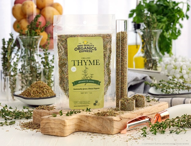 We love small goods product packing here at Digital Food Works, and these sample packets from High Quality Organics Express are very cool, because they stand up all by themselves! No additional propping, tape, wires, polarizers or special lighting required!
High Quality Organics Express is a small(er)-quantity, individual consumer division of the larger parent-company High Quality Organics (HQO). HQO is the largest supplier of wholesale bulk non-GMO, certified organic herbs and spices (and teas too), in North America.
HQOE offers consumers some of HQO's more popular spices and herbs — in smaller amounts (because not everyone needs 100 pound bags of organic garlic powder all at once).
HQOE typically provides 15-36 ounce jars (spice weight can very greatly — but the size of the jar doesn't), 5 pound bags, and occasionally even 50 pound boxes. Naturally, you'll want a sample before you commit to a 5 pound box, which is where those cute little sample packet subjects come into play!
Just between you and me, their prices are pretty good for organic spices… and all of the sample packets I received, were amazingly fresh, in color and in taste. They have an email list where they occasionally announce even better limited time and seasonal offers… if you're interested in getting on that list, it's kind of hidden. Go to their site at https://hqoexpress.com , scroll all the way down to the bottom of the page and you'll see a little "Sign up and Save 10%" prompt… enter your email in that box.. and bam… organic spice magic sent right to your in-box.

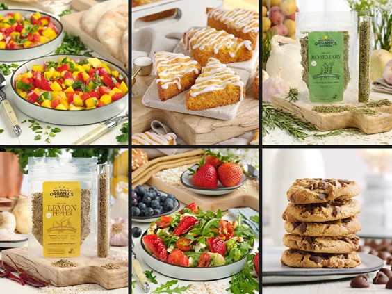
This Organic Garlic Pepper blend sample packet photo contains many of the elements used in staging for this series. A really nice, slightly antique white, thin strip board as the main surface, along with a natural blond cutting board and a couple mason jars filled with produce in the background. A glass olive oil decanter and our really cute little white bowl with the black edge add to the details.
For a surface, I went with an antique white (but not weathered) board and added a small natural blond cutting board to provide a little lift. A couple of simple mason jars, a glass olive oil canister, a copper cup, and a copper peeler were used to help define that we are in a food prep area of some sort.
There's a really cool small dish in a couple of the shots, that's mostly white with a black, thin line painted edge (I really want to work with those little dishes some more, they're just so cool)… and one of the more unusual items… a giant glass tube.

Oooooo... a giant glass tube full of spices!!! (Giant for a glass tube anyway.) The glass tube is open on both ends, so it had to be taped off on one side to keep the spices from falling out. The tube was then filled with spices, a 1/4 teaspoon at a time!
Lighting-wise I decided to put the main light on the right-hand side… exactly 90° to the right, and through a big 40" diffusion panel (my go-to modifier for this sort of thing). The angle is not exactly what I would normally do though… so this was a little change for me. I was hoping that having the light squared off, directly right of the main subject, would aid in the whole "mathematically clean" vibe, without making everything look too flat.
As it turns out — after around 20 photos using this set-up, I feel it worked out really well for these packet photos (which were not actually pointing directly at the camera, they were angled about 7° off parallel to the lens and camera sensor) — but, I think the lighting is a little flat for more "traditional" food or beverage shots (more on that below), where the camera is angled down more than it is here.

The top of the sample packets are very transparent and blended in with the white background a little too much. The fact that the background was one of the light sources, didn't help matters much. :)
Most however, don't have anything except for the white background material behind them. While a little of that helps create this "canyon" effect that brings the eye right down to the packet in the center of the "V" … there should be a little more definition between the packet top and the background.

In cases where a small item (leafy greens in this photo) that crossed over behind the packet, the transparent top seemed much more defined.
There's a 600w strobe, shooting into a very large umbrella, pointing at a 48" diffusion panel, with a curtain sheer draped in front of it. Whew.
There was one additional strobe providing fill light for the front of the scene. That light was modified using a 12x56" strip box positioned to the left of the camera and rotated just a bit, so the top of the strip box was closer to the camera than the bottom.

The lighting setup didn't change at all really, between the different packets. Both strobes A and B were both at around 95% (580 watts each, give or take), but because the back light was going through an additional bounce off the umbrella and then through two layers of diffusion, it wasn't nearly as bright as the main light to the right of the table.
These little shoebox diorama setups are so much fun to plan and photograph. I like collections of things to begin with, and getting to create and see how each packet looks with different veggies and props around it — is like building a little world, just for each product!
If you have a series of small goods products and are in the need of on-all-white, on-all-black, or themed and staged in mini settings like these… please reach out and let me know! It's so great having photos like these ready to go for various media requests and — the never ending need for posting material on social channels.
To see all the amazing HQO Express Sample Packet photos, click here (it's our product photography with elements gallery page), and scroll all the way to the bottom of the page.
