Comparing Two Lighting Set Ups for Unicoi Preserve Jars
August 15, 2020Product Photography
 In this article, I'm outlining two different lighting set ups that were use for some product photos on white, or "pack shots". Pack shot photos are usually for online shopping pages and white papers, and are sometimes used in marketing as well.
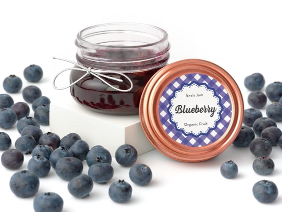
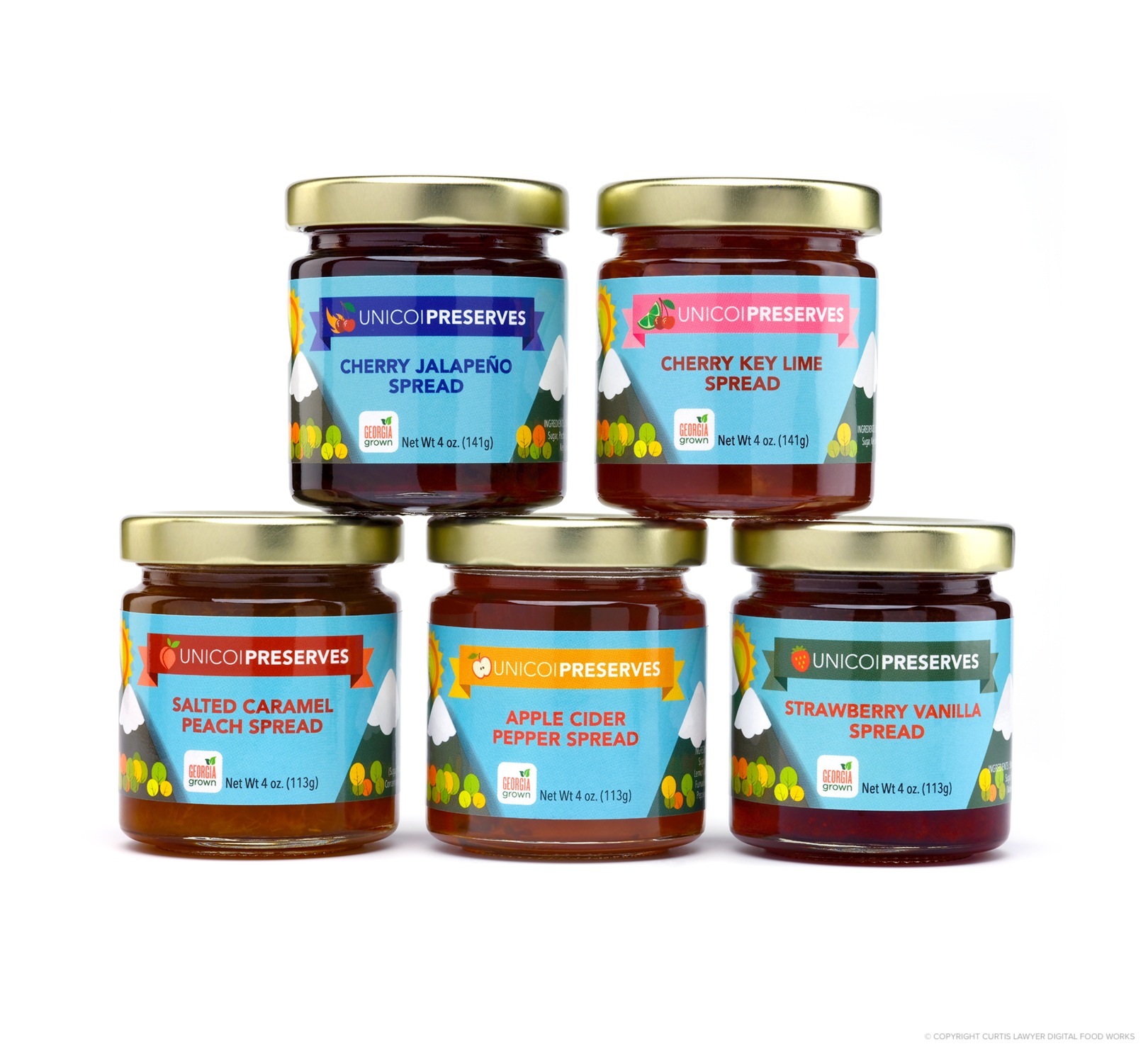
Our subjects for the article are some Unicoi Preserves jars. These small batch, hand-crafted preserves are inspired by and created near the Unicoi Wine Trail in Georgia. Many of the ingredients are sourced locally — and the distance from farm to jar, is as short as possible! Click here to read more about Unicoi Preserves.
Let me start out by saying, that whichever lighting set up you go with — is based on personal preference and when you're trying to achieve with the final product photo — this isn't an article where I'm comparing the right way -vs- the wrong way. Both of these setups are valid for all kinds of different products.
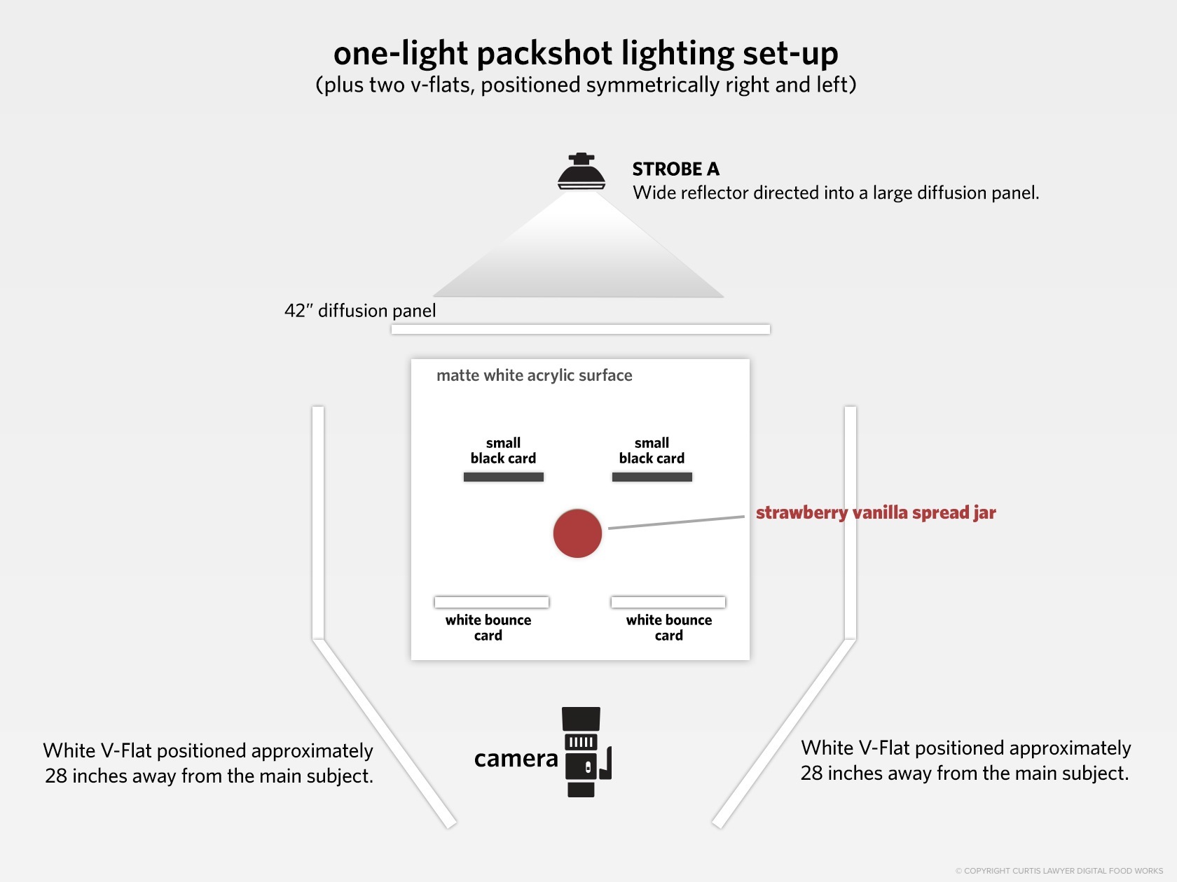
Here's a diagram of the first lighting set up. It makes use of just one light, positioned directly behind the main subject product jar.
The main light had a rather simple seven inch wide reflector with a hard plastic diffuser disc over it (to soften the main bulb a bit) and was then pointed directly into a 42" diffusion panel. The height of the light was around 18 inches higher than the center of the main subject… but angled directly parallel to the floor and not pointing down at the subject or camera.
I did have two large v-flats that are about four feet tall on either side of the main shooting area, approximately three feet from the center of the main subject — this provided a little bit of ambient light around the product (i.e. the main light comes streaming past the product, hits the v-flats, and bounces back onto the front and sides of the jar).
This is a test shot I did on a glossy acrylic surface. The two black "flag" cards are in the same place here, as they were in the photos on the matte acrylic surface... positioned very close to the jar, but not touching any part of the jar. This is what creates the darker edges on the extreme left and right of the jar, most noticeable in the lid.
Two small black cards were also positioned behind the product jar. These were not completely out of the frame — in fact they're positioned just about as close to the product jar as you can get — without actually touching the product. The black cards are cropped and removed in post production.
These were in place to help darken the edges and outline of the product jar. Without them, the high intensity blast of light streaming around the jar, would soften the edges too much, and give them a somewhat angelic look. That kind of edge softening is great for environment shots, especially where you're going for a "summer sunday brunch" kind of look, but I wanted to see a well defined outline and edge on the product jars.
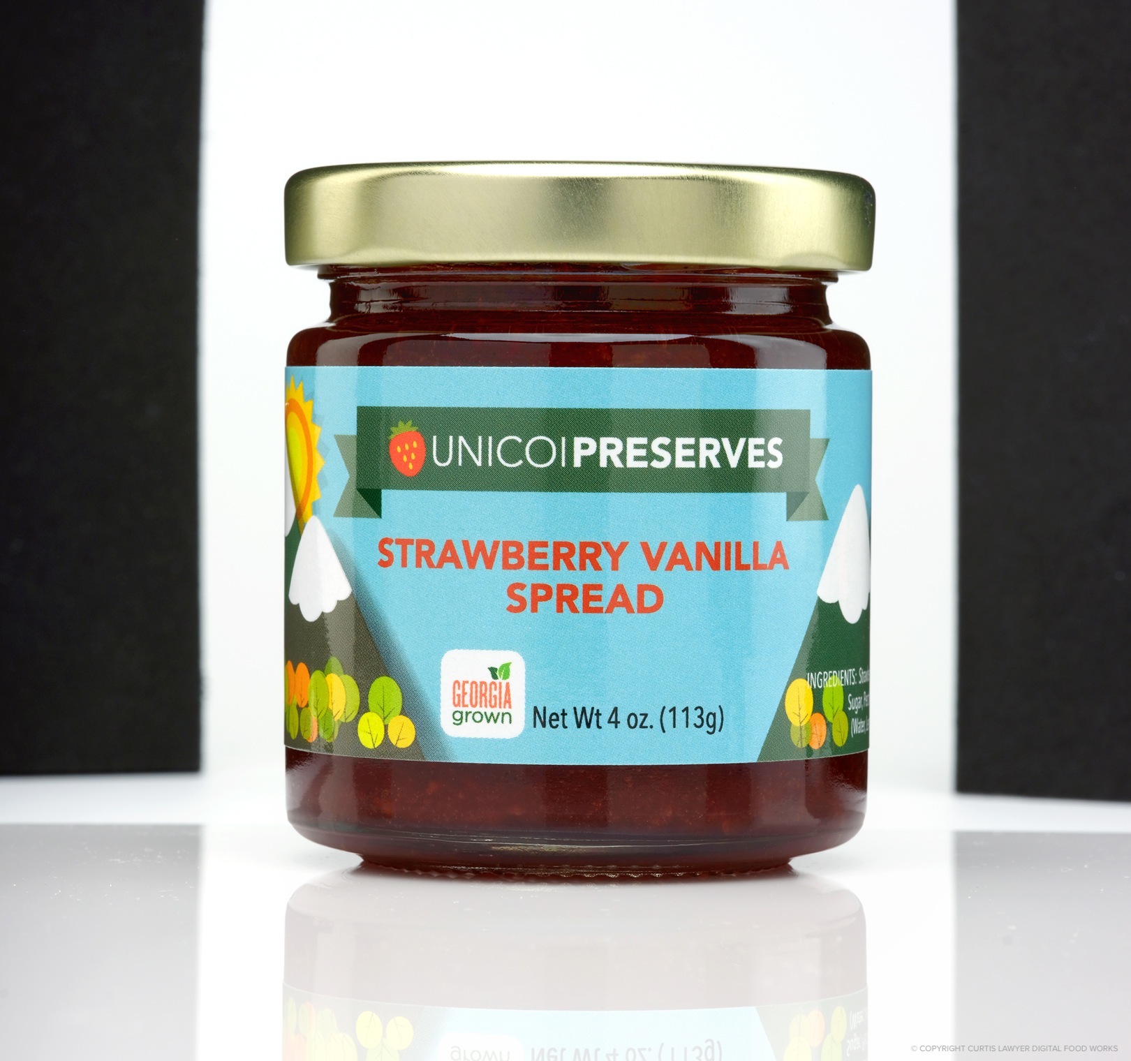
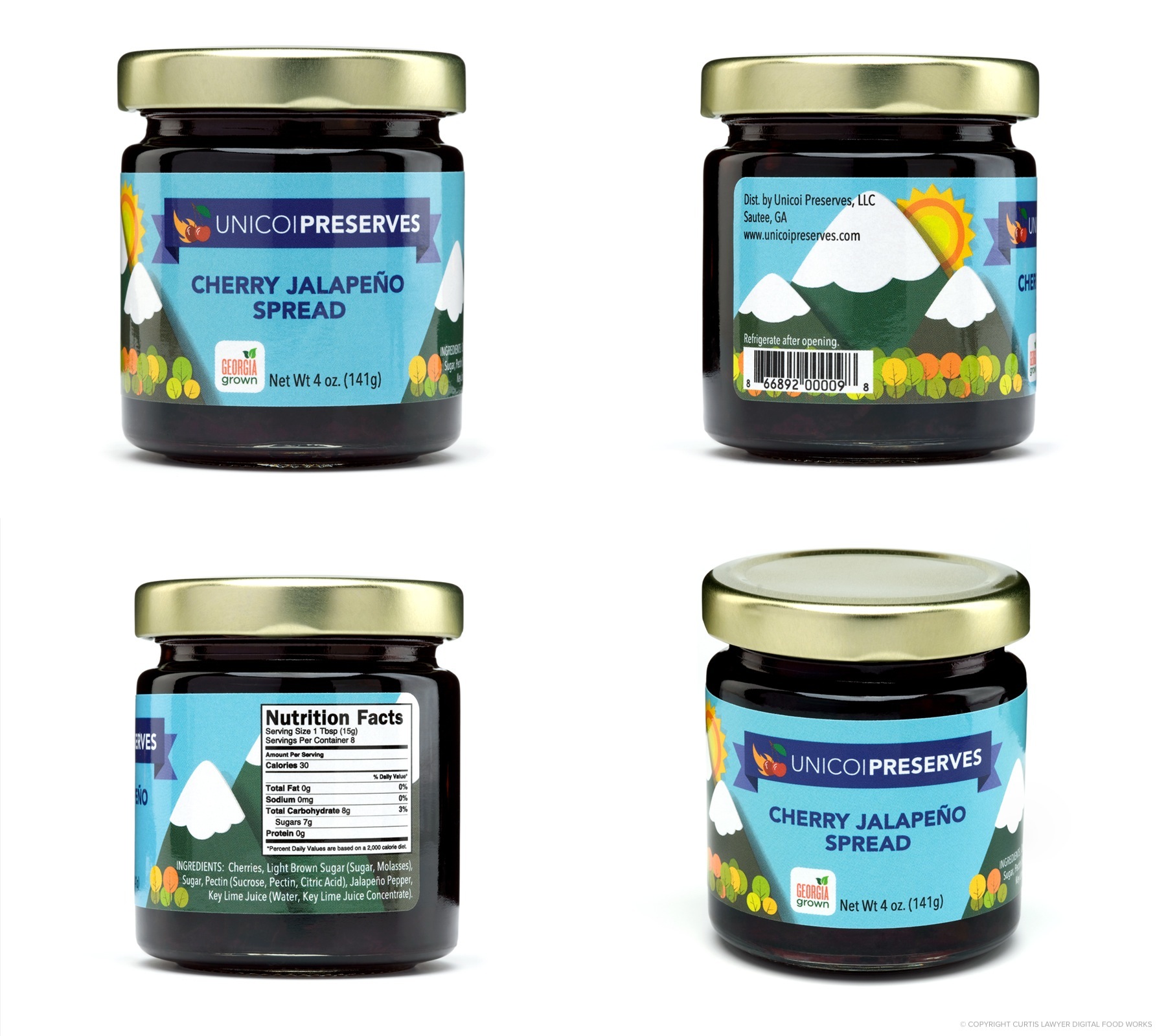
Let's take a look at one of the final photos… here's the front view of the Strawberry Vanilla Spread.
Lighting Set Up #1 : Here's the main front jar photo of the Strawberry Vanilla Spread using the first lighting set up. It's 100% powered by just one flash, positioned directly behind and slightly above the jar.
This was the first set up I tried out with the jar of preserves, and just looking at the camera back, I felt like the edges and top of the jar were still too soft. The front label and metallic lid looked incredibly great, with very few reflections.
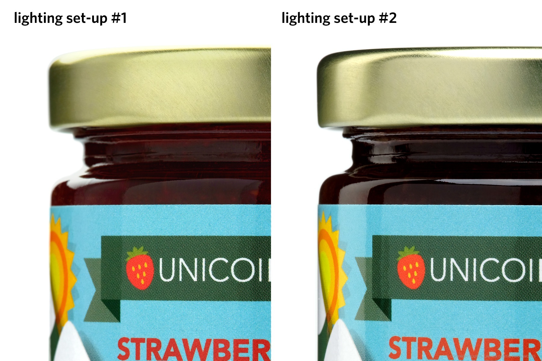
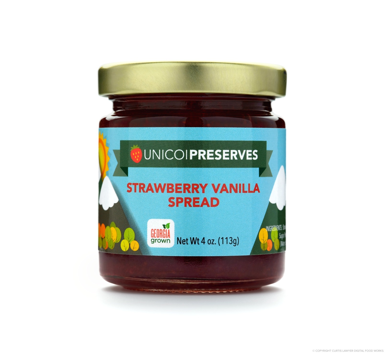
Lighting set up number one looks great, but the edges around the jar, especially near the top lid are not well defined. Both of these were shot at f/18 — and while I did pull back about 6 inches when using lighting set up number two, it would not have changed the soft light coming from behind the jar and around the edges.
I was probably at f/18 already, and while I have pushed that up to f/22 before, I felt like I would still need to go into "focus stacking mode" to get a really sharp edge and to get more of the edge of the bottle in focus and readable.
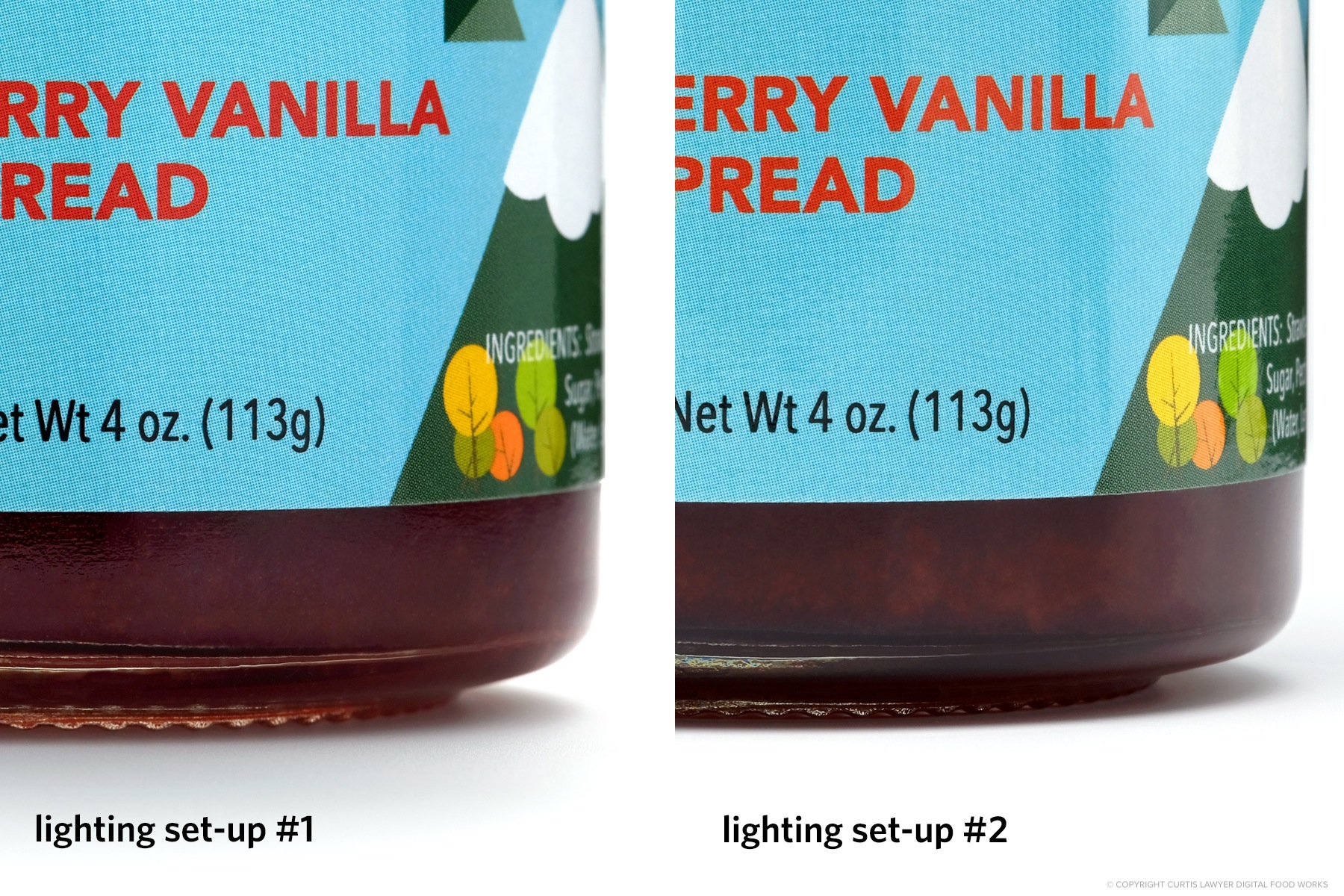
Looking at the bottom of the jar — the glass edge and label area using lighting set up number one are a little soft, when compared with lighting set up number two.
This set up was producing some good results though, so I went ahead and shot all five product jars and each of their side panels as well — and then did the group shots using this setup, because you never know — safety shots!
I wanted to try something a little different though (still without getting into focus stacking)… by simply trying to decrease the amount of light streaming in from behind and around the jar — and therefore increasing the edge contrast a little bit. I also wanted to pull the camera back just a couple of inches, to try and increase the amount of surface area that was in focus, around the jar.
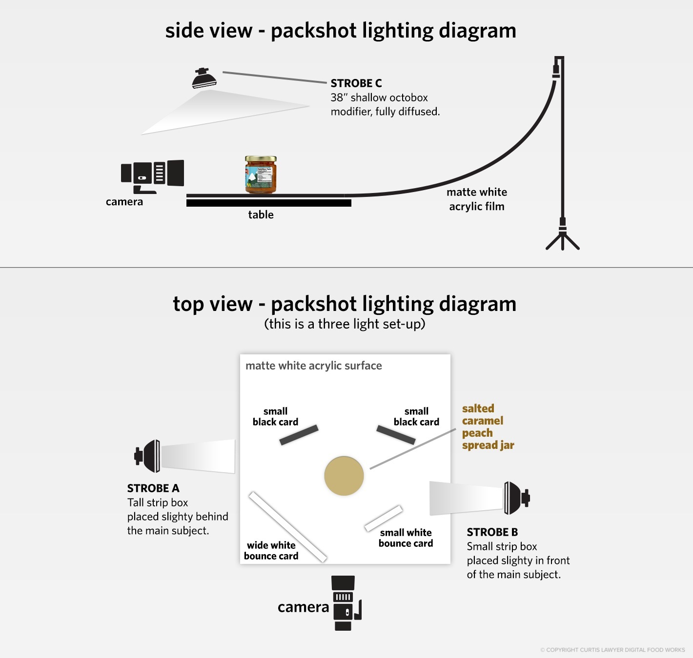
The second light set up for the Unicoi Preserves jars requires three lights — two on either side of the main subject, and one overhead.
With this set up though, you'll really see the "horizon" or any seam line between the background and the table surface, so a sheet of white acrylic was attached to one end of a light stand and the other end was attached to the table. This produces a "ramp", which eliminates the horizon — because the background and the floor surface are all the same material. There are some slight gradient differences from white to light gray in the photos, when using this surface and background technique, but they've very gradual gradients, and easy to fix in post production.
Very similar to the previous light set up, two white bounce cards were placed in front of (and very close to) the main subject, in order to provide a little more light directly onto the front of the jar and lid. Two additional black cards were placed behind (and very close to) the subject as well, to help define and darken the edges of the jar. Unlike the first light set up, the cards were all angled slightly into the main product jar.
Let's take a look at the lighting that this second set up produced on the Apple Cider Pepper Spread jar.
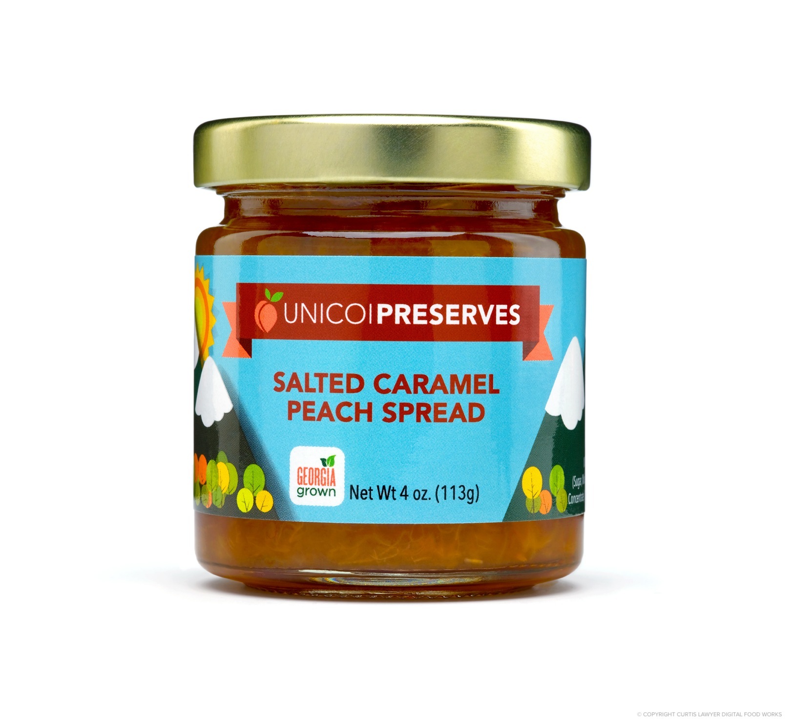
Lighting Set Up #2 : Here's a look at the front of a Salted Caramel Peach Spread jar using the second lighting set up.
The edges of the jar are defined much better with this set up. The reflections in the glass however, are much more prominent using this second set up. Another interesting trade-off is the color of the some of the spreads. In a couple of the less opaque spreads, the first light set up (where the light is directly behind the jar) was actually bright enough to shine through the contents and make the spread seem almost translucent.
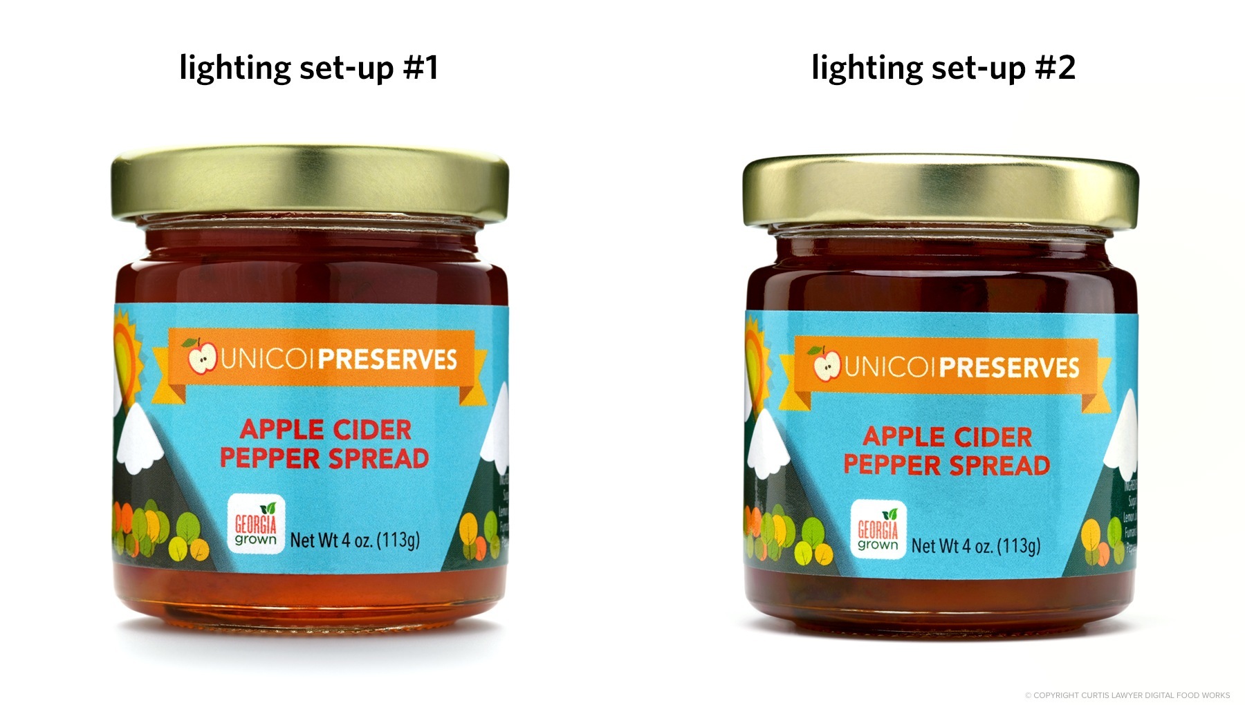
While the translucent effect of the spread using lighting set up #1 (left) is really cool looking, it's not really accurate for a product photo. Generally speaking, most people aren't going to be looking at the jar, with a 600 watt flash behind it. The photo on the right was taken using lighting set up #2. The color of the preserves on the right, is more accurate to what you would see, when picking up the jar.
While the translucent effect does make for a pretty cool photo, it's not something that would happen with all of the products however. Something like the Cherry Jalapeño spread is darker and doesn't let the same amount of light pass through.
Ultimately, I decided to go with the second set up, because it provided great label readability on all sides of the jar and had that great edge definition on all the jars. Also, the same exact set up worked when I raised the camera up to get the partial isometric shot of the product jars — with no additional modifications.
Lighting set up #2 provided the most even looking lighting, that was true to how the product would appear under normal store or home lighting conditions. We always recommend taking photos of all sides of the product (so that all labels are clearly visible) and a semi-isometric photo to show that the product has width, depth, and height.
The second lighting set up also worked very well with the group photos. Whenever I have a collection of items here to photograph, I recommend getting any logical groupings that you can think of… based on color, flavor, product size or height, flavor profile, etc. — any combinations really. They don't really take much extra time to photograph… and they're great for small marketing specials or even on individual product sale pages as one of the "b-photos" — it shows a potential customer that is looking at one specific product (i.e. Salted Caramel Peach Spread, for example) … that there are other great products in the line up!
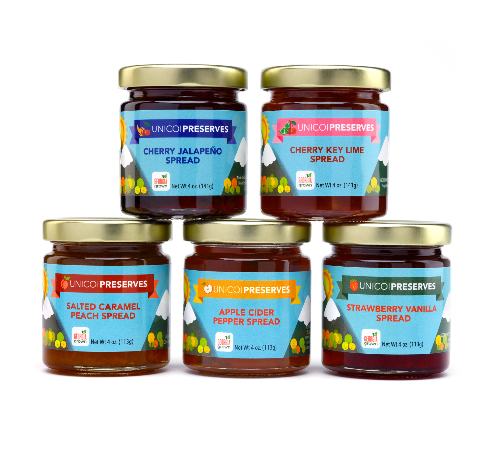
Lighting Set Up #2 worked great with the groups shots as well. Here's
all five of the Unicoi Preserve jars that make up the "Easy Entertaining
Sampler".
To get your very own collection of Unicoi Preserves jars (they're sooooo good), check out their web site at www.UnicoiPreserves.com — these preserves and spreads are great on morning baked goods — and really add some special magic to things like chili, ribs, cocktails, and even pizza!
I've got a few more articles on product photography posted here on the Digital Food Works site. Click here to see a list of those… or click here to check out the Isolated Product Photography gallery page!