The Evolution of a Spice Bottle
April 4, 2018Nine Ways to Sunday with PS Flavor
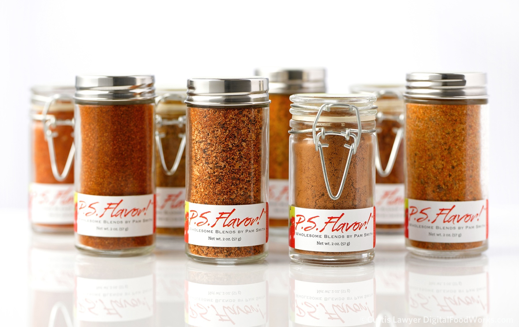
The original P.S. Flavor!™ branding version one bottle collection.
As it turns out, P.S. Flavor!™ was thinking about updating their spice bottle and label system -- and so began an amazing, creative, fun-filled journey -- that resulted in a major refresh of the P.S. Flavor!™ brand image.
Before getting back into my "Nine Ways…" project, I wanted to take a look at those three generations of spice bottles, and touch on a quick modification to what this version of the Nine Ways project is.
The P.S. Flavor!™ Chili Lime Rub bottle, dressed in it's version one branding! That bottle is so cute! One of the best parts about this system is how much of the product is visible. You really want to pick up the bottle and examine it closer.
Another need with product photography is the "isolated object" photo, where there entire object (product) is cut-out and available on a transparent background. While it was possible to do with my original setup, it wasn't as quick to get to that point as was necessary in a production environment.
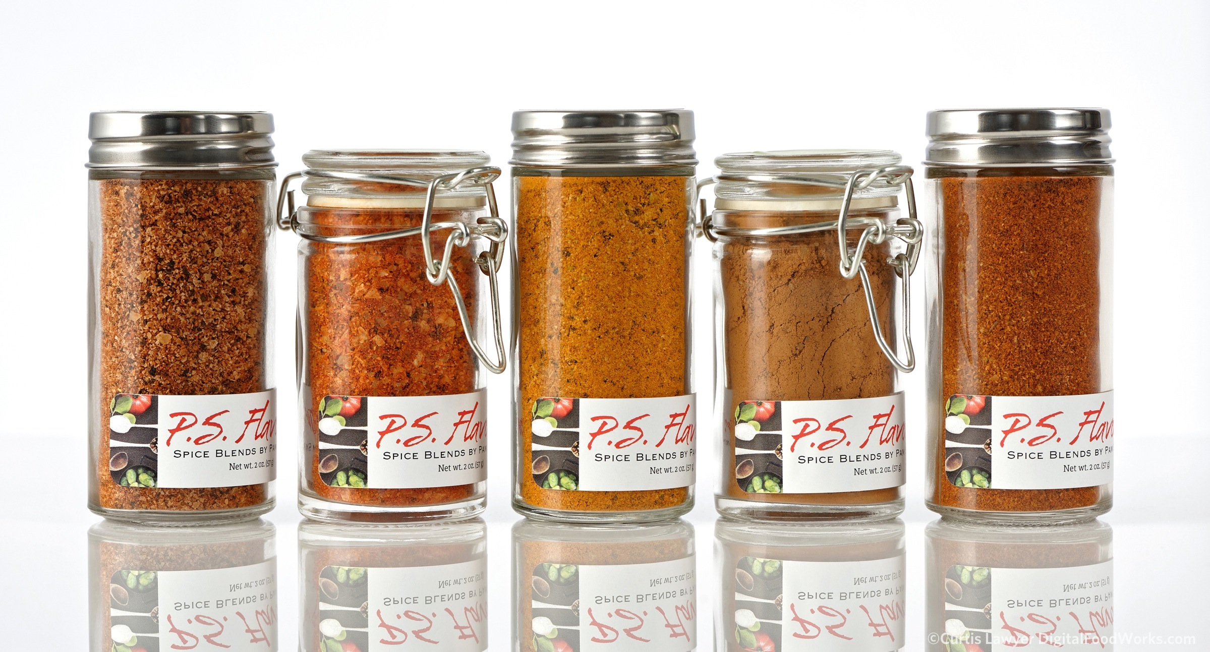
The second version of the P.S. Flavor!™ branding system was a small tweak of main image, away from a bright red pepper and into a darker "spoons and spice" image. Pictured here is the "Perfect on Pork" collection.
Whew. Another slight jog in writing for my public (personal) project journal here at digitalfoodworks.com (and all the other online properties that I write and create content for) -- is to start thinking in terms of smaller, more useful, quick-read vessels of information. Well -- I'm going to try anyway!
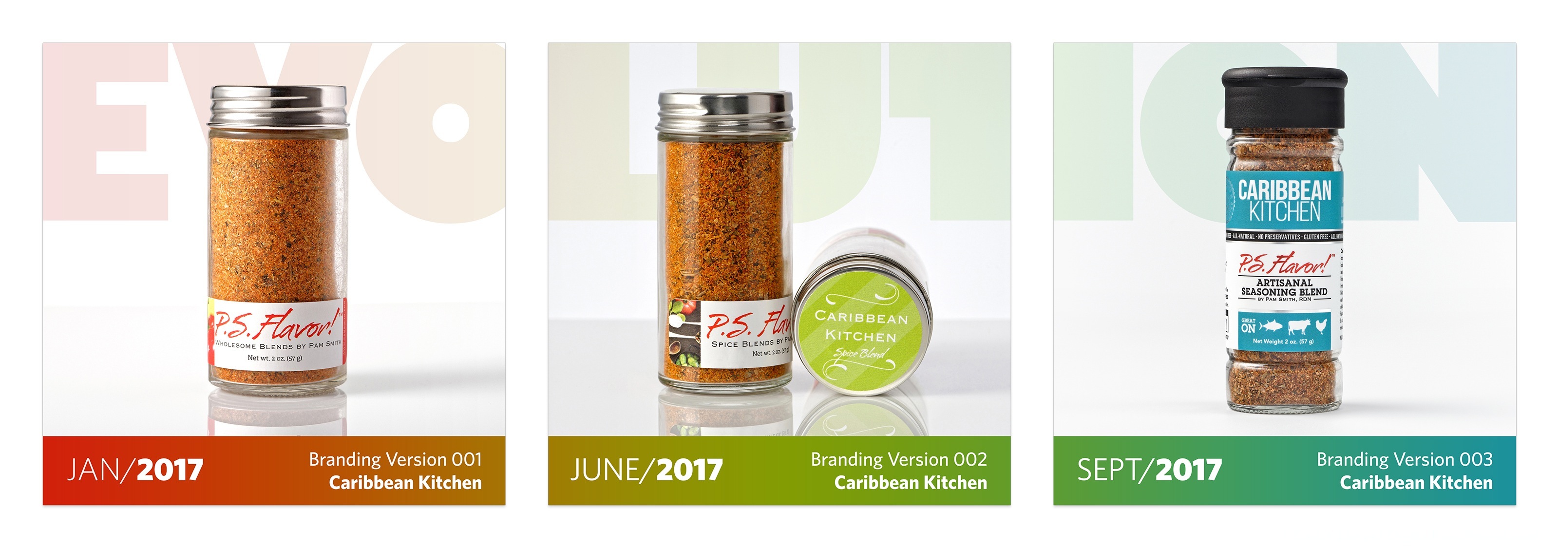
The third version of the P.S. Flavor!™ branding system also included a slightly larger bottle! The new color coded label system gets some really important information directly on the front of the bottle -- including the blend name and the "tastes great on" icons.
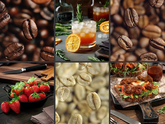
We have made such amazing progress with the P.S. Flavor!™ branding in such a short period of time, that a mini time line of the bottle branding seems like a perfect visual idea -- and a great tie-in image with this article -- and so the "evolution" triptych images were born!
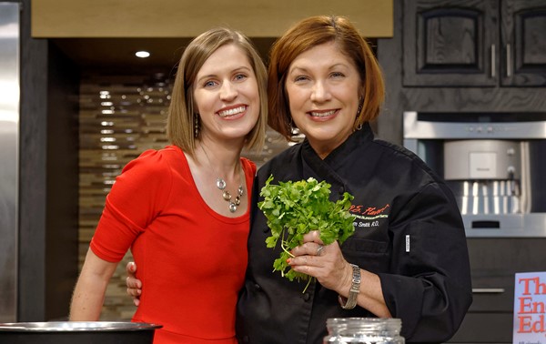
I also wanted to once again send out a huge "thank you" to the amazing women behind the P.S. Flavor!™ Spice Blends. Pamela Smith, RDN and Nicole Ramsland -- just -- thank you both so much for allowing me to play with this product. We really have accomplished so much, in such a short period of time!!!
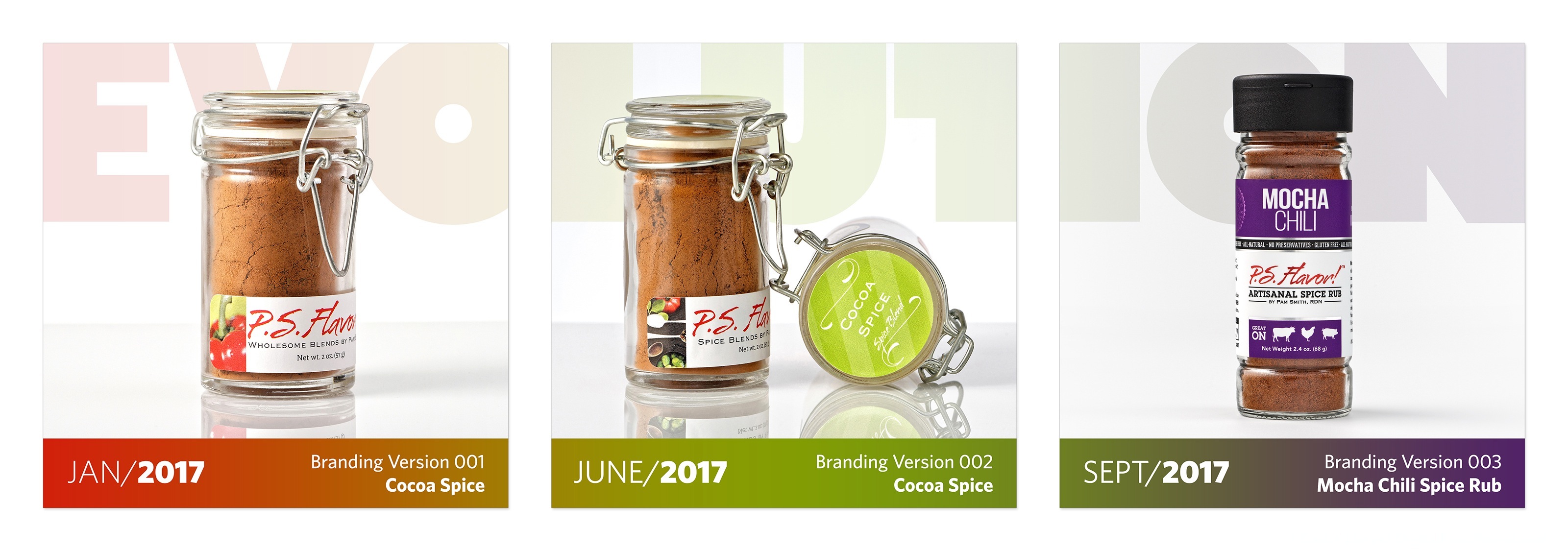
For branding version one and two, the "kitchen" series blends were packaged in tall shaker top bottles. In September of 2017, a "single matching bottle type" approach was taken, and we introduced a new color coded label system.
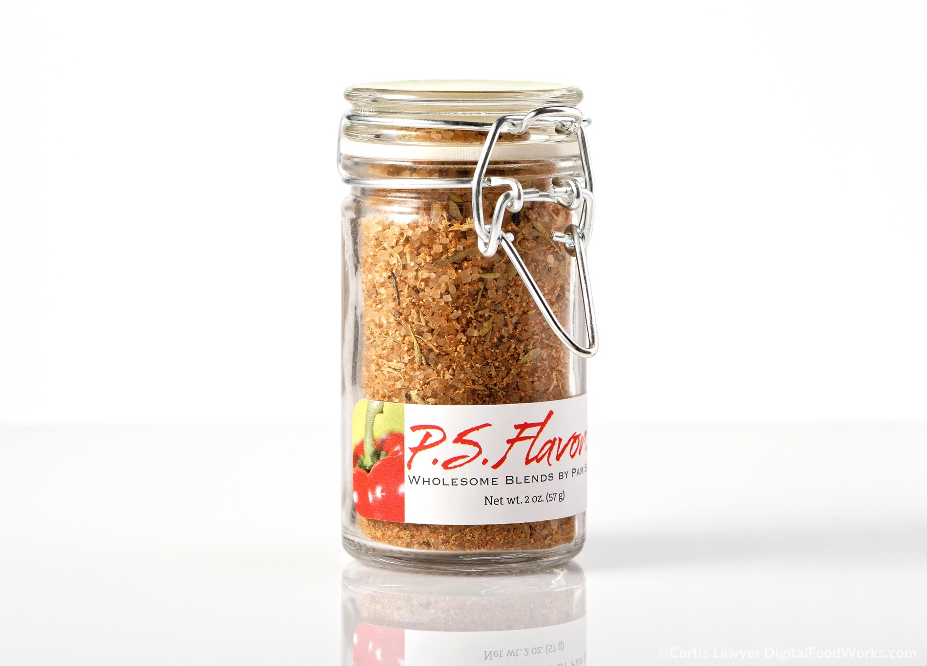
Cocoa Spice went through more than a branding change in this same period -- like a butterfly, it turned into the beautiful Mocha Chili Spice Rub! The "rub" series had been packaged in cute little mason jars. In the Fall of 2017, a dual flip lid and larger bottle were introduced, standardizing the size of all nine blends in the line-up.