White Background Product Photos with P.S. Flavor! Spice Blends
May 1, 2017Nine Ways to Sunday with PS Flavor
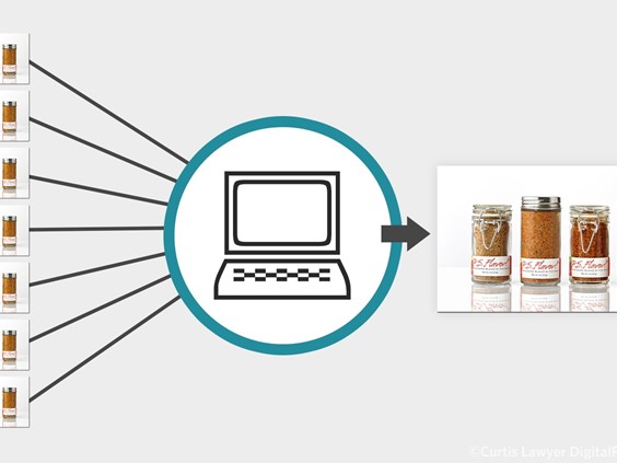
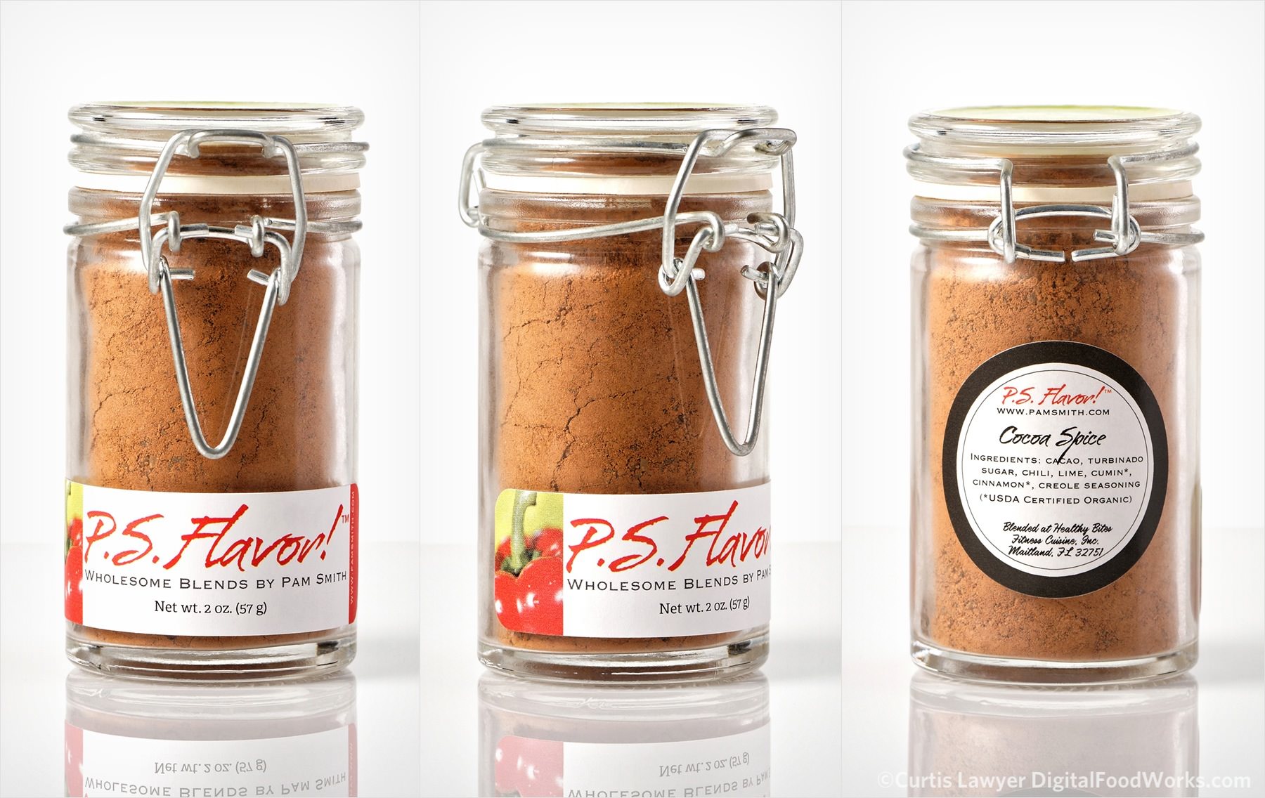
Way One of Nine Ways to Sunday (Part A) — The "product on white" photos are the first series I wanted to shoot with the P.S. Flavor! Spices. The "white background product shot" is one of the core photographs needed when selling things online. Some online stores even require that the product be shown on white. (To read more about this Nine Ways to Sunday... project, click here.)
The P.S. Flavor! Spice Blends and Rubs.
There's two things that are really important for this kind of photography... consistency (from shot to shot) and repeatability.
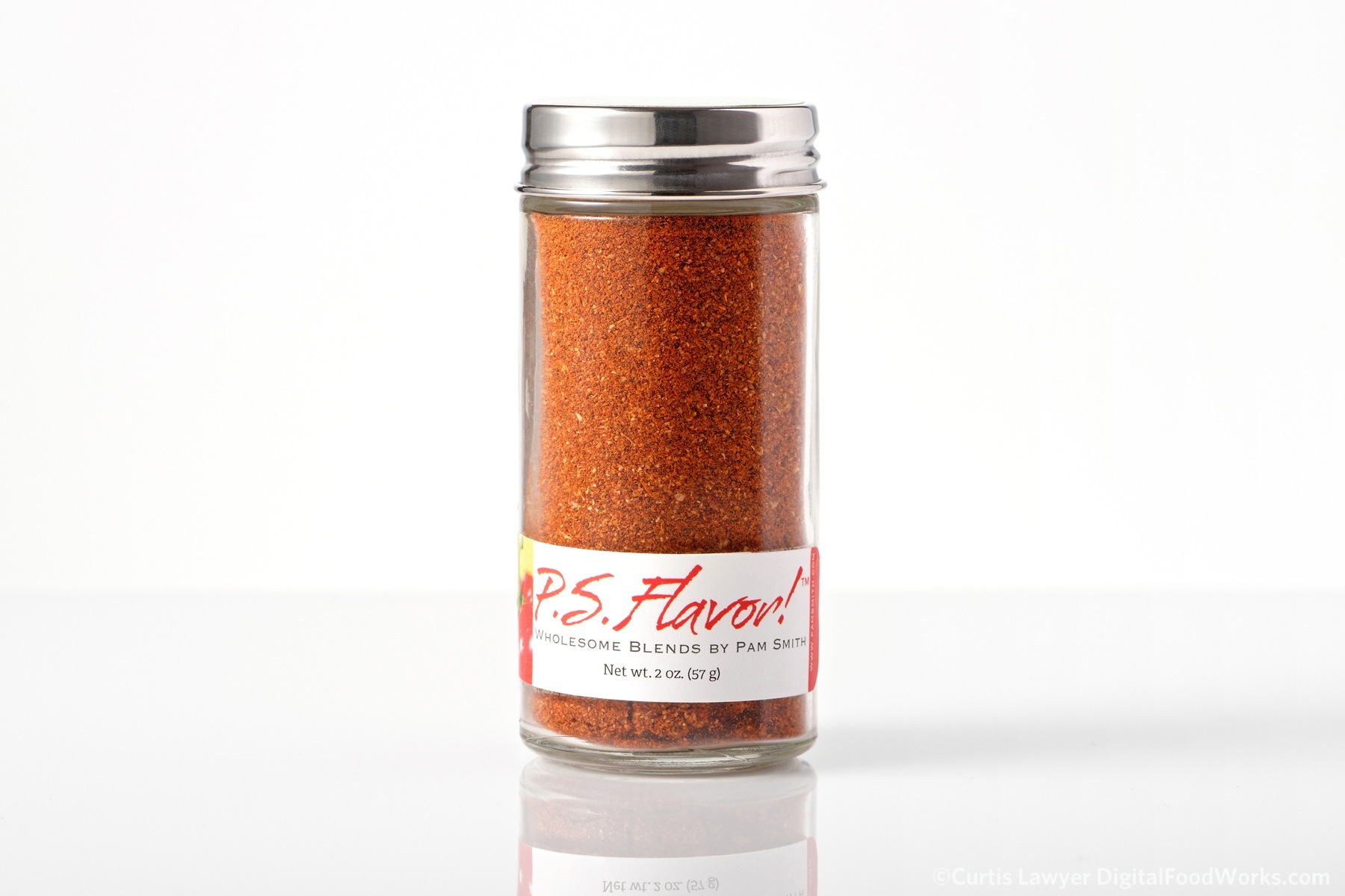
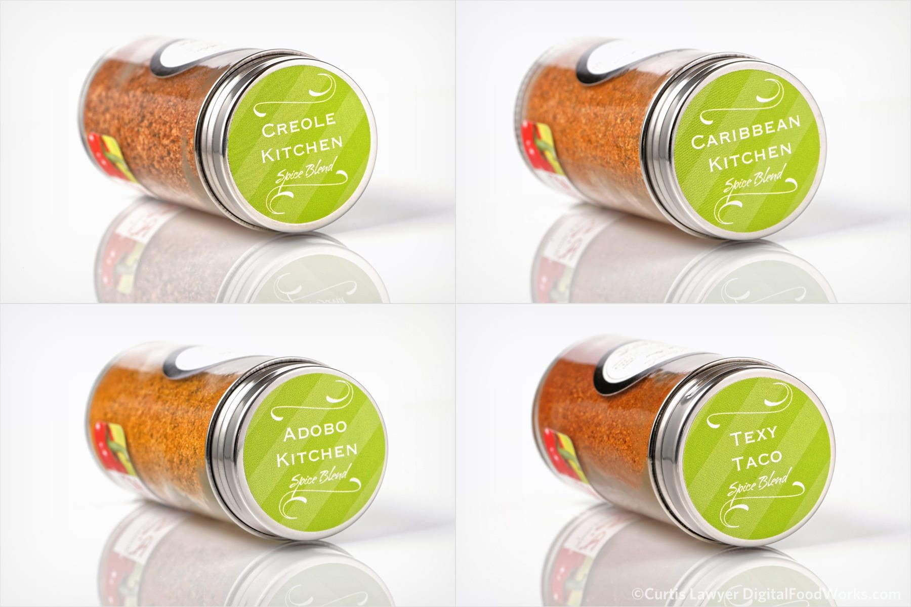
Hello sexy Texy Taco bottle!
So we have two kinds of consistency to deal with. The first is making sure the front, back, side and/or top photos for single spice blend looks the same… and the second is making sure that the rubs and the spice additives all appear as if they belong to the same family of product.
Consistency among photos of the same product is important. Even though the traditional "overhead" photo has been replaced with a "lay down" shot (because you can't really see the spices in an overhead photo), the four angles all look like they belong together.
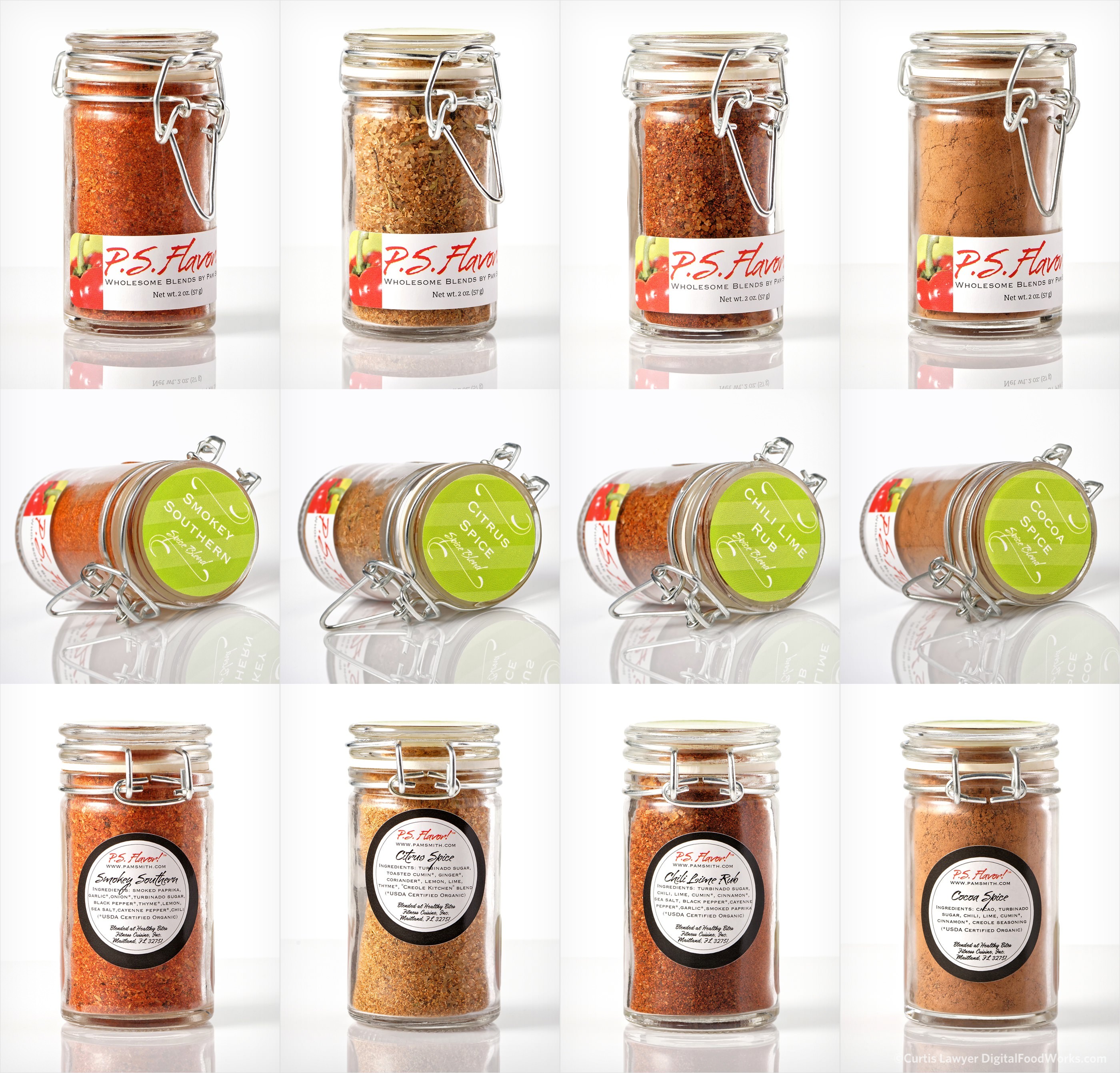
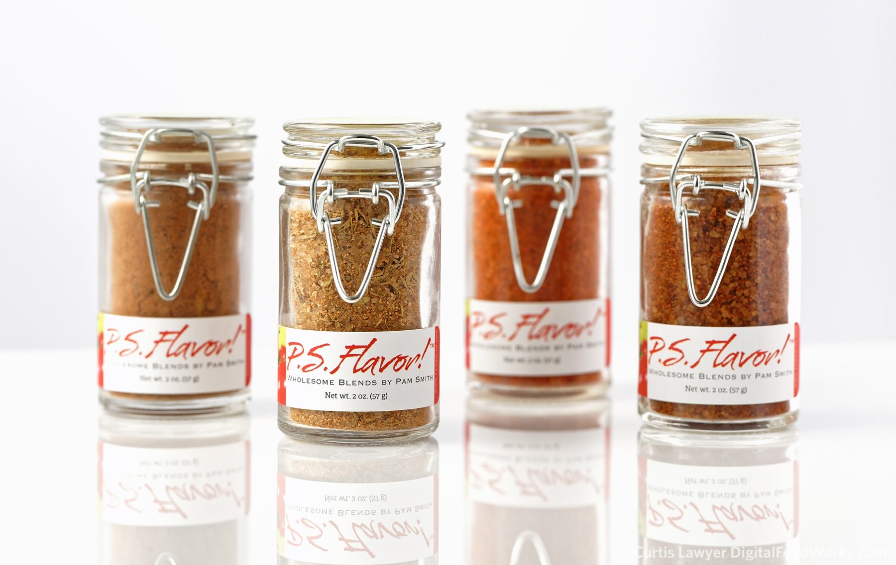
It makes marketing sense for these spices to be sold in groupings as well. As in... "buy all four spice rubs and get free shipping", etc. In such cases, it's not uncommon to see a group photo of everything you're getting, along with individual photos of each product in the series.
The group photo on top is consistent with the lighting and style of the individual product shots below.
Repeatability is important because when a new single product is added... weeks, months, or years from now… you're not going to get an opportunity to reshoot the whole line. The photos have to match, no matter when they were shot.
It's important to have a couple of notes written down somewhere, if the setup is very complicated. That's the main reason I tend to not overcomplicate things when doing product shots on white!
For these P.S. Flavor photos, I am using a two light setup totaling around 600w of power (give or take) with roughly 22 square feet of direct diffuse light and 12 square feet of reflected radiant light. What's a little uncommon for a product photograph of this nature, is just how much backlighting there is.
Which leads me to my third and final notation for this series, each and every product is different… often times in unforeseeable ways. The ultra clean shot that I was thinking about before getting these bottles, just wasn't going to be possible.

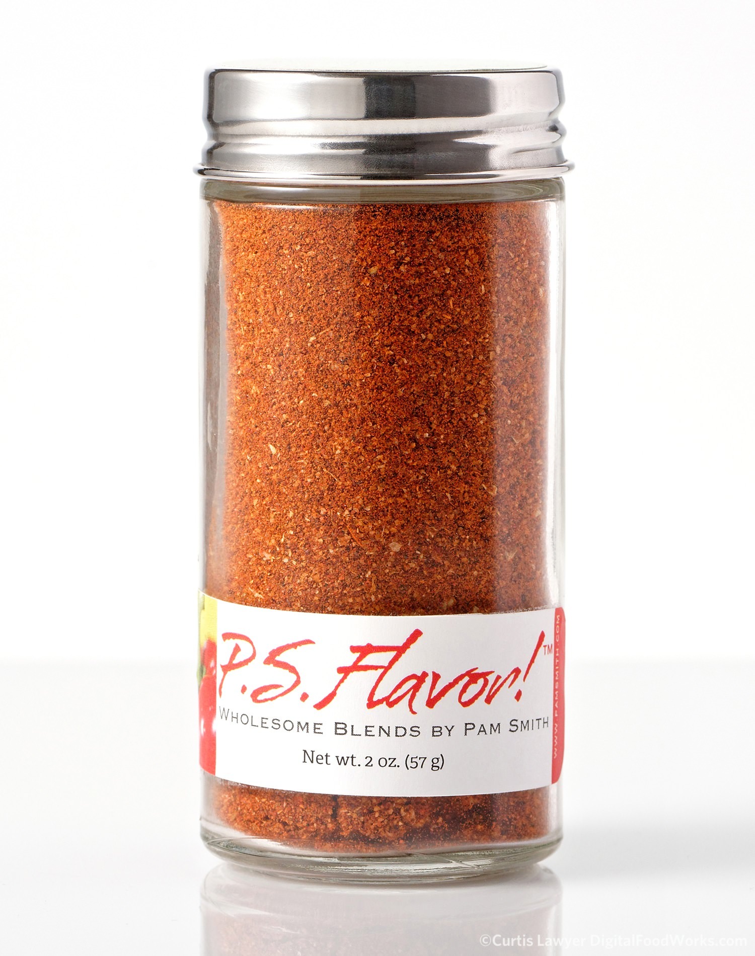
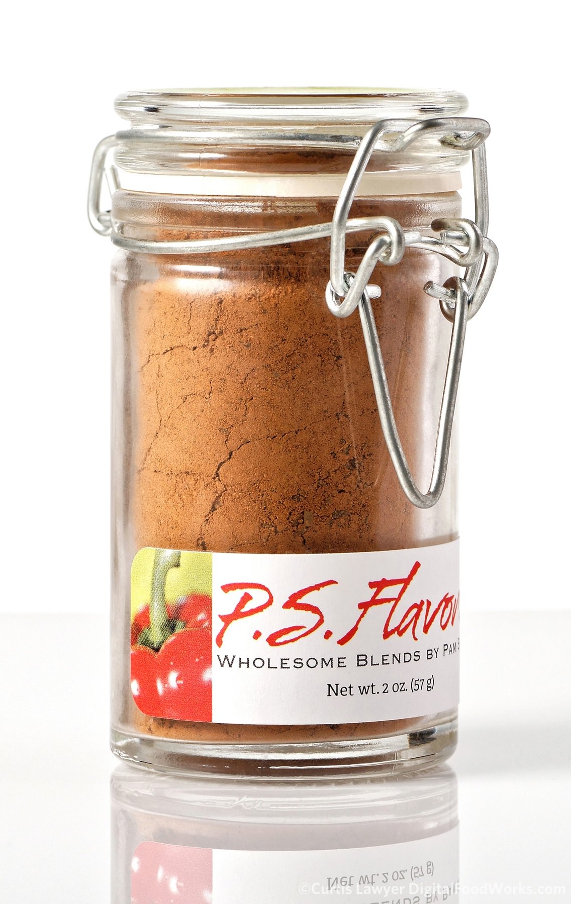
It's important to see what's inside the bottles. Identifying things like Turbinado Sugar and Toasted Cumin give you an idea what the spice is about, before smelling or tasting it.
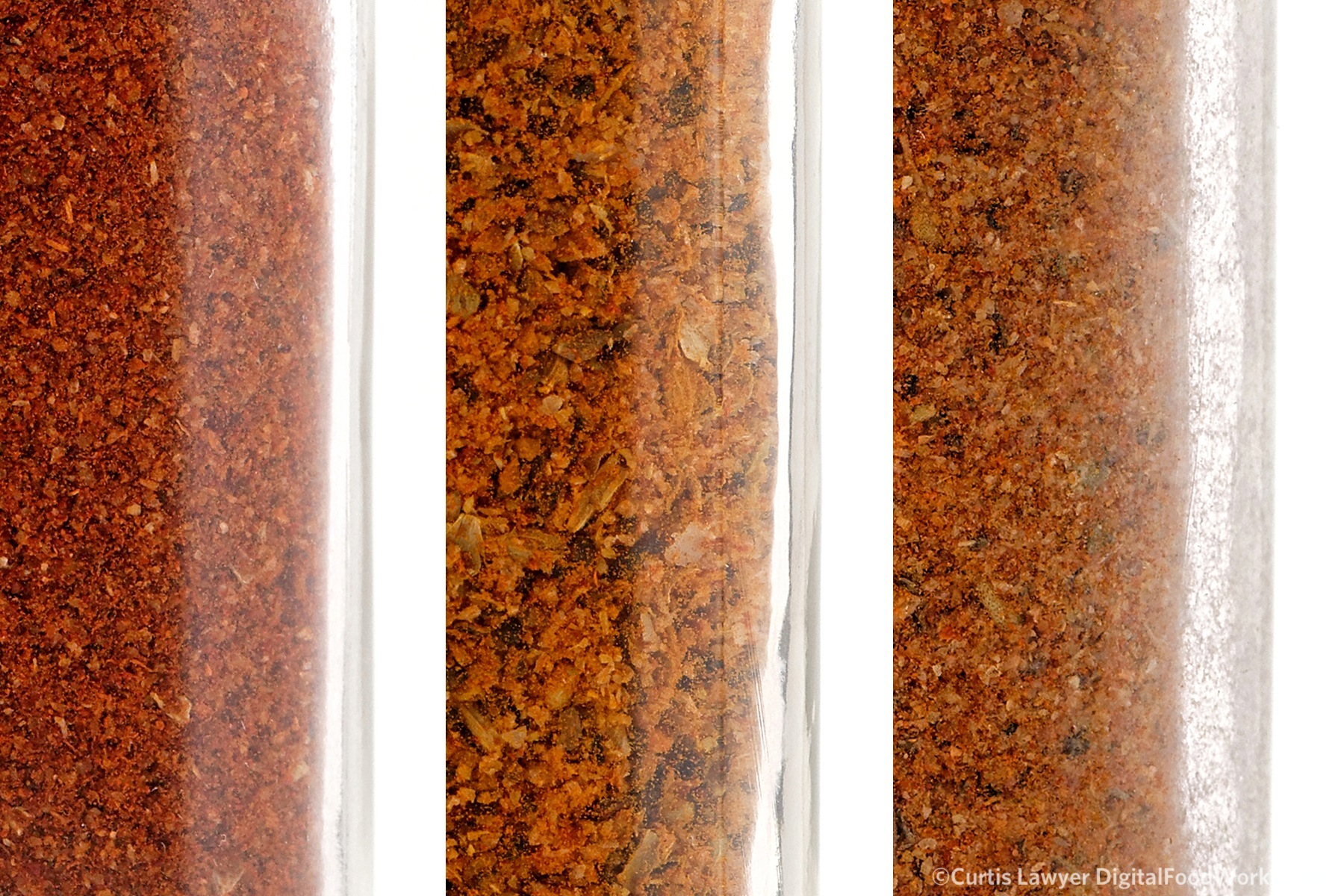
A closer look at the bottle wall reveals that while some are clear and straight, others were clear with uneven inner walls. A third group appeared less clear because of the many different striations in the glass.
All of that adds up to a softer look for the bottles, which I actually like for this product. The glossy acrylic floor surface can sometimes get a little too medical looking for food products when the lighting is sharp and harsh. This "Summer Sunday" light keeps everything looking clean and friendly enough where you still want to reach in there and grab a bottle for yourself.
You may have noticed that I've tagged on an unusual "Part A" to the "Way One" title. There's another set of product photographs that I wanted to explore that are so similar to these, that they won't get their own new "Way" designation. Hummmmm… I wonder what those could be? I can't wait to get working on the "Way One, Part B" photos!
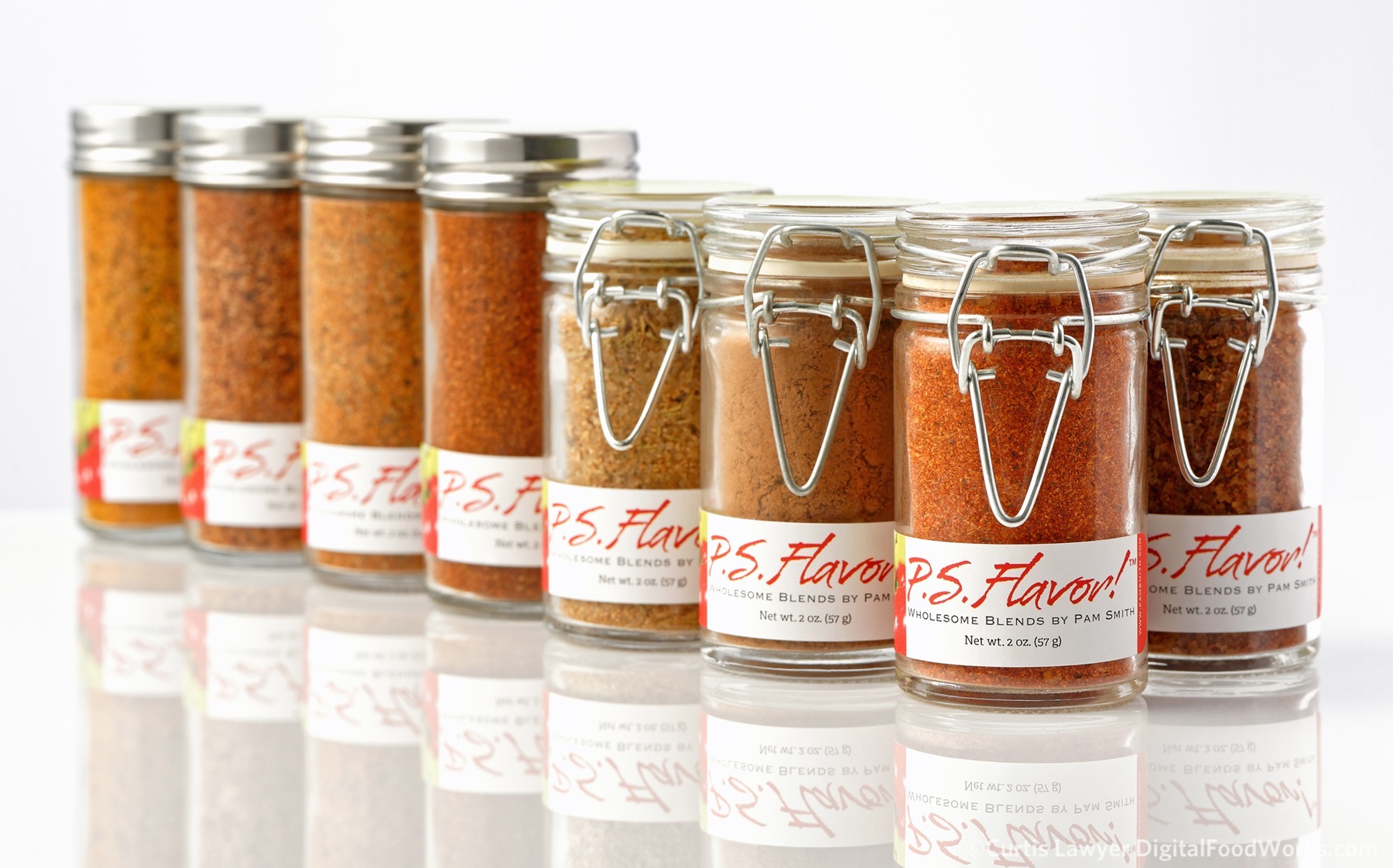
The P.S. Flavor! Family of Spice Blends and Rubs.
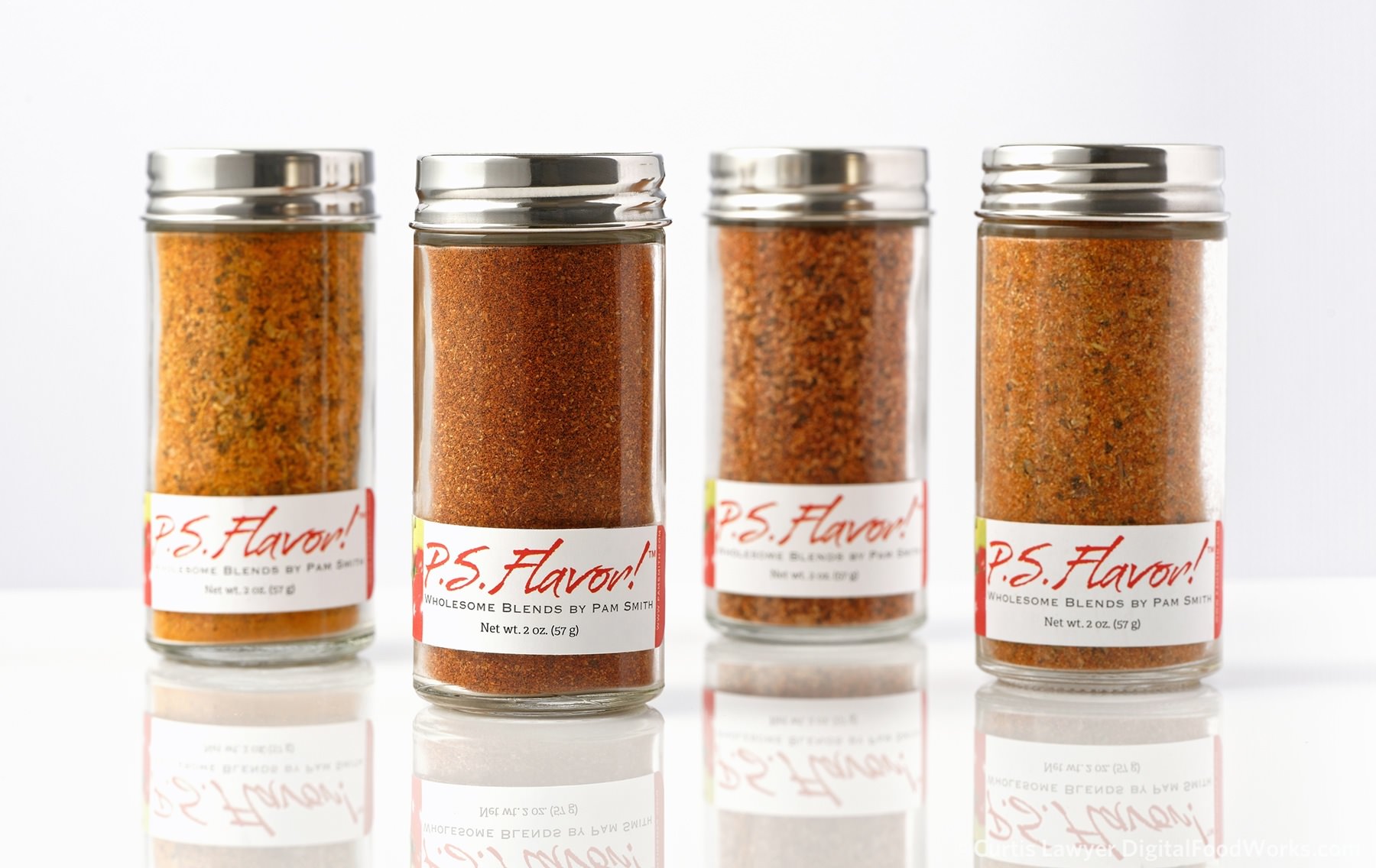
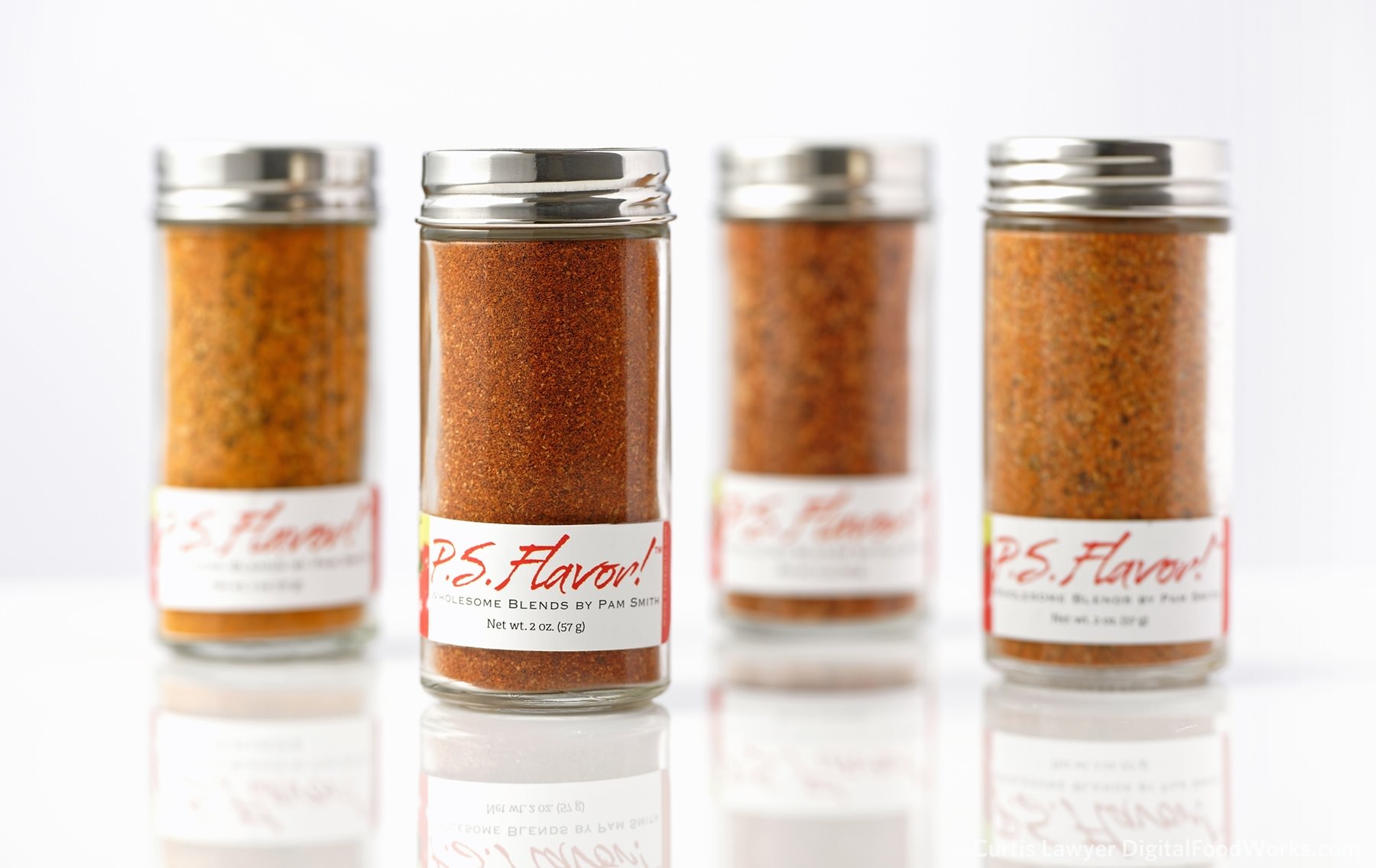
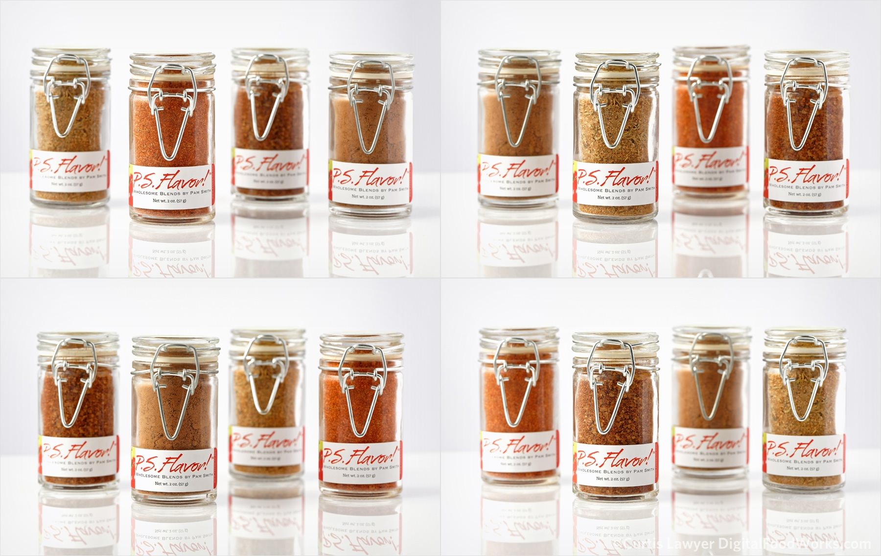
Each of the group photos has two variations, one taken at f/11 and the other at f/4. This is the f/11 photo which brings all of the bottles closer to the primary focal point.
This photo of the same group is taken at f/4 which blurs out more of the bottles and really highlights the main bottle. The two different apertures were used to support different editorial purposes.
I never get tired of looking at those Text Taco spices! Being able to see the product inside the bottle is extremely important.
The bottles were all photographed from their "solar plexus" level. While going a bit higher would have shown the top label (that shows the name of the spice), it would not have allowed this much product to show through the bottle.
Another benefit from shooting at this level is that it gives the product a bit of a hero complex. Shooting higher, tends to make things look a bit more playful. Shooting straight at the bottle gives it more authority.
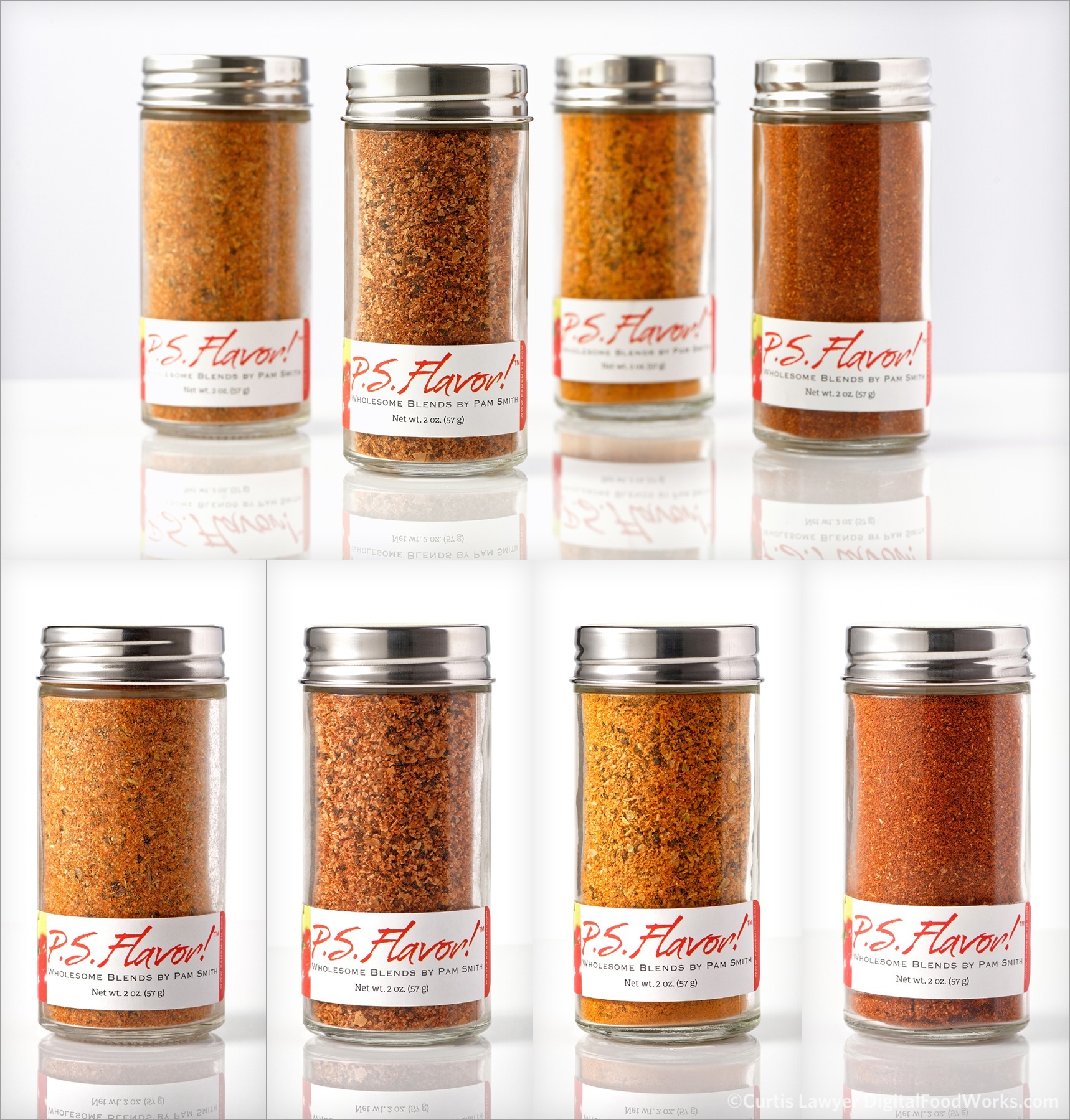
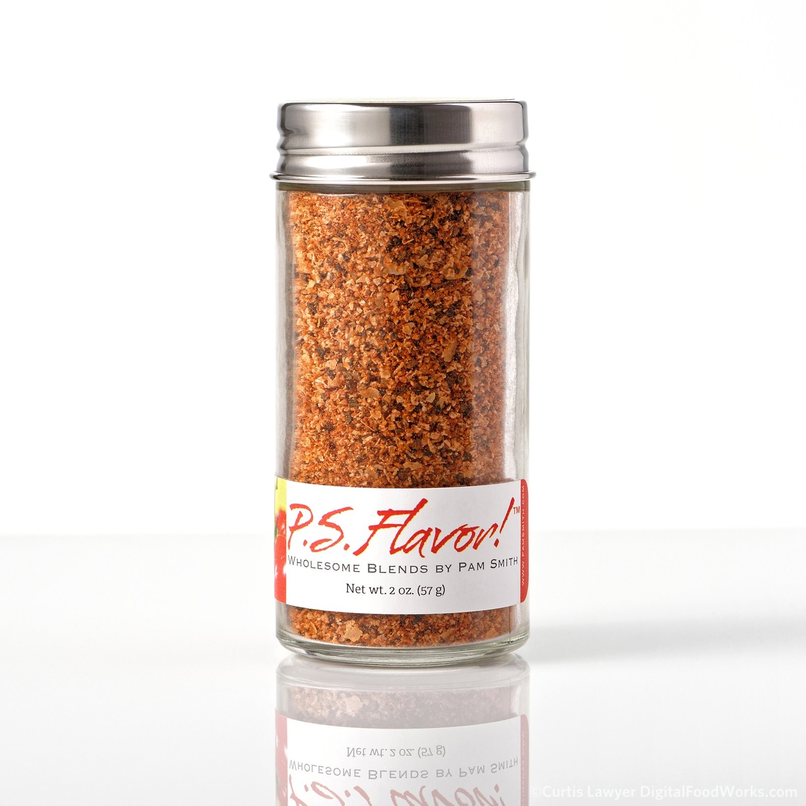
Each of the single spice additives (or shaker spices) has three angles... front, back and the lay-down so you can see the label on the top. A top-down shot didn't prove to be very effective as you could no longer see any of the spices.
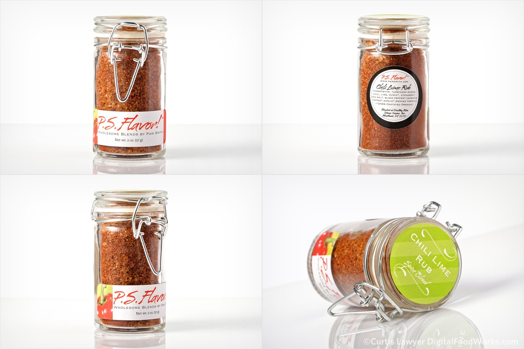
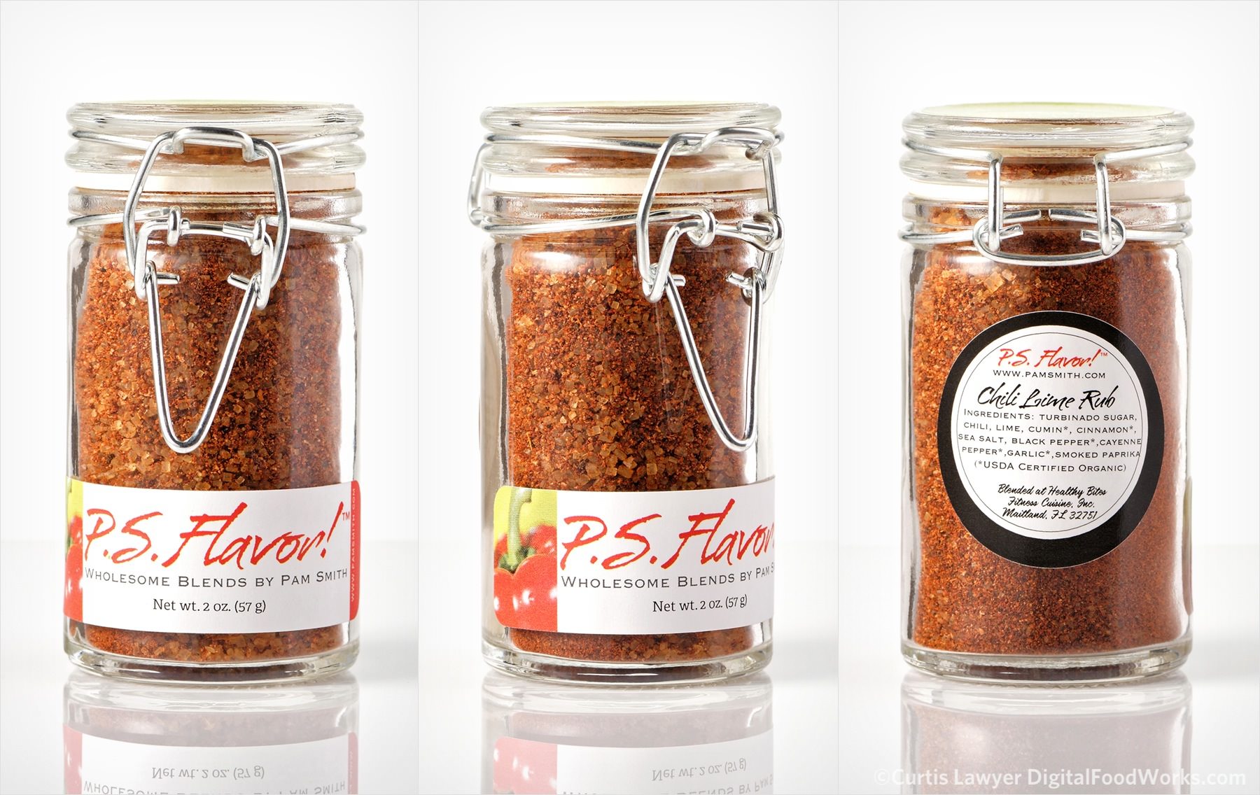
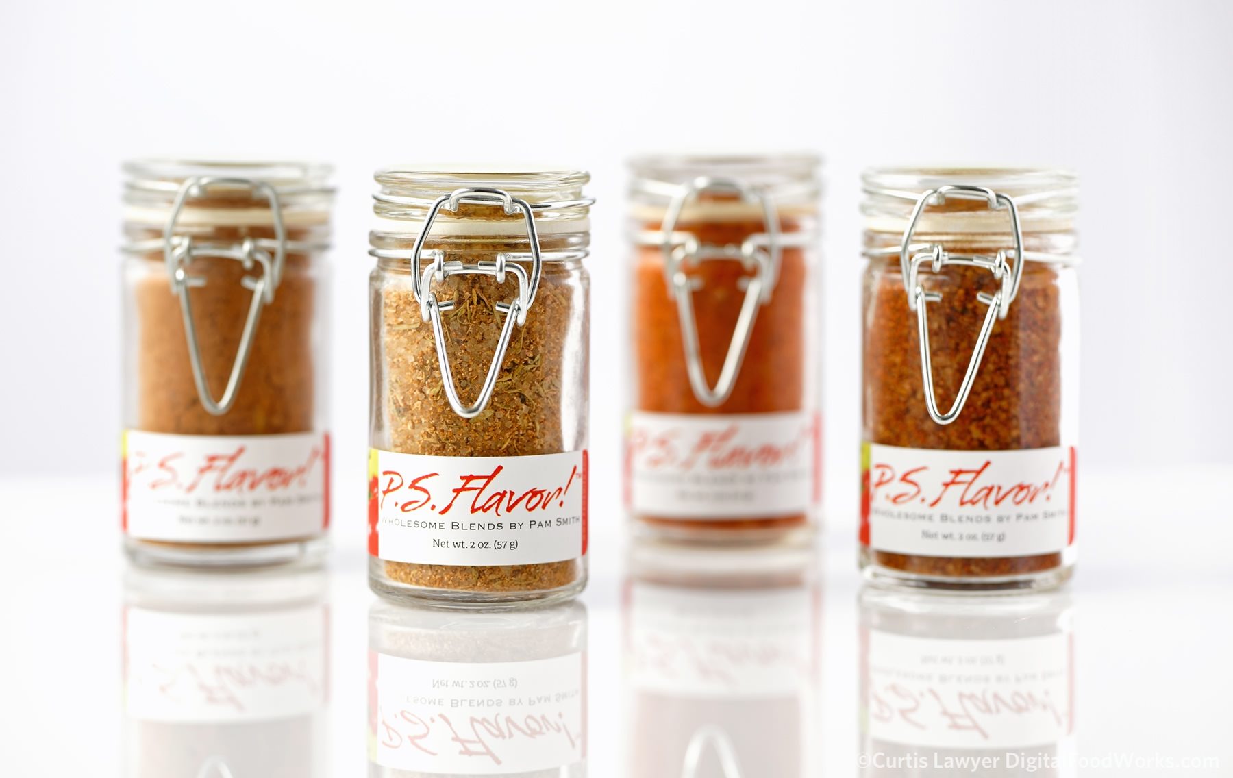
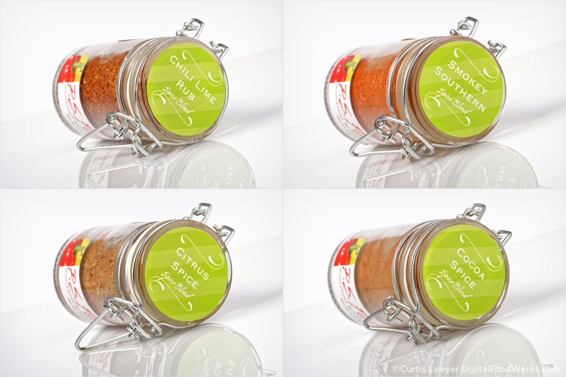
Each of the rubs actually has four angles... the front (not shown here), a three quarters turn, the back and the lay-down.
Each of the rubs were photographed in groups with one rub (the second from the left) being the main focal point.
Each of the spice additives (shakers) was also photographed with the second bottle from the left being the focal point. These were all taken at f/11 and f/4 for different editorial reasons.
Each of the PS Flavor products was photographed using a 36mp digital back so that details in even the smallest powdery Cocoa Spice can be seen.
Creole Kitchen is another one of those bottles I could look at all day long. The Sea Salt and Garlic contrast so nicely with the Black Pepper, it gives the mix a nice texture, along with a great flavor.
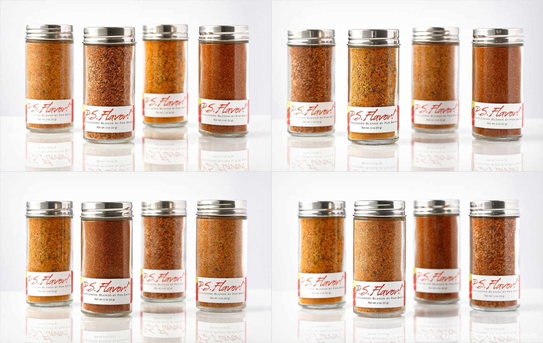
This spice rub group photo was taken with an
aperture of f/4 and features a large depth of field (i.e. only the front most bottle is in focus).
Here's another look at one of the spice rub groups. This photo, (taken with an aperture of f/11), features a large depth of field... (i.e. more of the bottles are in focus).
