Aquafresh and Expanding Waistlines
August 13, 2018Site Notes
 About eight months ago, I started developing a recipe application for a client project that didn't end up moving forward. I started thinking though— a recipe app and CMS might be a cool thing to have for my own Digital Food Works site (and another, separate project that I'm working on) — and so I restarted my development of the recipe application, using DFW (this site) as a sandbox.
As I started implementing the front-end of the recipe app though, I noticed a couple of things that I wanted to change on the main DFW site — and so I've taken a slight pause to get some of these new site-wide changes in place.
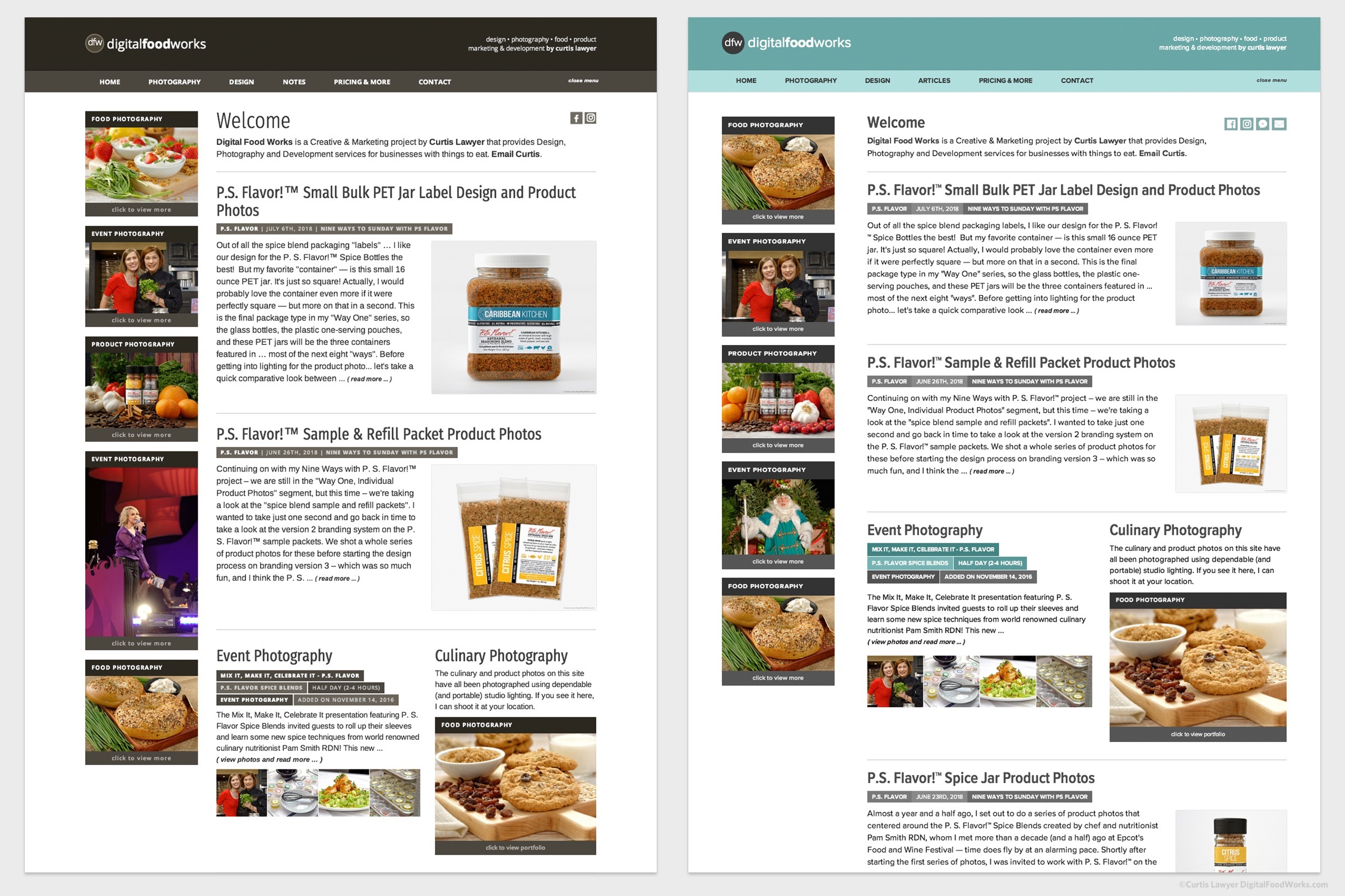
Version 2 is on the left and the new Version 3 is on the right. I've added about 200px to the overall width. I'm not 100% I'll stick with this home page layout, but for the time being, the extra width allows a little more of the text and images to be shown above the fold.
This was important for two reasons — the recipe app is probably going to display in a 2-column format on wider screens and a 1-column format on mobile. Certain iDevices are now triggering a viewport that is larger than what I was scripting for, and I wanted to make the most of all available space. The second reason, (and this is more for some of the other sites that I operate than here at DFW), it gives me space to use more standard banner ad sizes. The strange little "middle mode" will probably trigger a lot of text-based responsive sized ads… but the dedicated desktop mode should be able to handle two stops of common ad sizes.
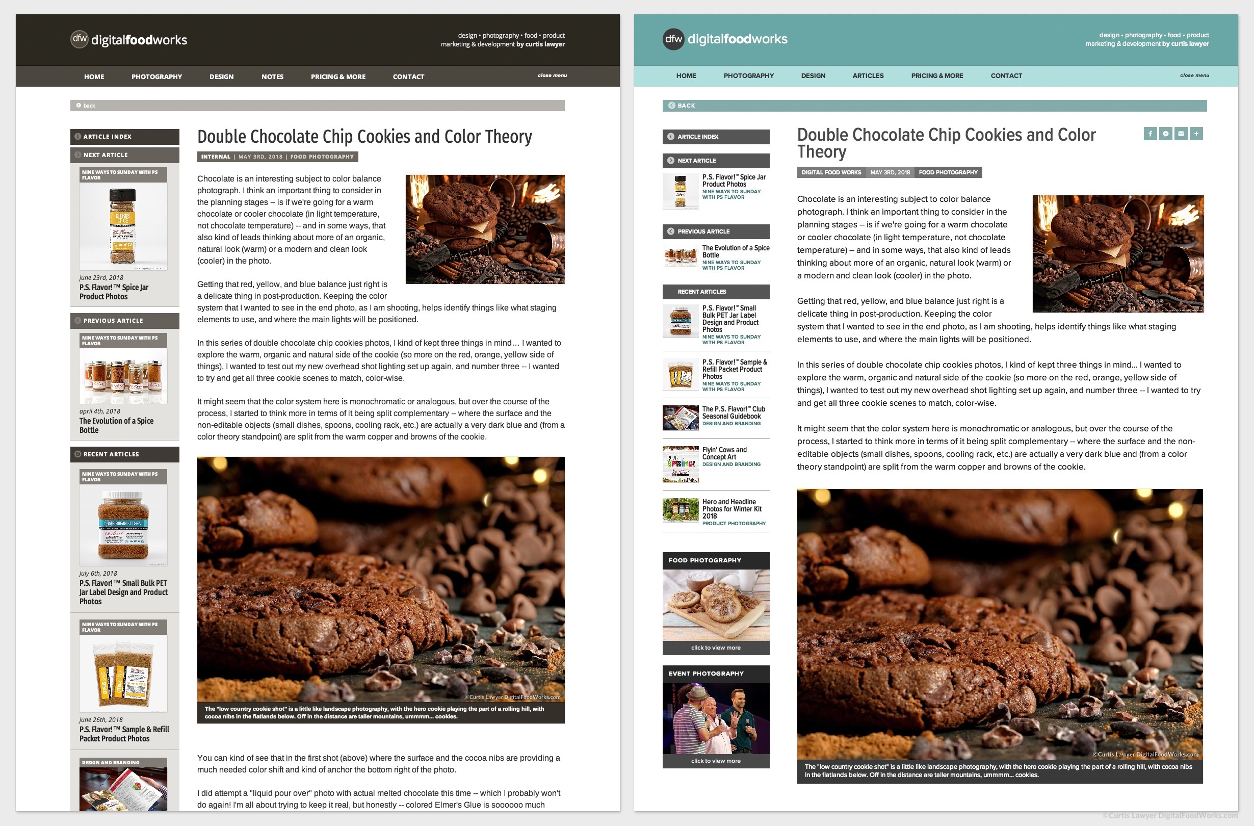
Even though the site is a little wider, the text size and text leading (the space between the lines of text), is a bit larger — which results in all of the content being pushed a little more down the page.
It's tough getting a font system to work and be readable "everywhere" (i.e. on all sized devices), and I'm still getting used to the new, wider viewport — but I think all in all — it's a step in the right direction. The font system does lean a little more to "casual readability" and not "stats and data" so much.
The new "/Fresh" landing page is mostly a place for Instagram's bio link to point to. It's a quick loading page with very little extra code, no menu, no javascript, and inline CSS. It's all built to render as fast as possible.
Getting back to the main site, I have implemented my "accept cookies and web beacons" script here as well (blagh), it's the same routine that I created for the Mealtrip.com site.
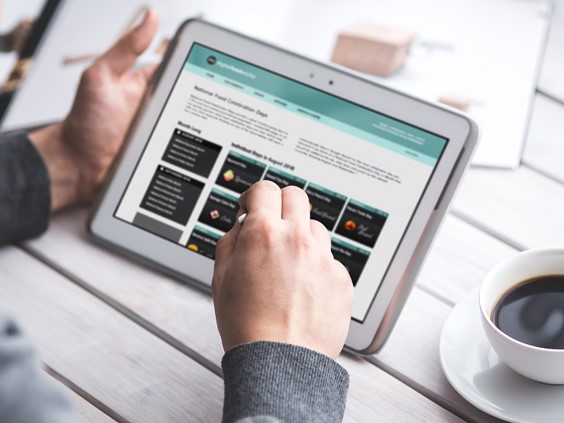
The last change is probably the most visible — I've updated the site to make use of an Aquafresh and Gray color system. The older v2 "Chocolate Brown" color system wasn't really working for me anymore. Saturation and darkness levels of the brown seemed to change a lot on different systems.
I'm not 100% sold on Aquafresh's ability to be "serious" should the need arise — it seems to be very fresh, friendly, light and inviting… but we'll see.
Which kind of leads me one more question about the DFW site in general. What is it? DFW started out as on online portfolio of sorts. Now that I've started writing about various aspects of projects, it feels like it's evolving into something else — but I'm not quite sure what that is — yet.
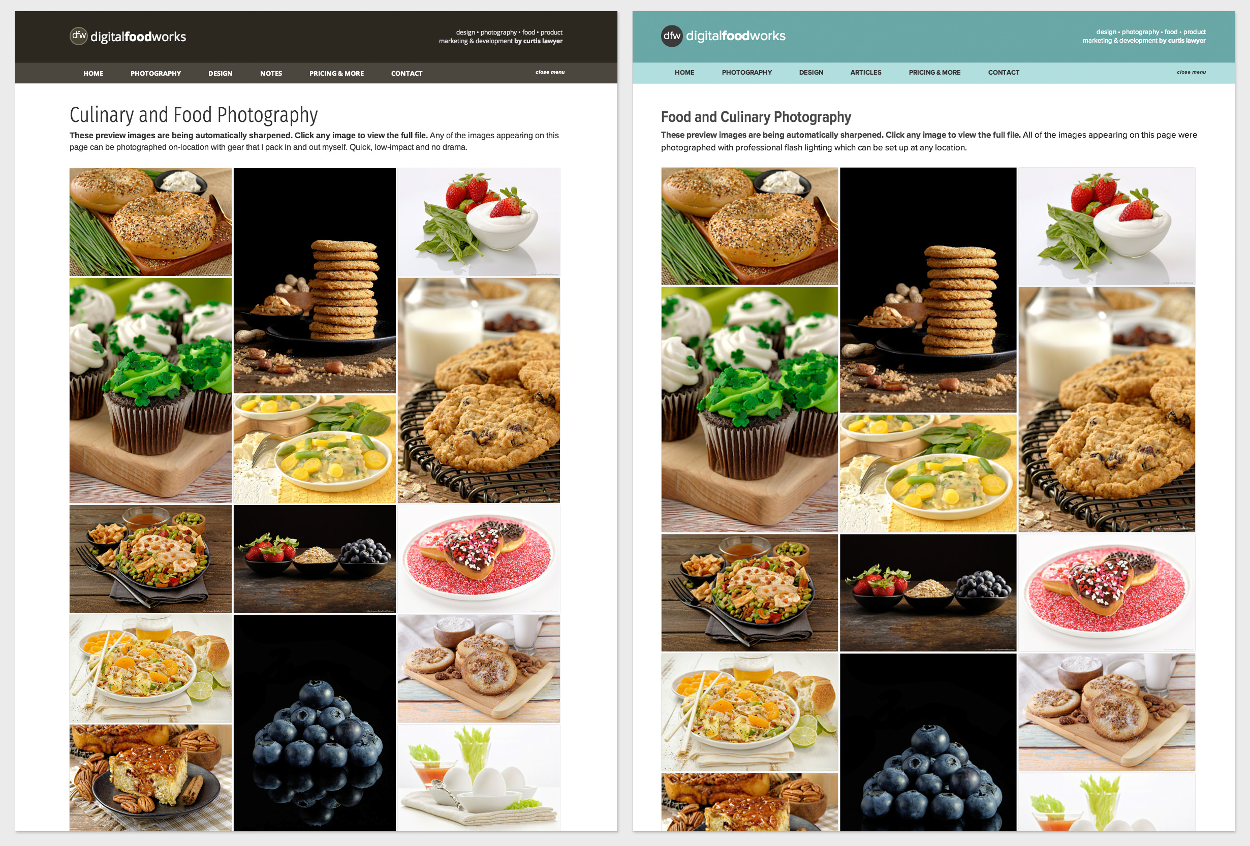
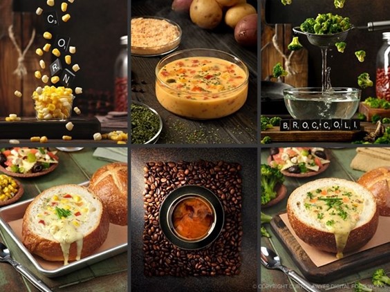
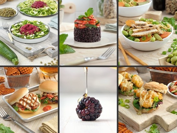
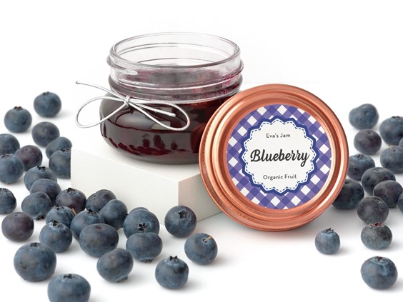
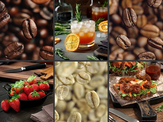
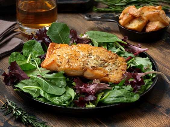
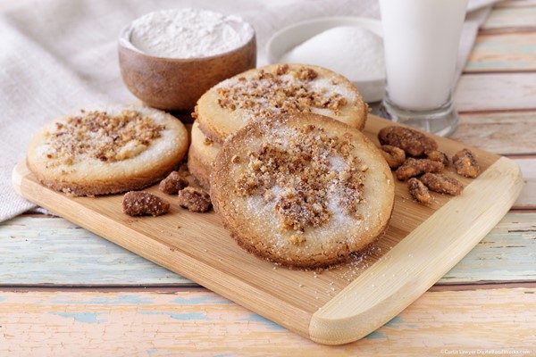
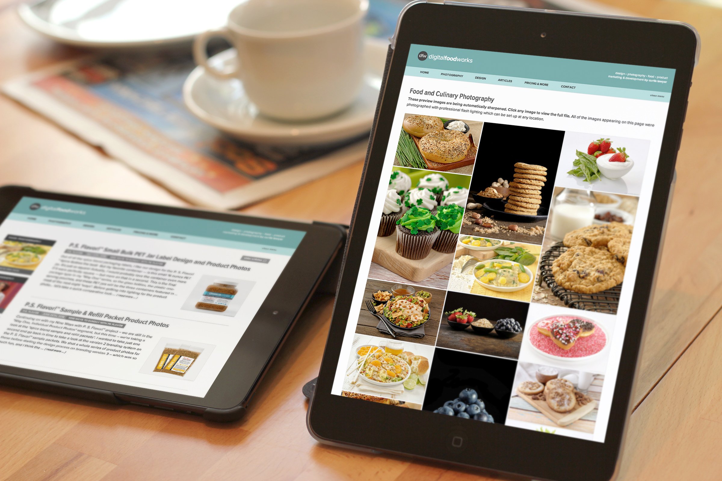
The images on the portfolio pages got a little bigger thanks to the
extra 200px of site width. I stayed with a 3-up grid system because the
image size is still large enough to get a good idea of the photo
quality, a 4-up system would make the photo too small.
At the end of the day, I'm having so much fun keeping the site updated and growing — and I'm just really happy about the work that I'm able to share with the world, through the site pages. There's a couple more changes and additions that I'd like to make to the interface of course, but the bulk of the "big edits" are done for a little while.
One of the really fun things about running multiple sites, is that you never really run out of things to do! We're getting close to Festival and Holiday Season over at Mealtrip.com — so it's time to switch gears, and get some content together for those sites!