Single Malt Whiskies Age Better Than Websites
March 16, 2017Site Notes
 Unfortunately, this article is about websites and not Scotch (hey, at least I didn't bury the lead).
Even though the first iteration of the digitalfoodworks.com site was less than two years old, it was time for a small change. The initial site was still great looking, but there were a few blocky bits here and there that felt out of place. That first version of the site was also not using a full implementation of my multi-over menu system. Long story short, a clean sweep refresh was in order.
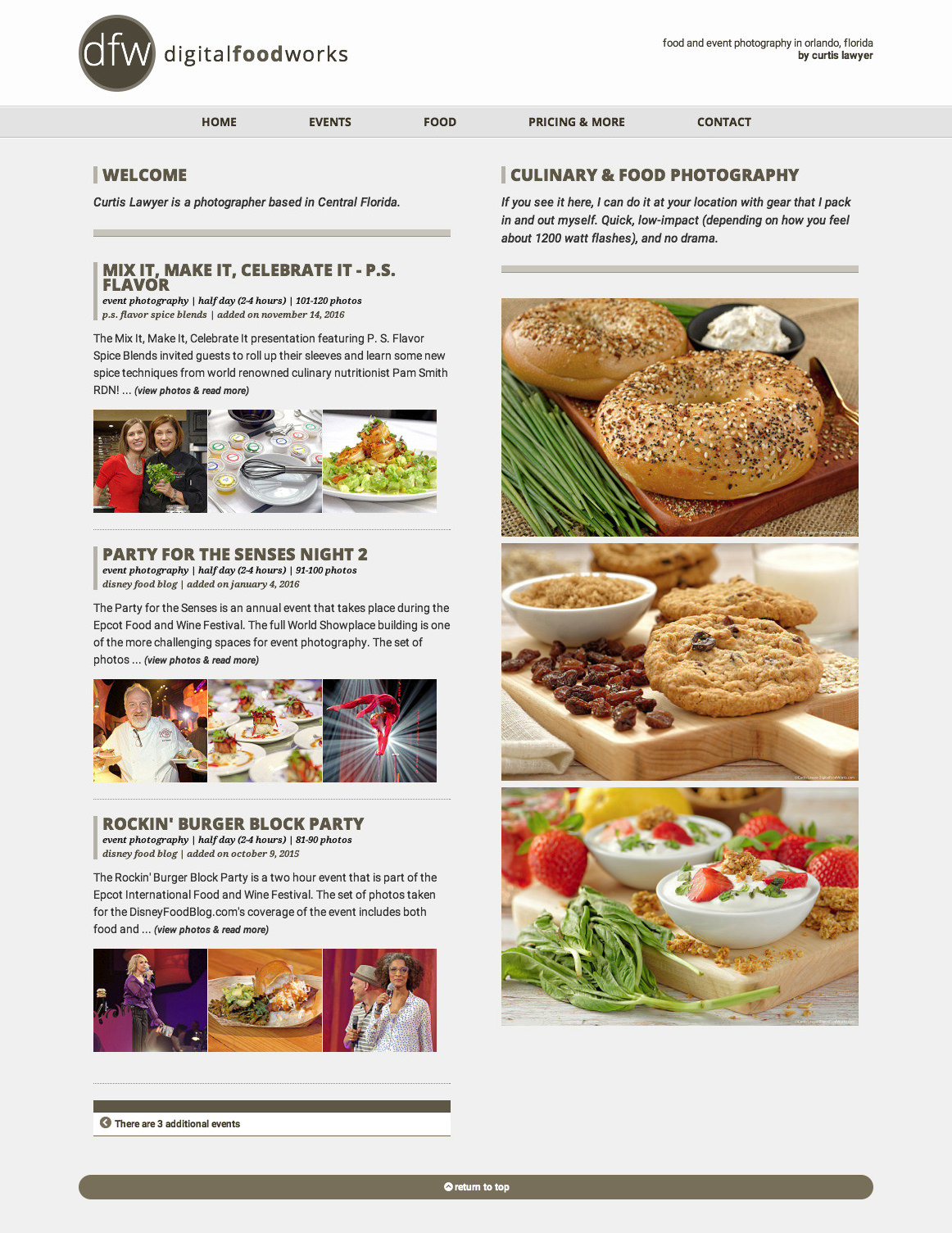
From a visual standpoint, the logo and menu areas have been tightened up. The old site used a caramel color which always felt a bit odd. Pretty, but odd. Now it's all a bit darker, and I can honestly say that there's not much in the food world that is the same color as the menu system. That has been done on purpose. It will make the navigation system more easily identifiable. The logo has also been changed to something that is a lot closer to what the "mobile" logo had looked like previously.
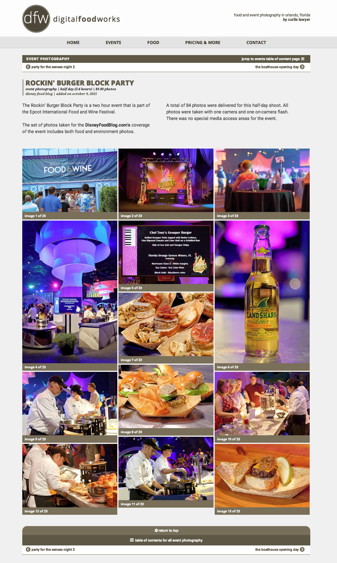
The old site's 'event index' page used javascript to move the event boxes when the page loaded. It was a neat effect and a quick way to make the page 'mobile ready', but it didn't provide a great user experience.
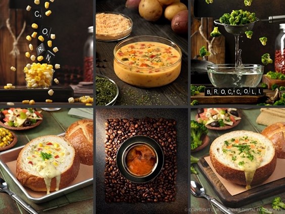
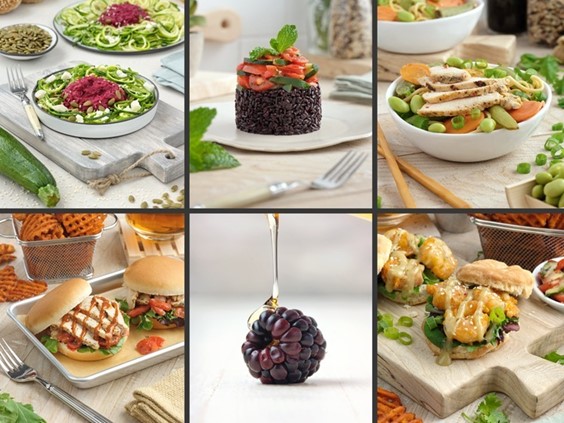
The Food Photography "index" page has (for the most part) been left alone. The photo grid system has some basic lazy loading type features built into it. Now that I can quickly implement secondary items from the main menu, it is much more logical to start separating different types of food photography at that level.
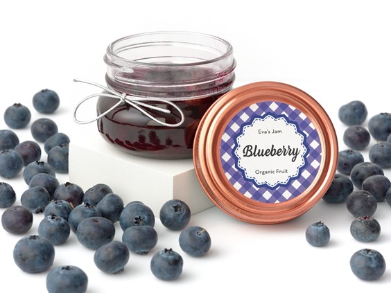
Many of the food photography sites that I have looked at feature giant pictures of food rather than this "grid" system, but I'm not completely sold on that idea. Obviously my photos look great when viewed really large, (which you can see by clicking on any photo), but this site isn't really for me… it's "for" anyone trying to determine if I am capable of creating an image worthy of their product or service. To that end, it's probably best to let site visitors see many great photos quickly rather than showing a single giant photo of a blueberry that fades or scrolls by after an arbitrary amount of time.
The new addition to the site is the are you are in right now... the "Project Notes" area. It utilizes one of my "blog" style blocks from the SpotAdmin suite that I scripted all those years ago. (Yes, I'm a programmer and a food photographer. I can also vamp three chord songs on a piano, who knew?)
A blog-style "project notes" area can be a double-edged pairing knife. Too many times, the front-end site gets neglected because internal projects take a back seat to client projects. Still though, as a copywriter (another hat), you are supposed to write something on a regular basis. Daily, I've been told. So my hope is that by installing a "project notes" segment to this site, to my personal portfolio site curtislawyer.com, and the ever hungry mealtrip.com site's multitude of copy entry points... that I will write more. We'll see how that goes.
Now that I've completely buried the social media lead… this site and my HCF objectives. Everything seems to be a push. Refreshing this site wasn't really high on my HCF list of things to do, but it does act as kind of a "jar" that will hold information about other things coming up soon. Now that this site more "done" than "not done", I now have more logical place to write and show photos of those other food based product, photography, marketing and publication projects.
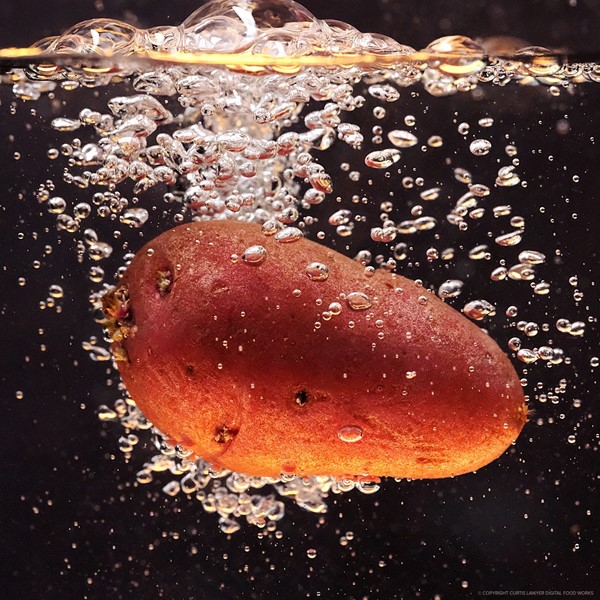
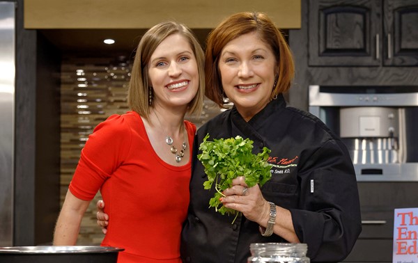
Below are a couple of screen shots from version one of this site, just for reference. Thanks for reading along!