P.S. Flavor!™ Small Bulk PET Jar Label Design and Product Photos
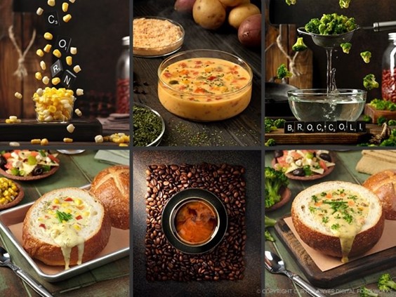
July 6, 2018Nine Ways to Sunday with PS Flavor
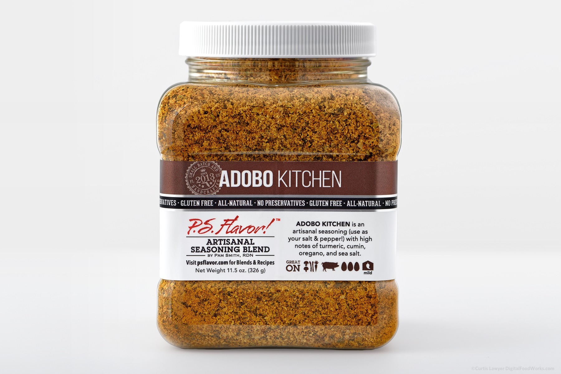
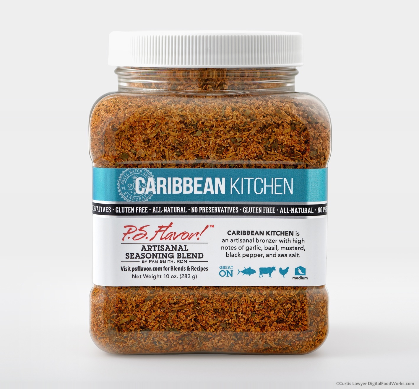 Out of all the spice blend packaging labels, I like our design for the P.S. Flavor!™ Spice Bottles the best! But my favorite container — is this small 16 ounce PET jar. It's just so square! Actually, I would probably love the container even more if it were perfectly square — but more on that in a second.
This is the final package type in my "Way One" series, so the glass bottles, the plastic one-serving pouches, and these PET jars will be the three containers featured in … most of the next eight "ways".
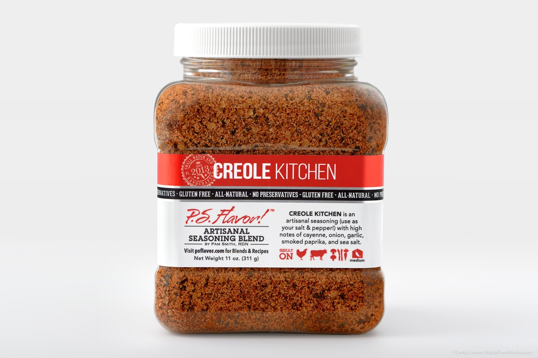
Before getting into lighting for the product photo... let's take a quick comparative look between the retail glass bottle label and this bulk food service jar label. The bulk PET jar has these really convenient gripper handles built into the back of the jar. For this reason, a wrap-around label similar to the glass bottle label — wasn't going to be possible.
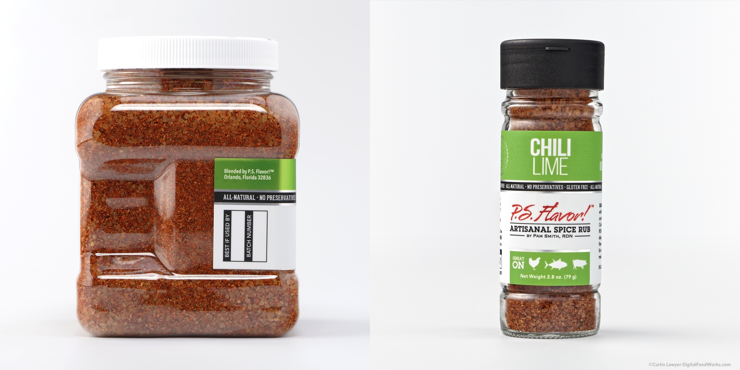
Ooooooo, curvy! The bulk jar (left) has gripper handles that are molded into the plastic, making a "wrap around" label impossible. The retail glass bottle (right) has smooth sides all the way around, and uses a label that very nearly makes it all the way around the bottle.
Another small hiccup was that the top and bottom quarter of the jar pucker out (probably to maximize the volume of the interior). This is a fairly common design right now, so it's something that anyone having to put a label on this jar is going to have to deal with. It limits the total height of the label to 1.5 inches and a total possible width of around 6 inches. To stay on the same print stock as the bottles though, we opted to keep the label down to 5 inches wide. There is one other flat space on the back of the jar … a small 2 x 1 inch area ended up being a great place to add some background verbiage about the blend's creator, Pamela Smith, RDN.
Being as cost-conscious as possible, we packed a few more collateral stickers in the remaining area of the total print area. While this does mean there are going to be quite a few cuts on the 5 x 2.5 label stock… it does at the end of the day, save money!
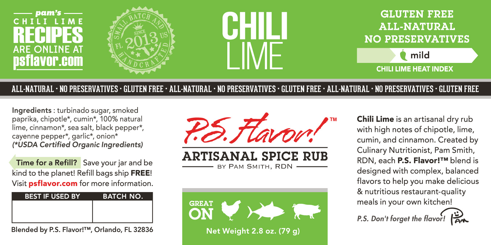
The PS Flavor!™ retail bottle label is a 5 x 2.5 full wrap.
There is only 1.5" of available height on the bulk jar, so I set up an additional back-side label and three more "stickers" in the extra space. Printing on the same 5 x 2.5 label as the retail jar saves set-up time on-press, and makes the best use of material that would otherwise be discarded.
Lighting this little guy — was not quite as complicated as the other two package types, but there were still a couple challenges. One that remains consistent across all the labels is the metallic backed substrate that is used. It looks amazing on a shelf, begging you to pick up the product and investigate further — but just like with the glass bottle and plastic pouch labels — you can't really dump a ton of light directly on the front of the surface. All that light ends up bouncing right back at you, and causes some strange banding issues that make the color (and white) blocking appear uneven.
Another interesting issue was that little pucker in the jar at the top and bottom. Any amount of usable top lighting would hit those pucker points and create a massive white reflection at the top — and a shadow at directly underneath. This had the effect of drawing your eye to the twist top instead of the label and the name of the blend.
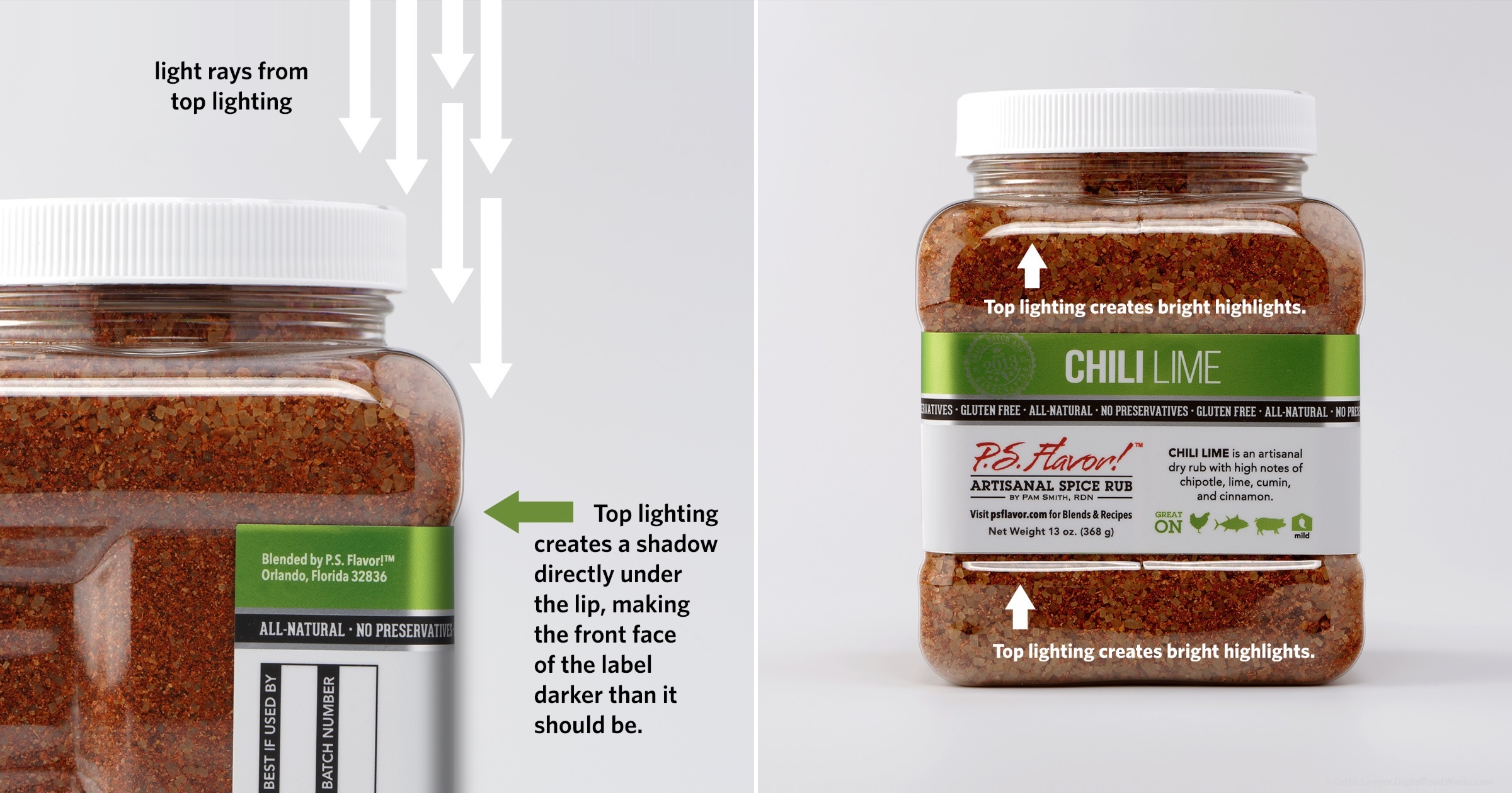
Any amount of top-down or front-based lighting creates really bright
highlights on the plastic jar, and then a shadow directly under the
overhang. Unfortunately, that's where our front label is!
In order to more evenly light the spice blend in the jar and really make the label the focal point — we had to loose some of those hard angle light reflections on the jar itself. This meant no "direct down" lighting from above, the product was evenly lit from both sides using two really tall light panels coming in at 90 degree horizontal angles. Any light making it to the front of the jar, is indirect "bounce" lighting — from a single panel to the front and left of the jar and "bounce" up from the white "floor" surface itself. There's also a fair amount of "spill" light coming from the large panels.
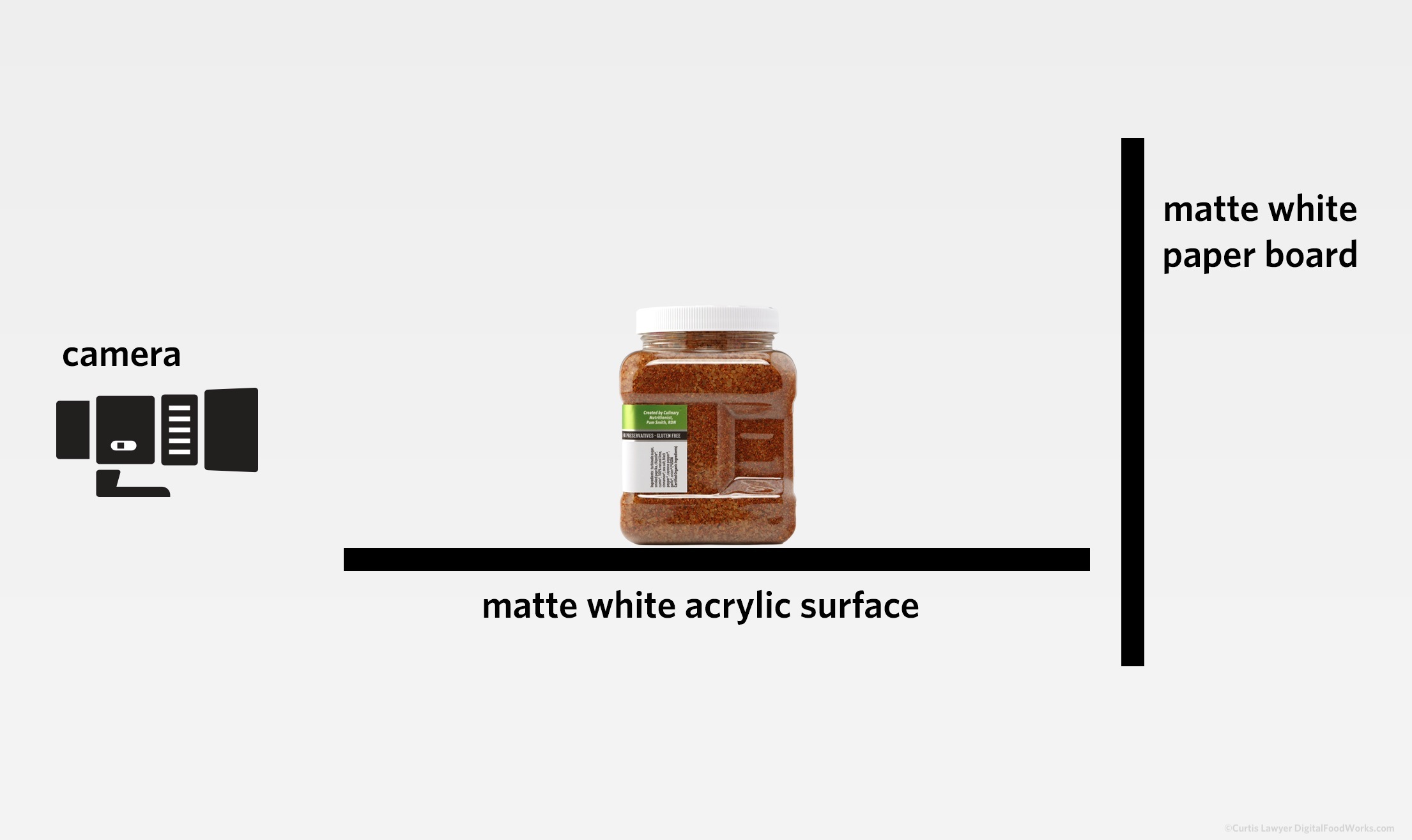
I used a normal background for this one (i.e. no seamless was necessary because the horizon line hit at a really straight part of the jar, as was easier to correct for in post-production).
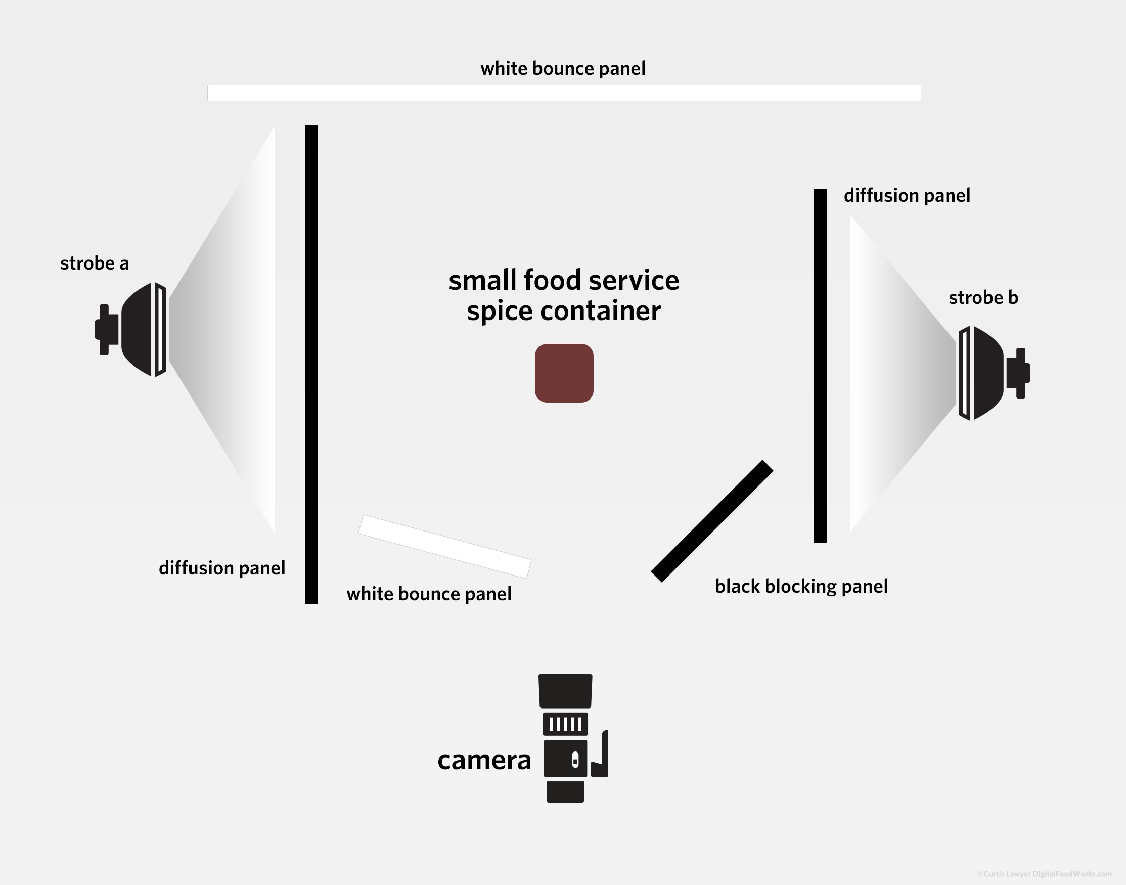
All of the light was provided by two large surface panels located to the side of the main jar. Any light hitting the front of the jar was indirect bounce or spill lighting from the floor surface or a single bounce card in front of the jar.
This time, none of the strobes were polarized — but the camera lens was still polarized. This was done to control some of the reflections on the jar… but I didn't need to completely reject light from a particular direction this time. No seamless background was needed here either… the "horizon" fell on really straight bottle sides and was fairly easy to edit in post-production.
You can read more about the P.S. Flavor!™ Spice Blends at http://psflavor.tumblr.com
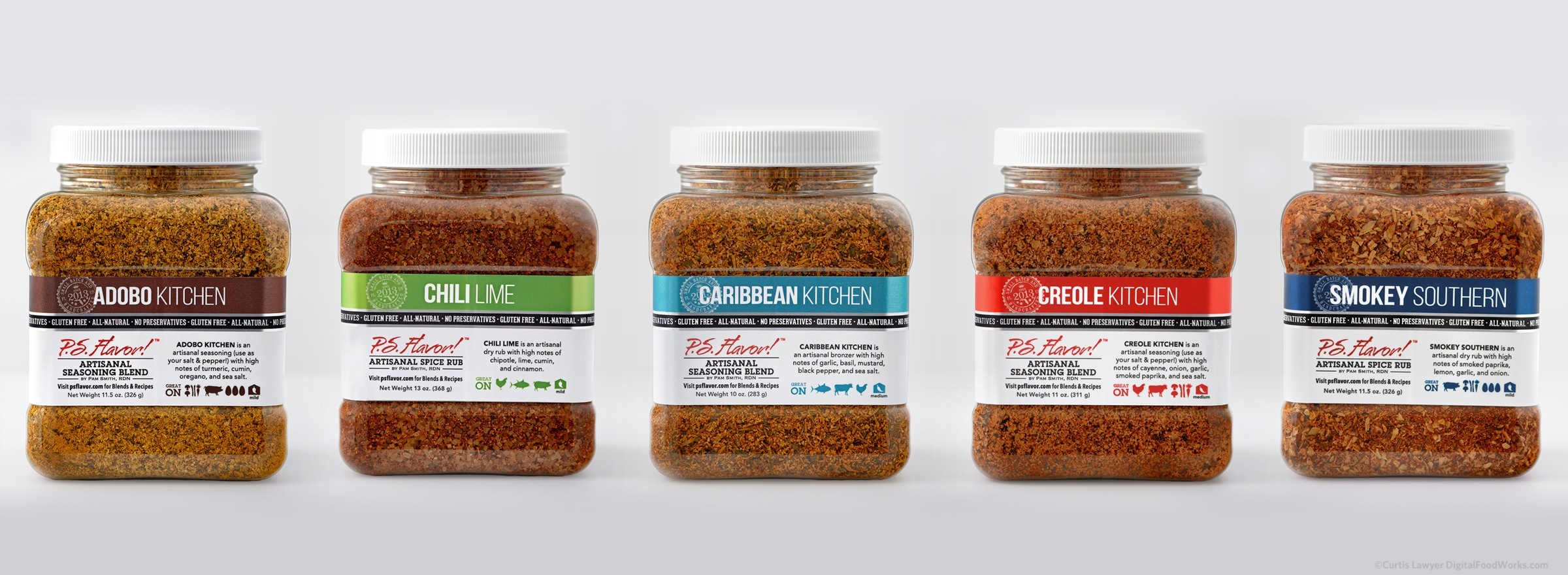
Below are a couple more of the bulk jar photos from the series. You can see more of these and some of the other P.S. Flavor!™ "branding version three" container types in my isolated product photo gallery page by clicking here.
Next up… "Way Two" of my "Nine Ways" project! Yay!!! (Although technically, I think the "way two" idea actually went into production before we even got the labels back from the press house!) These will get fresh again — once we get to ways three, four and beyond!!!