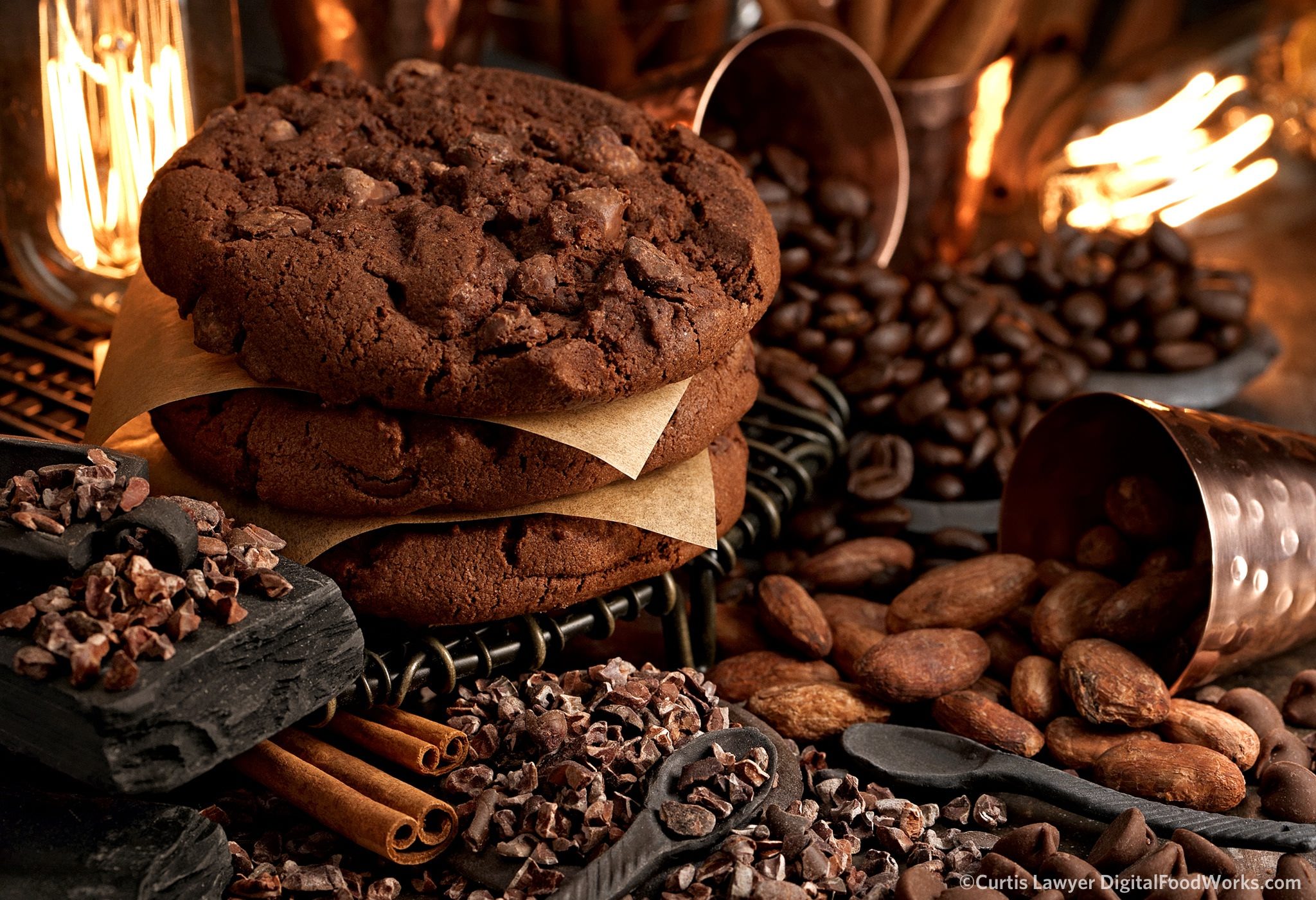
Double Chocolate Chip Cookies and Color Theory
May 3, 2018Food Photography
 Chocolate is an interesting subject to color balance photograph. I think an important thing to consider in the planning stages -- is if we're going for a warm chocolate or cooler chocolate (in light temperature, not chocolate temperature) -- and in some ways, that also kind of leads thinking about more of an organic, natural look (warm) or a modern and clean look (cooler) in the photo.
Getting that red, yellow, and blue balance just right is a delicate thing in post-production. Keeping the color system that I wanted to see in the end photo, as I am shooting, helps identify things like what staging elements to use, and where the main lights will be positioned.
In this series of double chocolate chip cookies photos, I kind of kept three things in mind… I wanted to explore the warm, organic and natural side of the cookie (so more on the red, orange, yellow side of things), I wanted to test out my new overhead shot lighting set up again, and number three -- I wanted to try and get all three cookie scenes to match, color-wise.
It might seem that the color system here is monochromatic or analogous, but over the course of the process, I started to think more in terms of it being split complementary -- where the surface and the non-editable objects (small dishes, spoons, cooling rack, etc.) are actually a very dark blue and (from a color theory standpoint) are split from the warm copper and browns of the cookie.
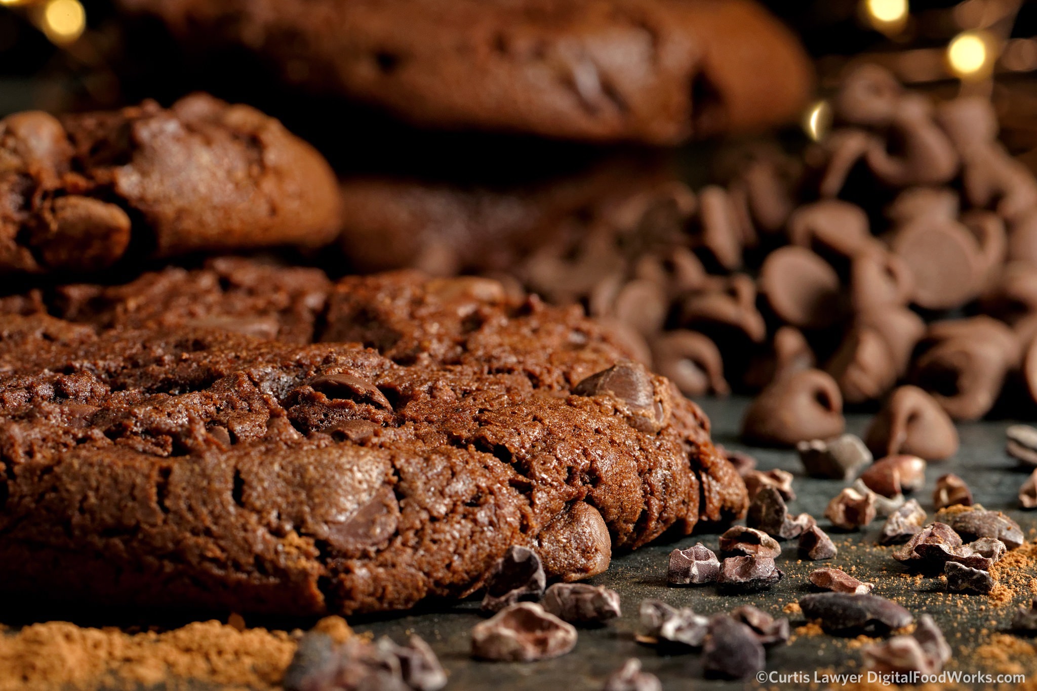
The "low country cookie shot" is a little like landscape photography, with the hero cookie playing the part of a rolling hill, with cocoa nibs in the flatlands below. Off in the distance are taller mountains, ummmm... cookies.
You can kind of see that in the first shot (above) where the surface and the cocoa nibs are providing a much needed color shift and kind of anchor the bottom right of the photo.
I did attempt a "liquid pour over" photo with actual melted chocolate this time -- which I probably won't do again! I'm all about trying to keep it real, but honestly -- colored Elmer's Glue is soooooo much easier to work with!
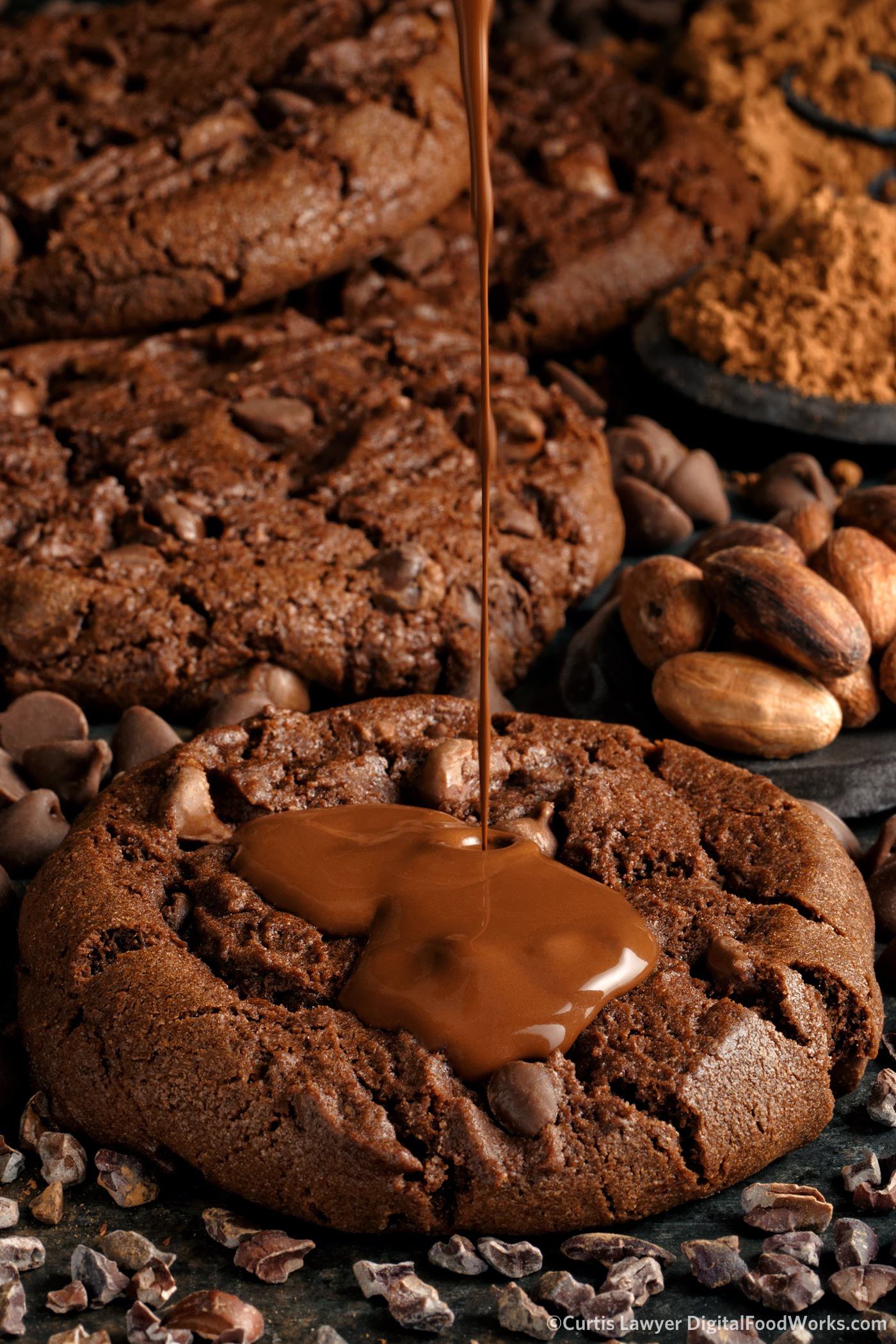
I was really surprised at how good the "square" version of this photo turned out when formatted for our Instagram feed. As it turns out, you don't have to see the "whole" pour for it to be effective.
For the overhead shots, I wanted to try out a new overhead lighting set up I've been developing -- which is designed for speed more than anything. It worked out really well for the seamless texture shots that I've been testing it with, and wanted to see how the light would fall over a slightly larger area.
I think these turned out good, however, the soft and fairly non directional lighting may be more suited to lighter toned photo. Maybe. I don't know, that's what testing is for! Every new set up has a useful purpose!
In post-production, these overheads really felt right and just looked amazing with that "lower dark tone contrast" treatment -- where there isn't really any 100% black in the photo anywhere. You basically bring up anything darker than 90% to the 90% level.
I reduced the dark tone contrast a bit in post production. From a color balance standpoint, the overheads have a bit more blue and are a little less "warm" than the others. Interestingly, the overhead shots were taken with LEDs with a CRI of >91 and all the other chocolate cookie photos were taken with strobes that have a CRI of >93 -- hummmmm.
The final scene of the three is where the cool blacks and slate grays start to form the basis of my split complementary theory. In context, they look like true neutral dark tones, but they do measure slightly blue from a technical "by the numbers" standpoint.
I love that I got to use the Edison lightbulbs in the photo. They sort of remind me of a hot oven -- and that plays into the fresh cookie idea.
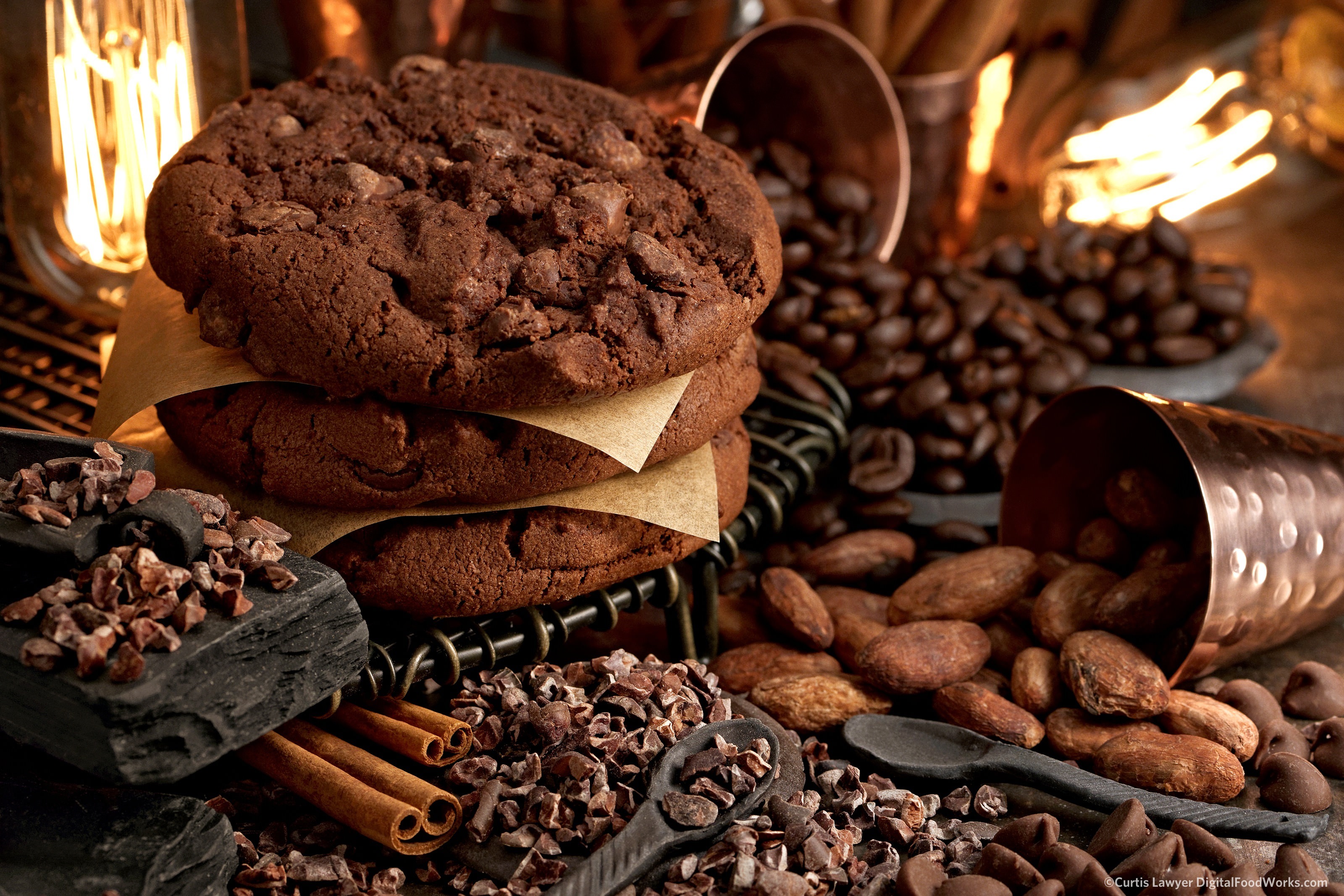
Two Edison-Era lightbulbs were placed in each corner of the photo and remind me of a hot oven.
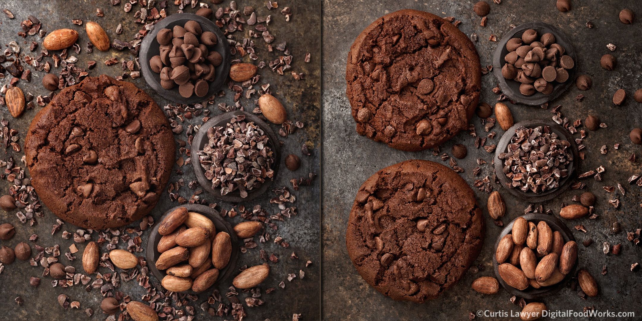
In post production, pulling back on the yellow and orange just a little bit, starts to reveal more of the blue tones in the slate and stone elements in the photo. When seen side-by-side, the difference is quite dramatic.
The photo on the left shows the "black" acting more as a dark blue as you might see in a split complimentary system. To me, the scene is starting to take on a bit more of an edgy tone. While the more analogous color system on the right appears to be softer and definitely warmer.
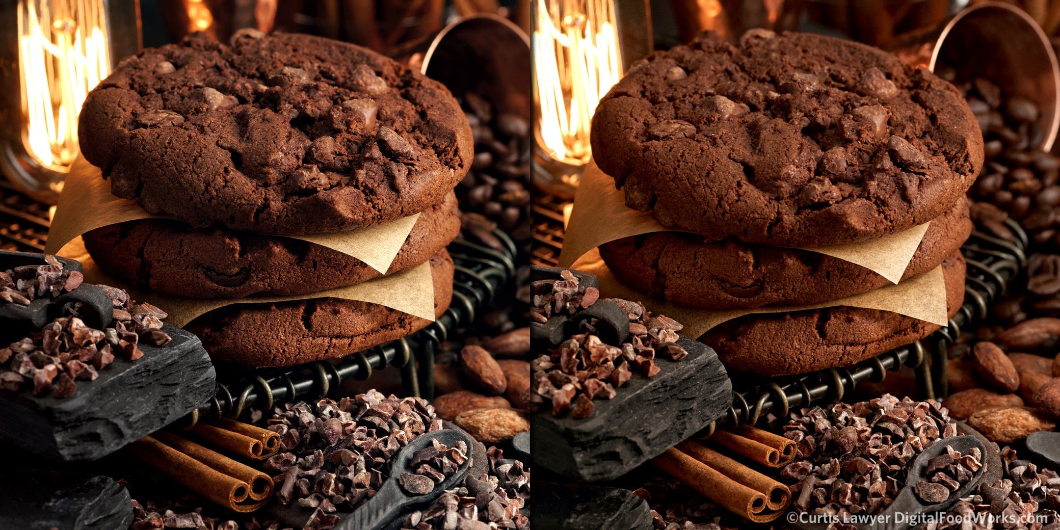
Left Photo : The yellow and oranges in the photo have been balanced (i.e. reduced) by setting the dark stone elements to a true gray. Right Photo : The stone and non-chocolate elements are picking up more of the warm color hues from all the other objects in the photo.
I hope I get a chance to do a series of cooler chocolate photos and then put them all side by side. For right now, I'm leaning to this darker and warmer chocolate idea for dark toned photos. I'm thinking that in a lighter toned photo, where the chocolate elements need to be in a high contrast setting, or even "on white" -- moving to a cooler blue color temperature is going to be needed to keep the chocolate elements from looking too yellow against the light tones.