The Bottle Lighting Ceremony Photos
December 25, 2017Design and Branding
JUMP TO THE PHOTO GALLERY
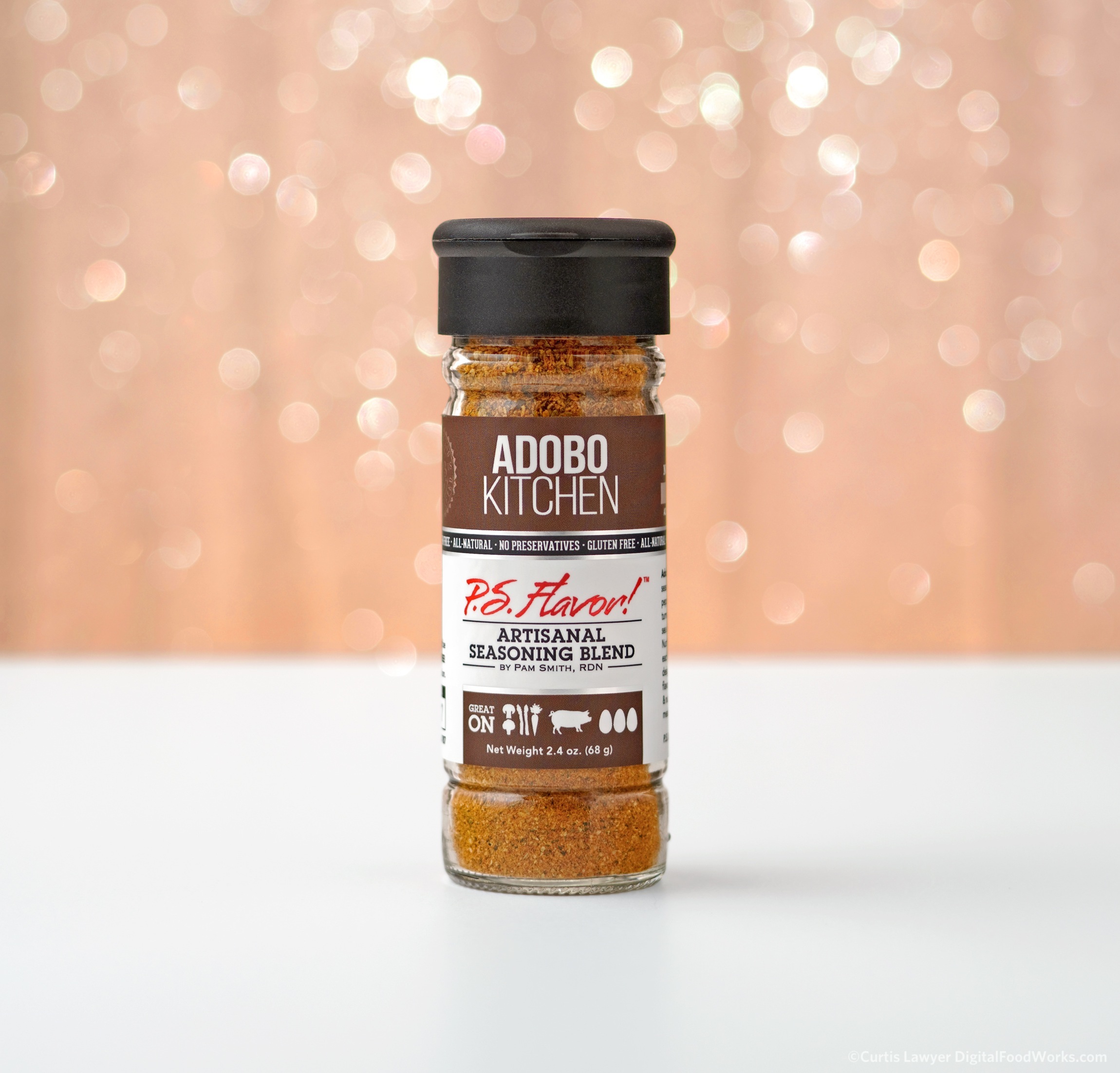
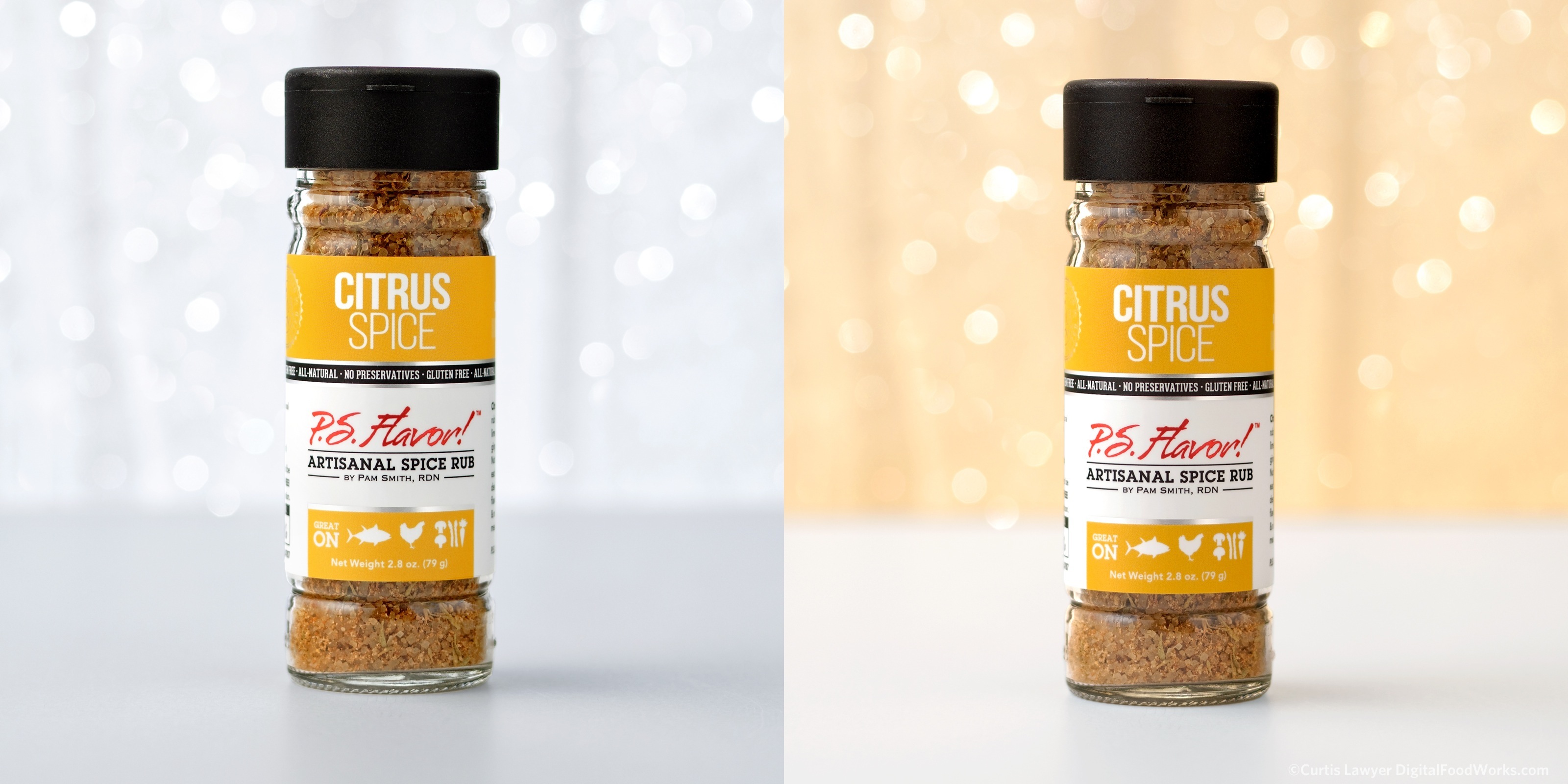
Answering the question, can you make light brown? Yes, yes you can!
Continuing with the P.S. Flavor!™ bottles, we needed some Christmas themed photos of each blend, just to have for social and media purposes. Naturally, I went back to the silver mesh, but wanted to give it a lighter feel… more like Christmas lights. The setup was the same, but just using a white background in the very back, gave the silver mesh a much lighter feel. A color gel to match the label color was selected for each blend. And so… the whole "bottle lighting ceremony" idea was born… a loose concept (because there was not much time available here)… that if these bottles were Christmas Trees, what colored lights would they put on.
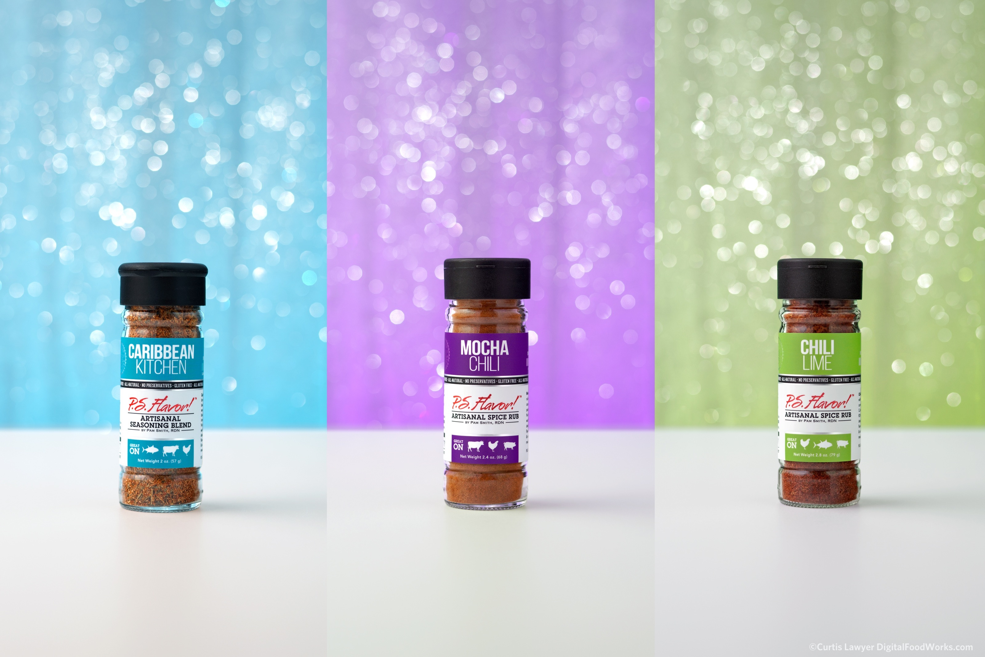
Matching a gel to the color of the label wasn't too difficult. Fortunately I have several gels on-hand to choose from. The gels are also stackable, so if the color isn't quite right, you can generally get it to move in a certain direction by layering colors. The green for example, also has a 1/2 CTO gel to get it closer to the "lime" that's on the bottle label.
We have been shooting the blends with an acrylic surface, but that ended up being a little too crazy busy, picking up light and color from everywhere this time, so I ended up using a non-reflective surface for this series.
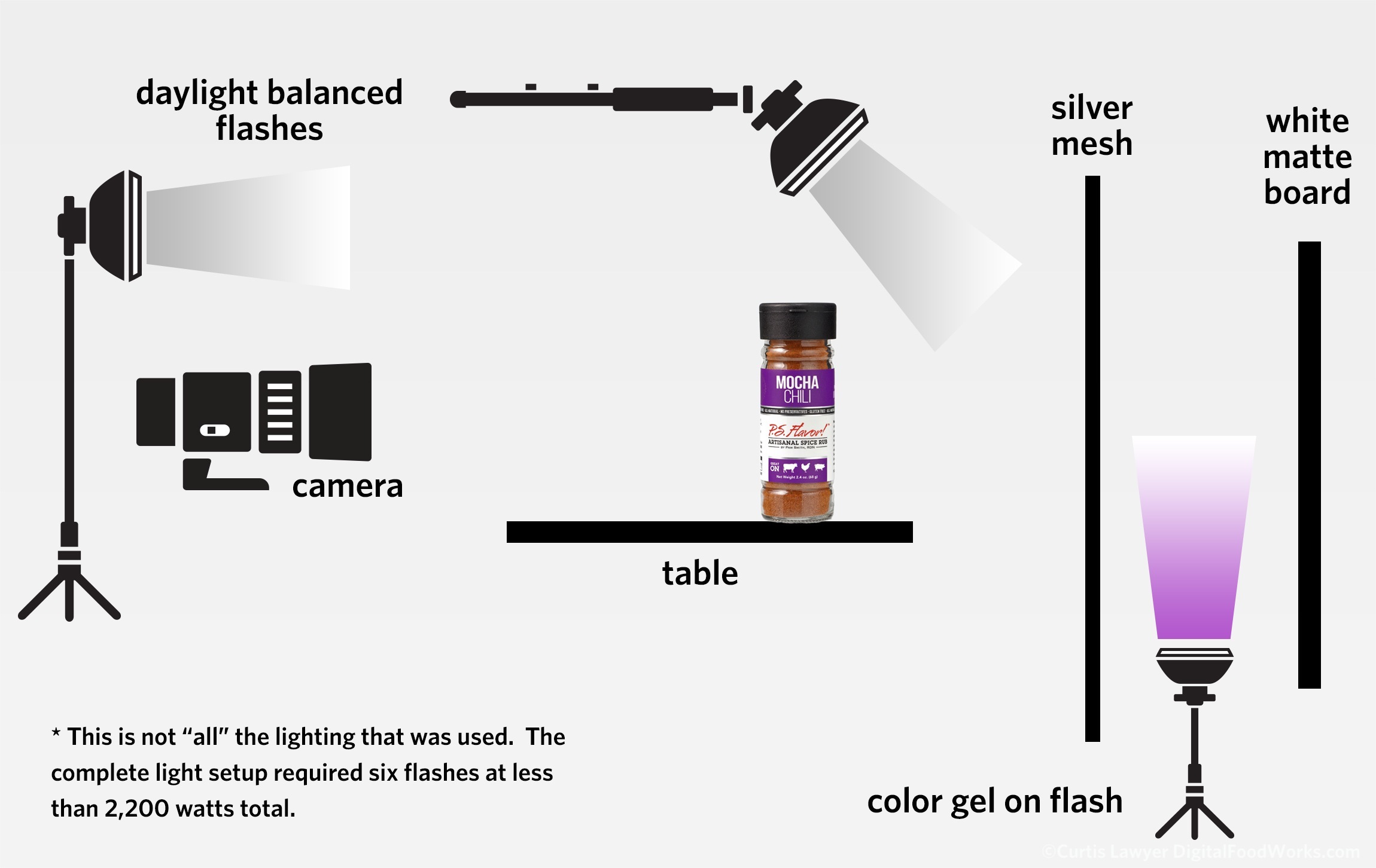
The trick here was trying to keep the silver specs on the front of the mesh silver, while allowing the color light behind the mesh to fill the space. Some, of the color can spill out onto the board (it's just unnatural looking if there's none) but you don't want too much. The white label has to match the white surface as close as possible.
The real trick, is trying to make sure the backing color is visible, but not letting any of that colored light spill onto the surface or the bottle. A really high, focused flash positioned directly over the top of the bottle and pointing slightly down and directly at the mesh solved that issue, and also helped keep the silver mesh, looking silver.
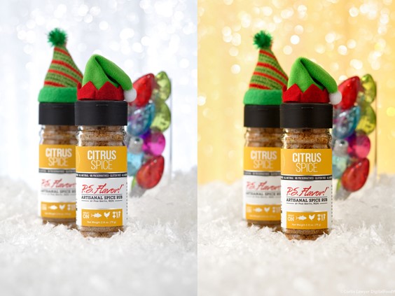
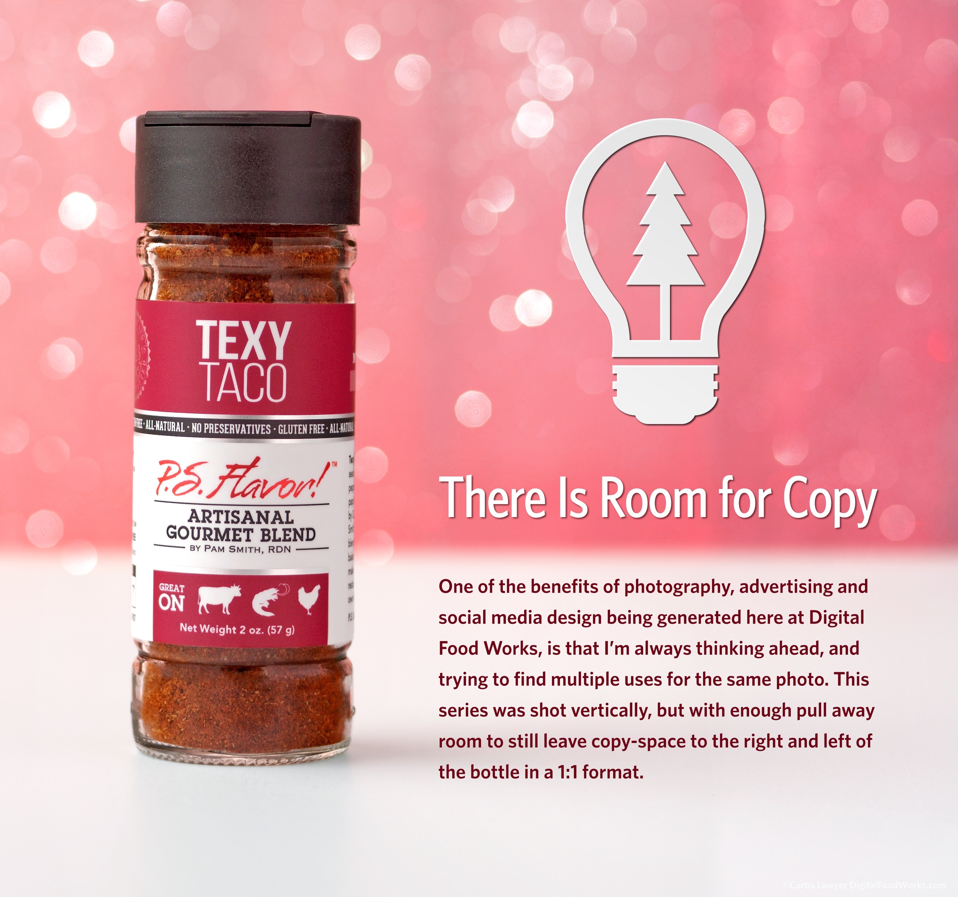
The series was shot vertical and centered but there is enough pull away room to get some copy space in vertical or a 1:1 format if it's needed. I have a feeling, I will also be using these photos in a motion clip, very soon.
Here are a couple more shots from the series, which comprised all ten P.S. Flavor!™ Spice Blends... Thanks for reading along, and Merry Christmas Everyone!!!
Each bottle was photographed with the gelled flash on and off. I had to take the flash power up a couple steps when the gel was being used, depending on the color.
There is enough room around each photo to allow for different cropping options. A right and left sided 1:1 and full vertical are possible. Something like a 4:3 could also be achieved, but the bottle does end up in the 'center' of any horizontal crop.
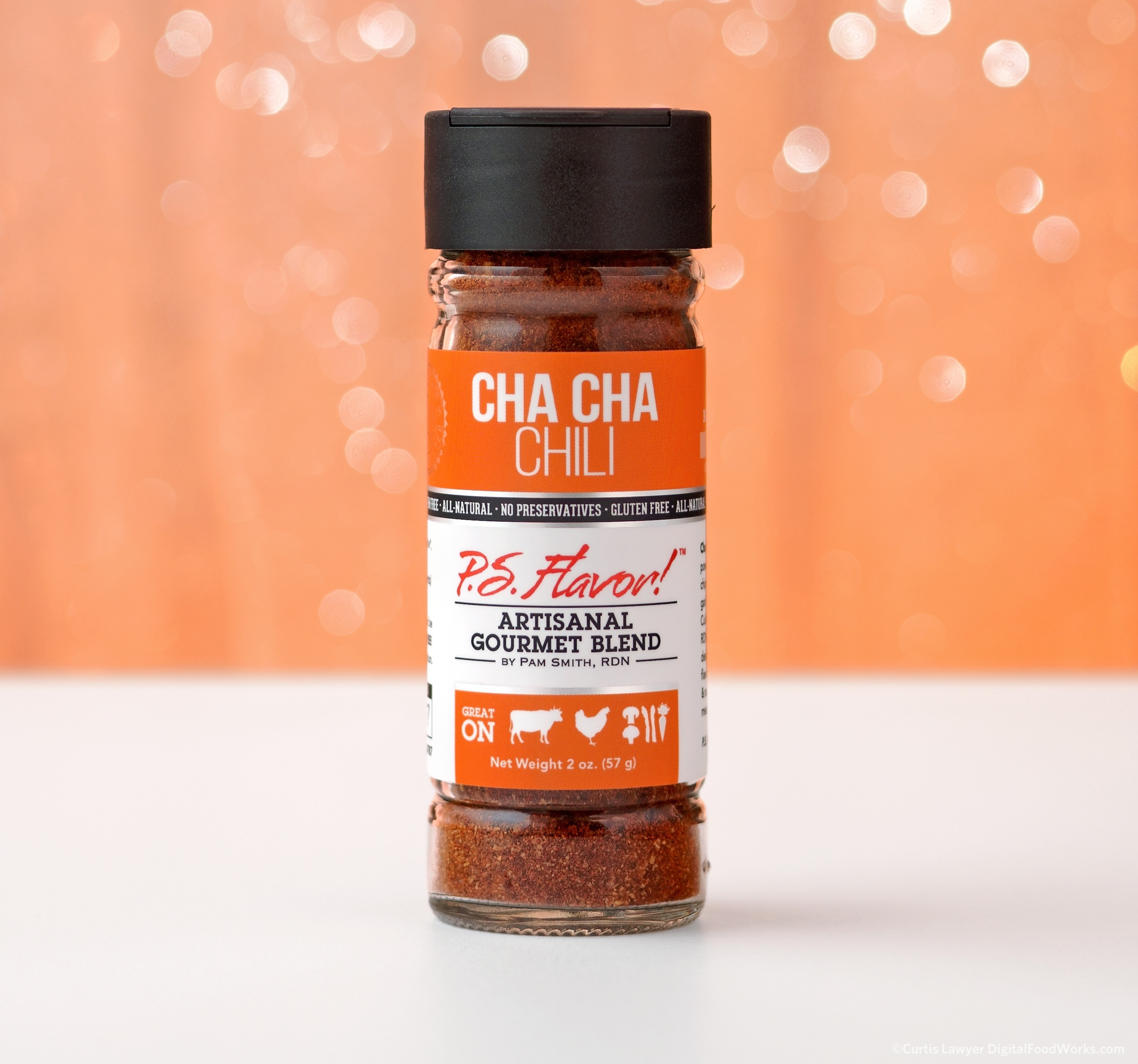
The Cha Cha Chili bottle was one of the trickier ones to photograph with its matching color gel. The bright orange gel starts to bring in parts of what you would get with a full CTO, but times 10! The contrast of have a "pure" white with the black parts of the bottle is important to the overall composition of the photo.