Branding Version 3.0 - Ten Design Elements on P.S. Flavor!'s New Label System
November 6, 2017Design and Branding
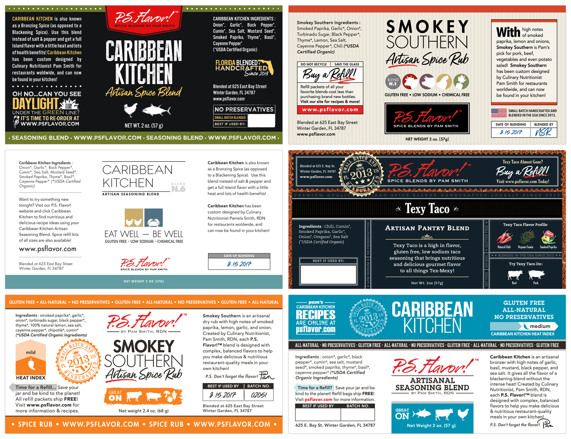
Just a few of the P.S. Flavor! label designs leading up to the final production label.
After 24 sometimes major and also very minor sample variations... we have created an amazing label system and branding base that has miles and miles of practicality and growth built into it!
Before getting back to my photography project with the product... I wanted to dedicate a page to... and outline... the various part of P.S. Flavor!™'s new label.
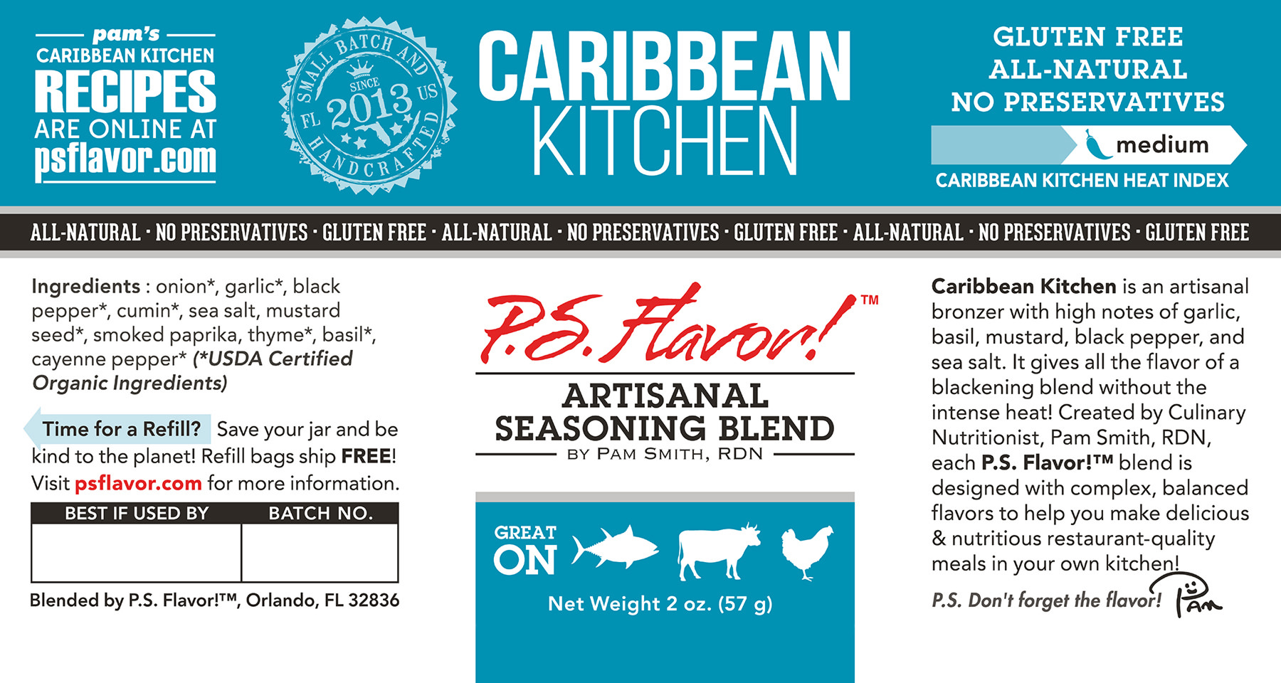
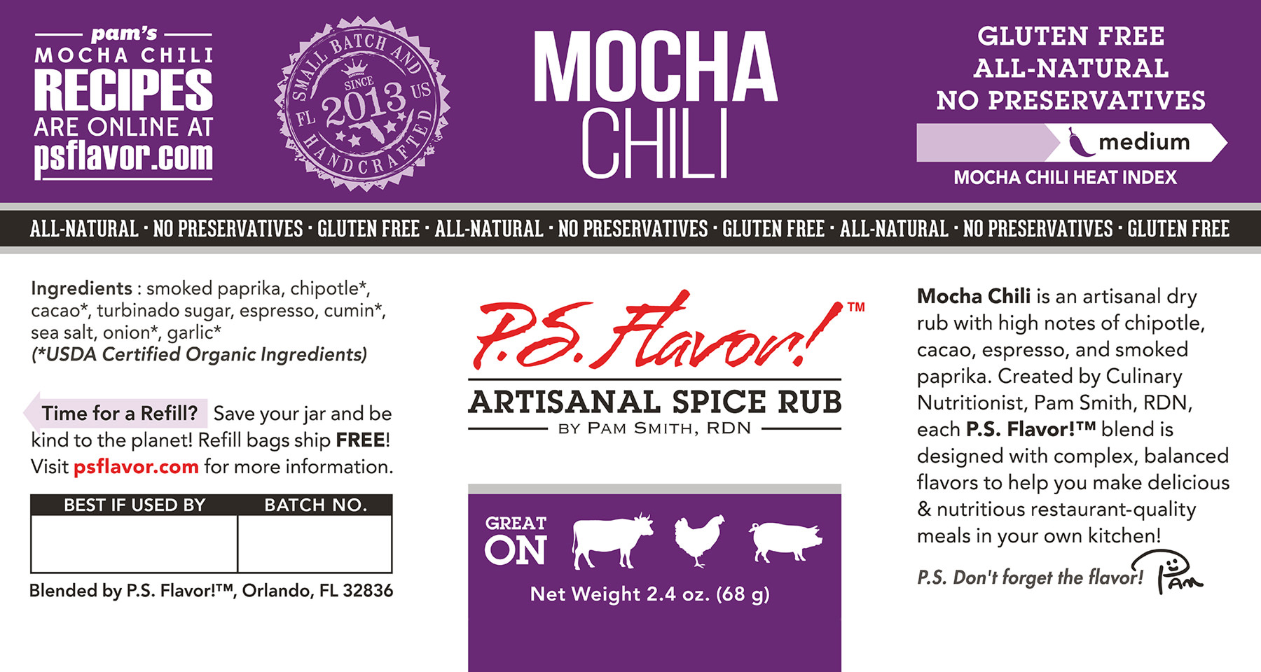
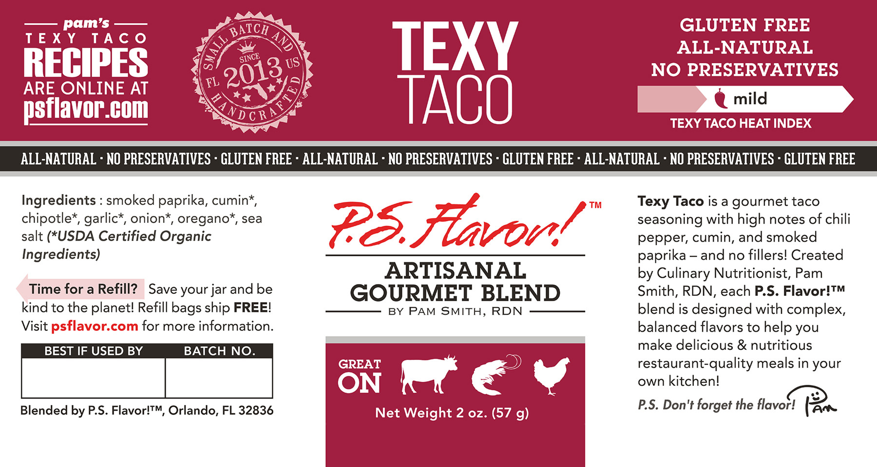
The P.S. Flavor!(tm) logo is printed as a red metallic element on all of the product labels.
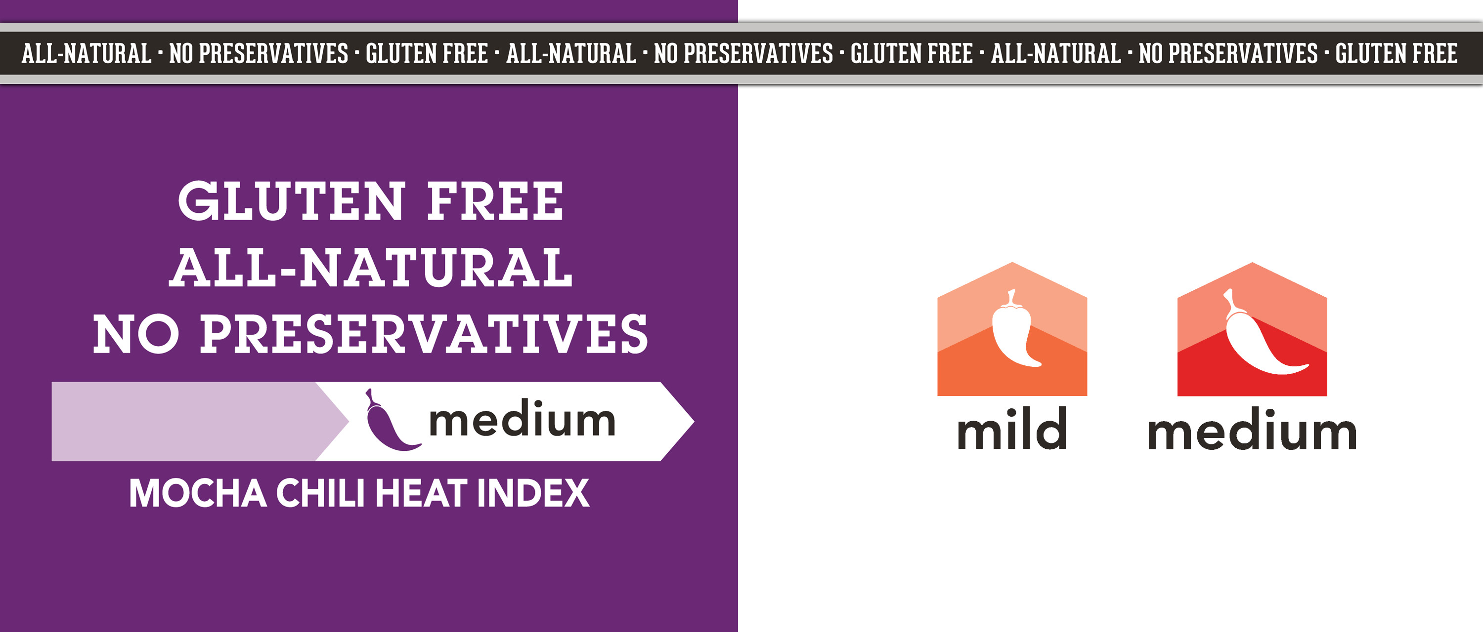
9. The Spice Blend Name — The name of each blend has been knocked out of a solid color using a two weight font system, that just looks great everywhere. Stacked on two lines or one, the blend name is really the first place your eye goes to on the label.
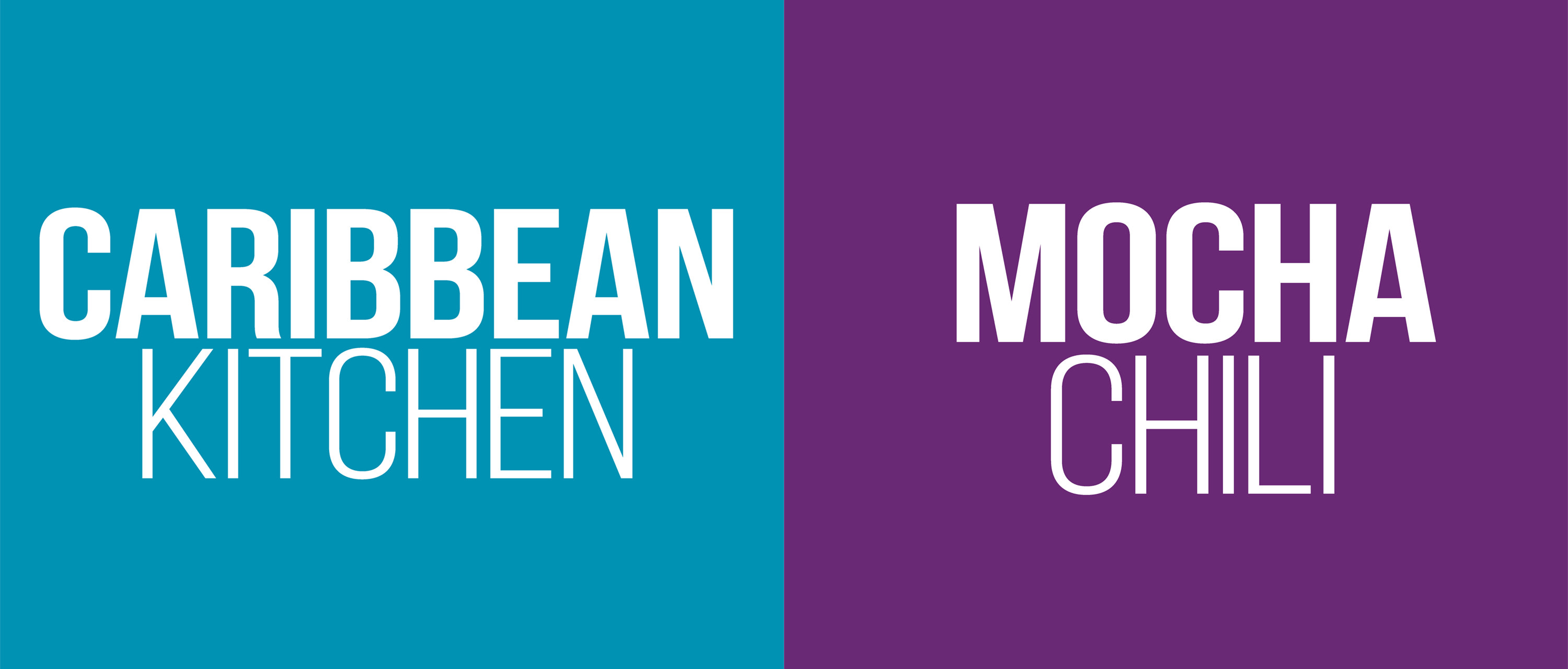
The spice blend name uses a two weight font system that looks great on
one or two lines. The blend name is always reversed out of the blend's
unique color.
It's hard to talk about the blend name, without talking about the color system… but those perfectly brilliant colors should be the subject of their own article!
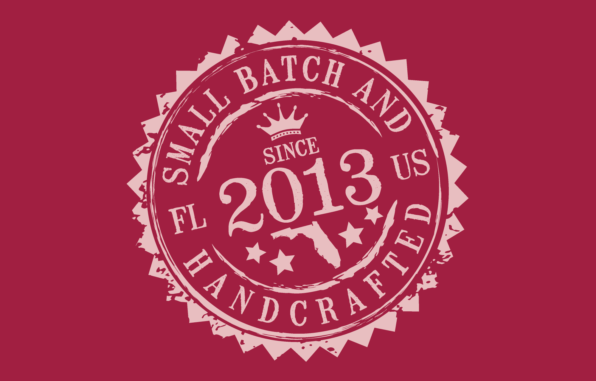
The Small Batch And Handcrafted in Florida, US since 2013 seal is a new element on P.S. Flavor!™'s product labeling system.
7.& 6. Feature Words and Heat Index — These kind of happen together and in a couple of different places. The heat index is a new device for the P.S. Flavor! label system… and one that's pretty important. When you have the word "spice" on anything, flavor profile and heat-level seem to be the first two things that consumers are curious about.
Where we have space, a long horizontal bar is used with a little pepper icon and the words mild or medium (currently, the only two heat levels) inside a "heat level arrow". When space is at a premium... very small vertical/square arrow is used in more of an "icon" format.
Feature and Benefit words and the new Heat Index appear in different
forms on different types of packaging. The "premium" black and silver
bar element (bottom) used as a separator between the blend's color bar,
and other label information.
The recipe callout helps the consumer link the spice blend with online recipes.
4. Use By and Batch Box — The freshness of spices and blends is something you might not think is very important if you were to just look at how tiny those markings are on some big brand spice products. In so many ways… I think you really need to try any of the P.S Flavor! products in order to realize just how much better a small batch, handcrafted and fresh spice blend product can be on your food. It makes a tremendous difference... and the hand-dated and batch number system on the P.S. Flavor! product labels highlights that fact.
3. The Ingredient List — Is necessary! If the spice blend product you are using does not list all of the ingredients, and instead says "and other spices" … be suspicious… be very, very suspicious. Each and every ingredient that is USDA Certified Organic is clearly marked with an asterisk on the P.S. Flavor ingredient list.
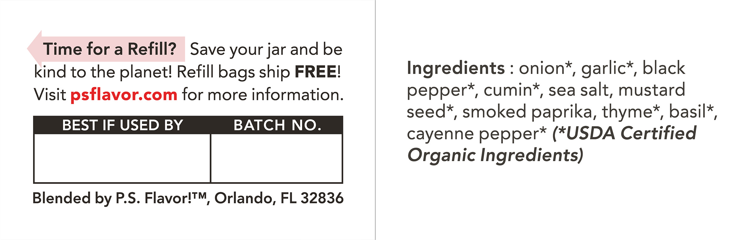
Just above the "Use By" date box, there's a "refill reminder" line and arrow that reminds consumers that it's time to order a refill.
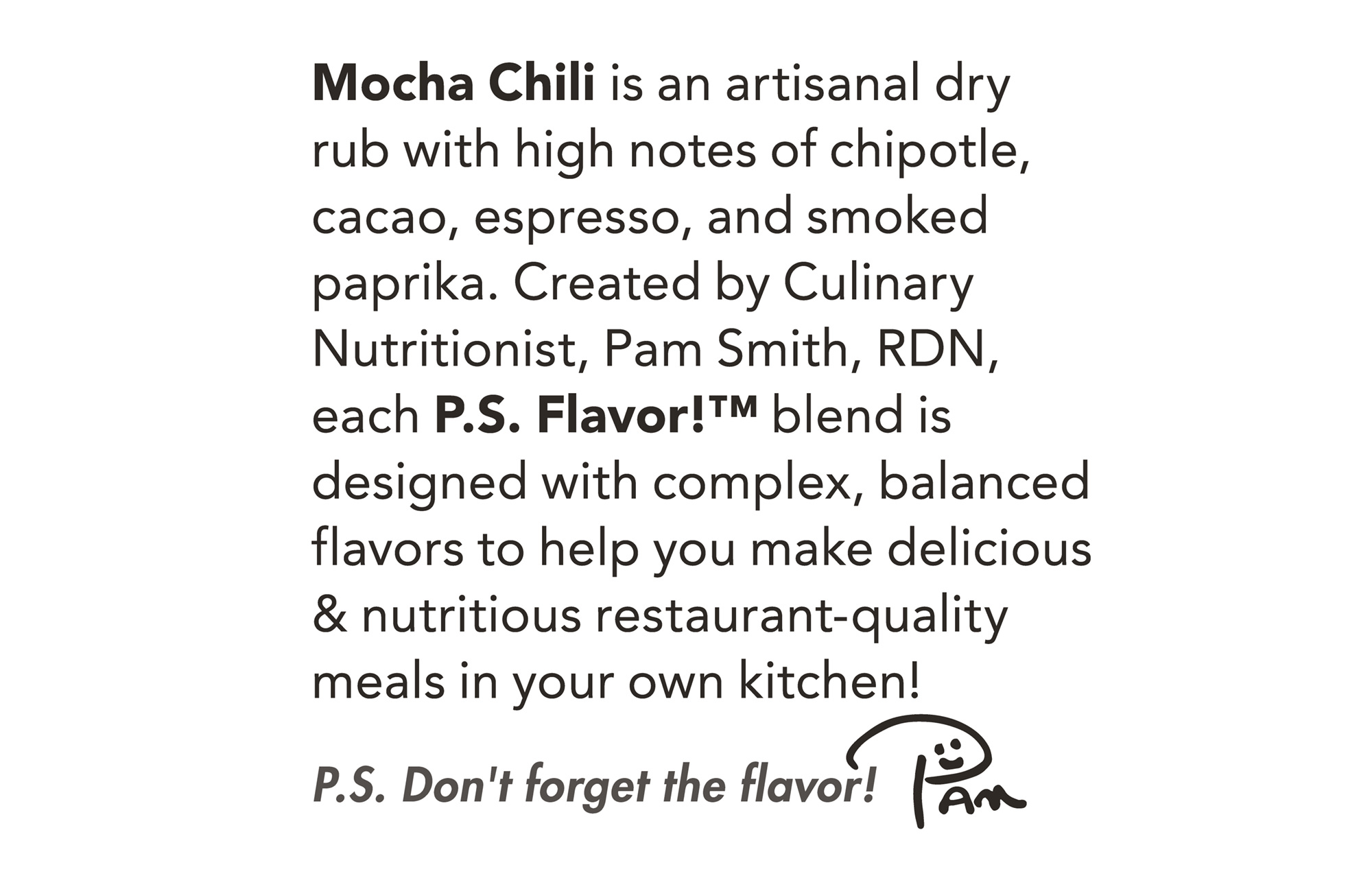
The Mocha Chili blend description from the right hand side of the P.S. Flavor! bottle.
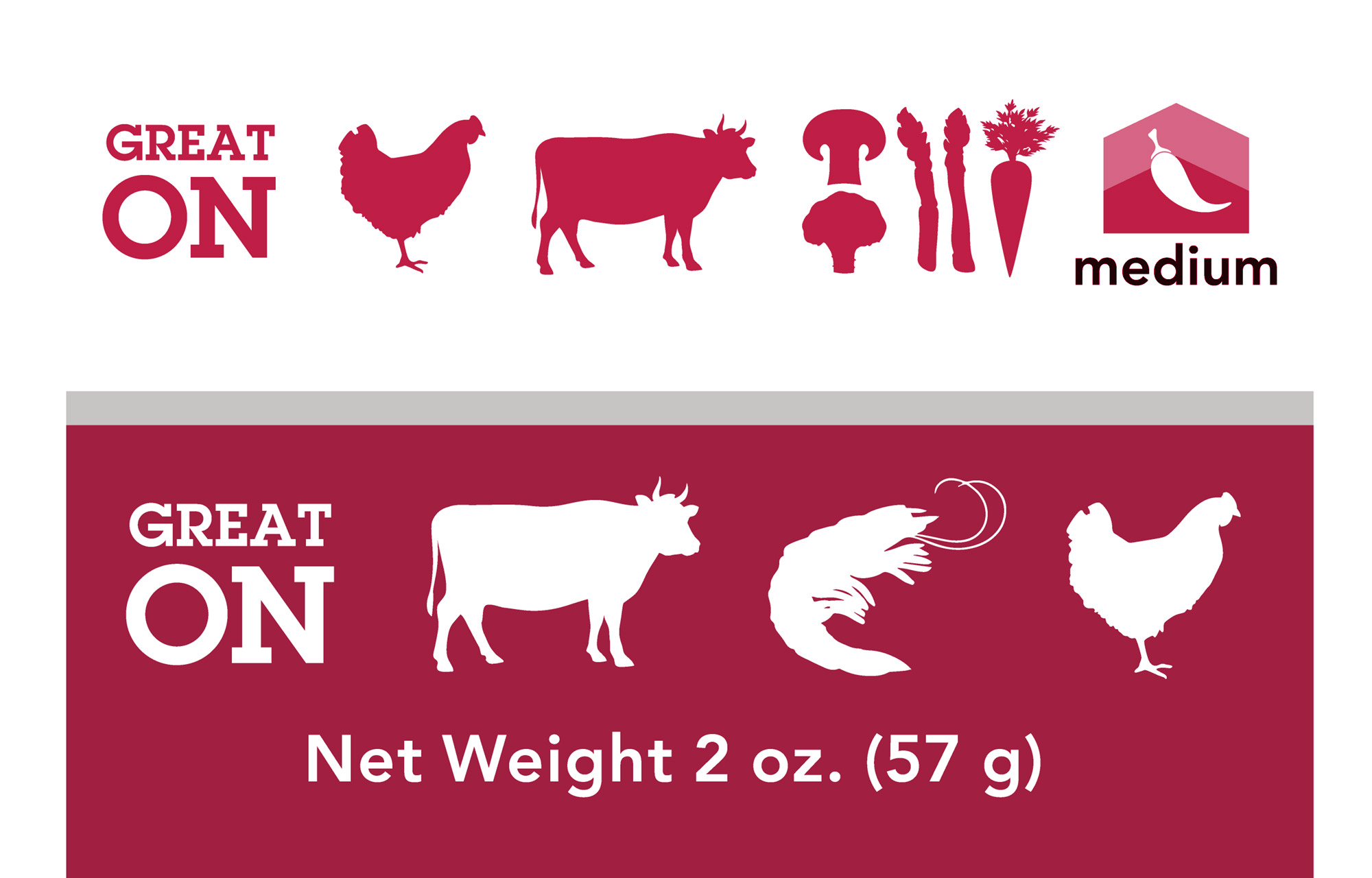
The "Great On" icons are so much fun!!! On some labeling, they appear reversed out of the blend's color block. Where there's less room, they are the same color as the blend. The Heat Index scale icon sometimes sneaks into the "Great On" line.
I am so happy with the entire project, process, product and the end results! P.S. Flavor! is a top-notch, class-act company from start to finish, and I feel simply blessed to have been a part of their rebranding version 3.0 story… a story which I hope is not finished, as there are so many more amazing things in the works at P.S. Flavor!
I am also very happy to have these new, great looking bottles and labels to continue (eventually ... in non-specific, relative terms)... with my Nine Ways to Flavor photography project! The bottles, packets and jars look stunning dressed in their new labels… and quite a bit of the "on white" product photography that has been kicking off the "Way One" of my nine part project, will actually be used in P.S. Flavor!'s ongoing marketing and sales efforts.
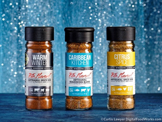
Here's a quick look at one of the bottle labels, from each of the three product groups. They are 5x2.5's that wrap around the bottle, with an 0.15" gap space at the back of the bottle.
